
Project Spotlight: Family Kitchen Goes from Black & White to Warm & Welcoming
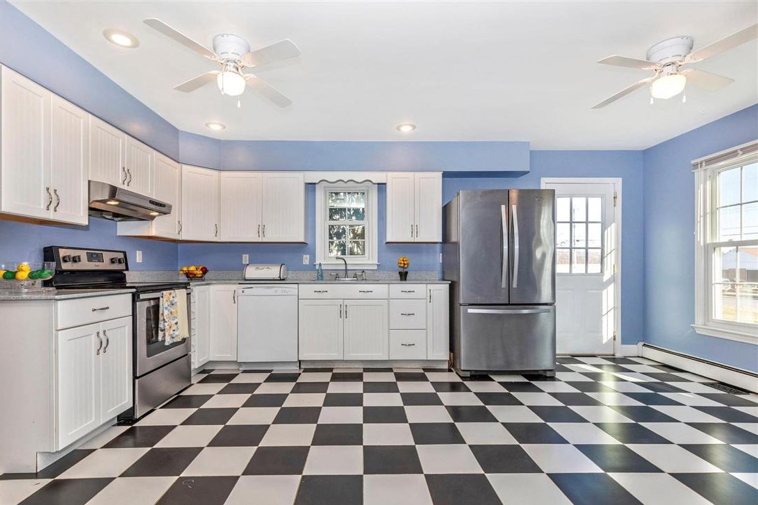
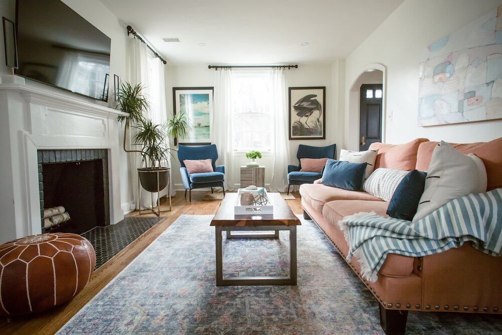
When Jessica and Joel first toured their new Montgomery County home, they knew it was the one for many reasons (I was there as their agent, so I saw it on their masked faces)…however, the kitchen wasn’t one of them. While large and with great natural light, the layout and look wasn’t them. Jess is a (fellow) baker and with an active boy at home, the space needed a blend of form (bye-bye brick and checkerboard floor) and function (hello storage and counter space).
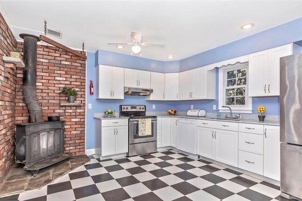
How It Started… (Image Credit Kathryn A. Tucker, Keller Williams Realty Center)
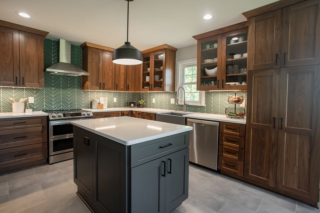
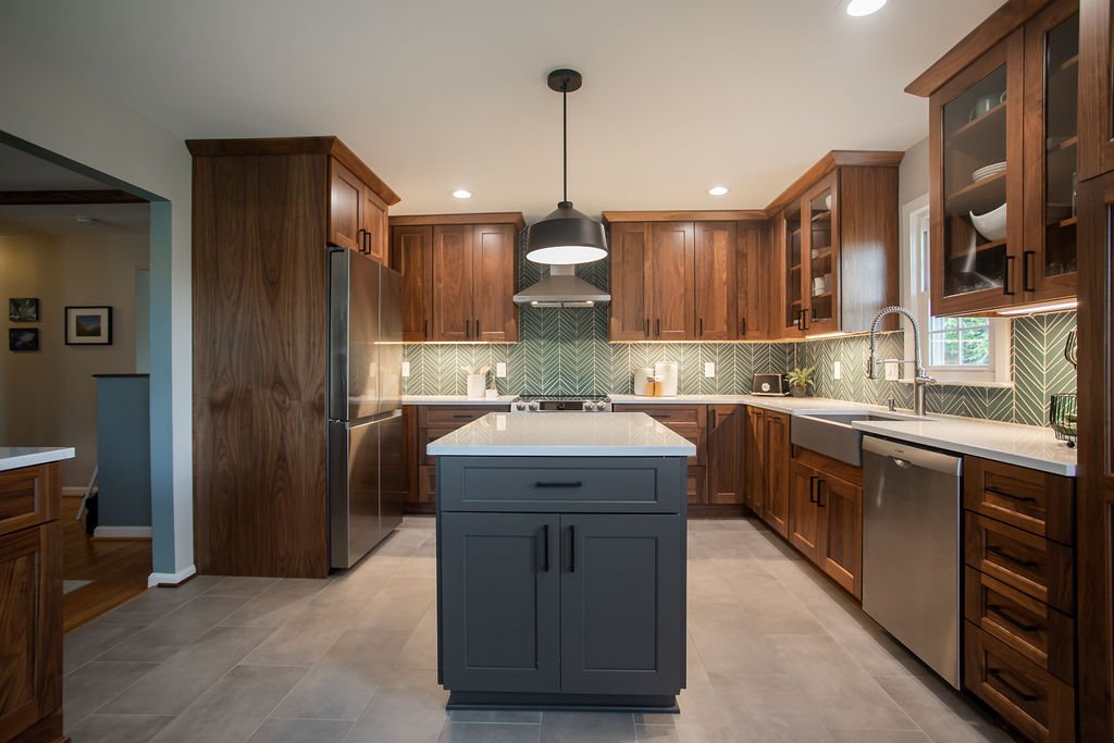
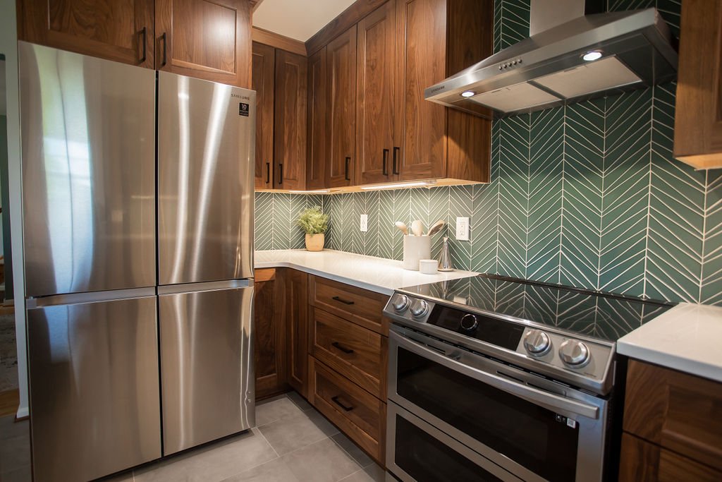
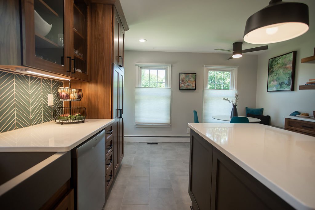
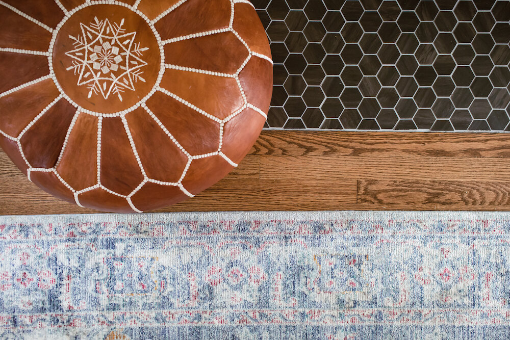
After settling into their home a bit more, J&J reached out to partner on this exciting transformation. From picking out cabinets to pouring over tile (my chosen pastime), the end result is not only beautiful but now serves as a favorite room for all. Keeping the same footprint (save shifting the opening to the dining room), we were able to confirm the brick could be removed (a messy but worthwhile update that extended into the living room) along with the soffit and — opening up layout options. By relocating the refrigerator, we achieved a beautiful stretch of cabinetry that welcomes you as you walk in and added a welcome pantry. We also created enough space for an island (including a microwave drawer tucked away) and an eat-in area with seating, storage and an essential coffee station!

How It’s Going…
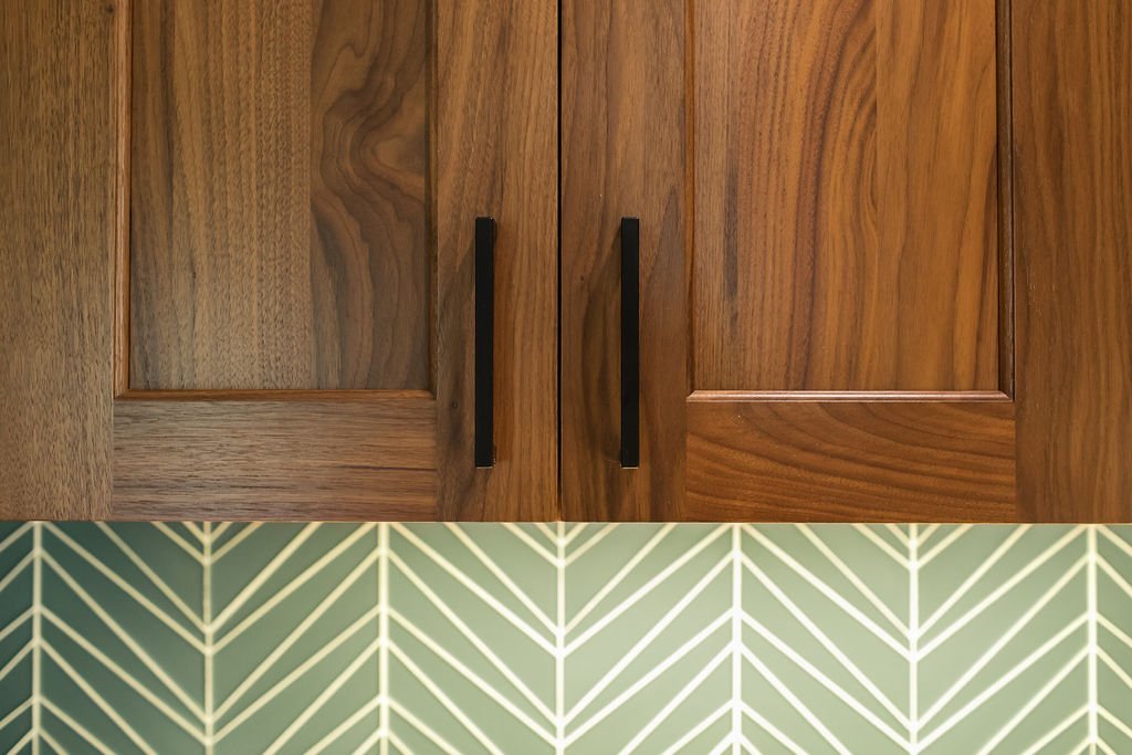
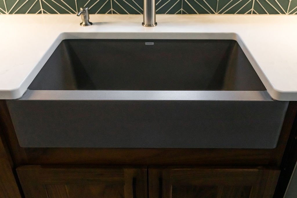
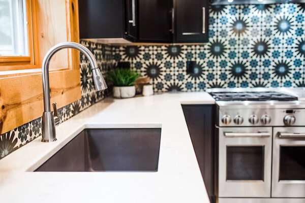
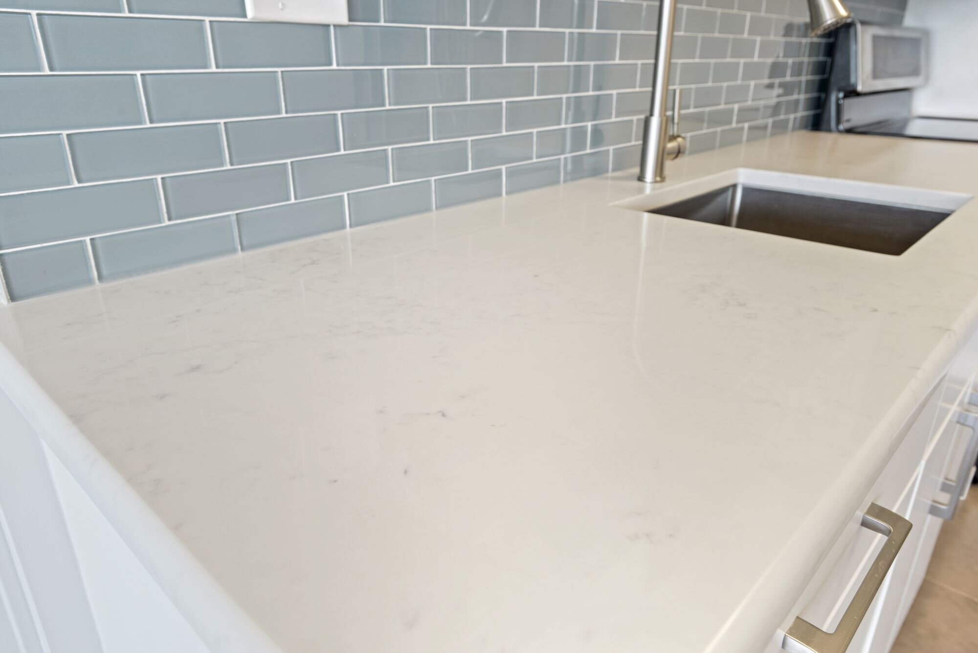
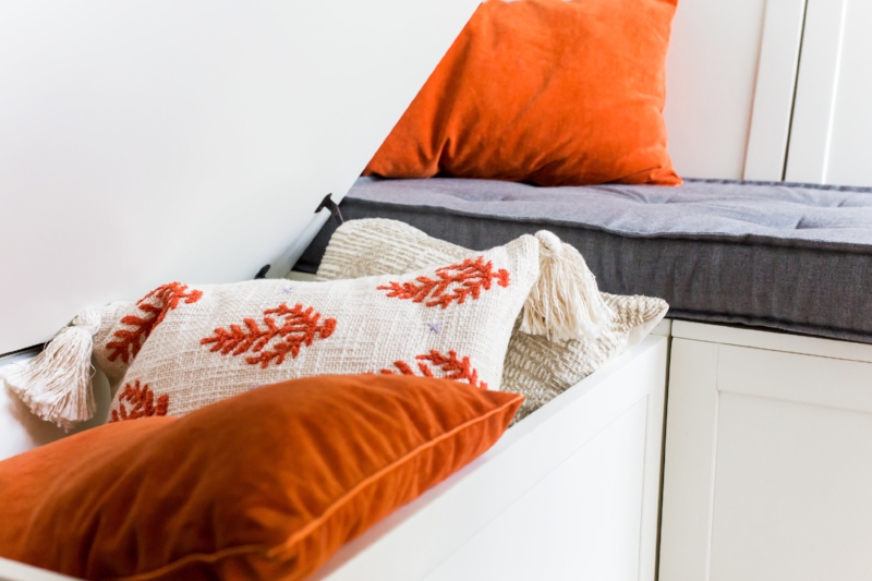
For the aesthetic, we focused on the cabinetry finish first, with the clients wanting a wood finish. Brighton Cabinetry had a beautiful walnut in a natural finish that we all loved in the Cascade style and paired with a contrasting island in Urban Bronze. For the backsplash, we knew there was an opportunity for a “wow” moment, so we went to my favorite local tile source, Architessa, and picked out Island Stone’s Palms tile in the Matte Lagoon finish. To round out the surfaces, we chose a clean matte gray field tile and a quartz countertop with subtle veining throughout the soft white background.
To pick up on the angles in the backsplash, we chose an island pendant and ceiling fan that mimicked the lines, in addition to a similarly styled range hood. Rounding out the design, we added a farmhouse-style Blanco sink in a complementary gray and matte black accents through the lighting and cabinet pulls. A suite of Samsung appliances in stainless steel and a faucet my clients had upgraded in the previous kitchen worked well with the overall look. The dining nook is a second home for their son and features a custom bench cushion in a fun Sunbrella print, CB2 tulip table and easy care chairs from Article, with crisp cellular shades from Smith & Noble and colorful artwork selected by the client. Check out more of the project (after photos by the talented Beth Caldwell) in the slideshow below!

Thinking about a renovation and need a helping hand (and eyes)? Don’t hesitate to reach out and let’s chat!
Get the Look
Island Stone Palms Lagoon Matte (Architessa)
Brighton Cabinetry in Cascade/Walnut Natural & Urban Bronze (Cabinet Discounters)
Bench Cushion in Sunbrella Shibori Classic (Beni Services)
Sanctuary II Modern Metro 5" Center to Center Bar Pull in Matte Black (Wayfair)
Axis Outdoor Rated 44 Inch Flush Mount Fan with Light Kit by Modern Forms in Matte Black (Capitol Lighting)
Svelti Dining Chairs in Teal (Article)
Ethereal White Quartz (Corian)
12x24 New York Concrete Matte Field Tile (Architessa)
Holgate 14" Wide Deep Matte Black Dome Metal Pendant Light (Lamps Plus)
Odyssey White Dining Table (CB2)
Kichler 6u Series LED Undercabinet Lighting (Capitol Lighting)
First Star Paint (Sherwin Williams)
Amber Harris is the owner of At Home DC, an interior decorator and a licensed real estate agent with Keller Williams Capital Properties working with clients in DC, Maryland and Virginia.
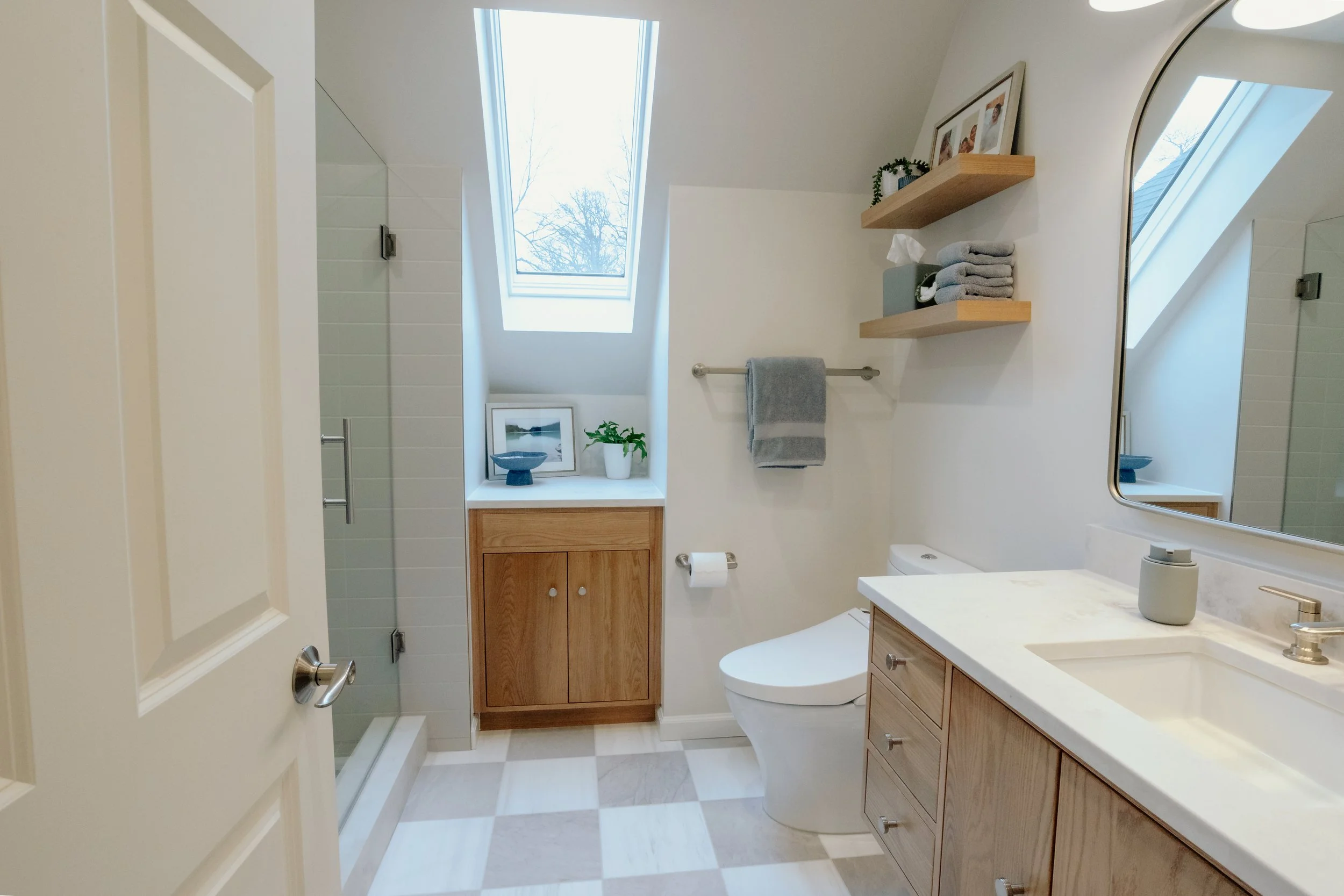
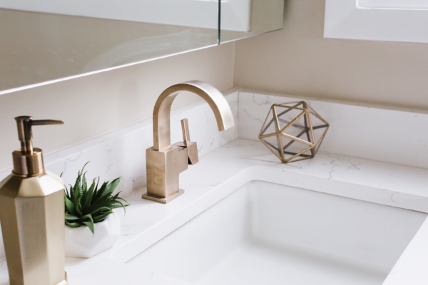
Project Spotlight: Historic Dupont Bathroom Renovation

Old Meets New in This Beautiful Bathroom Upgrade (Photo: Beth Caldwell)
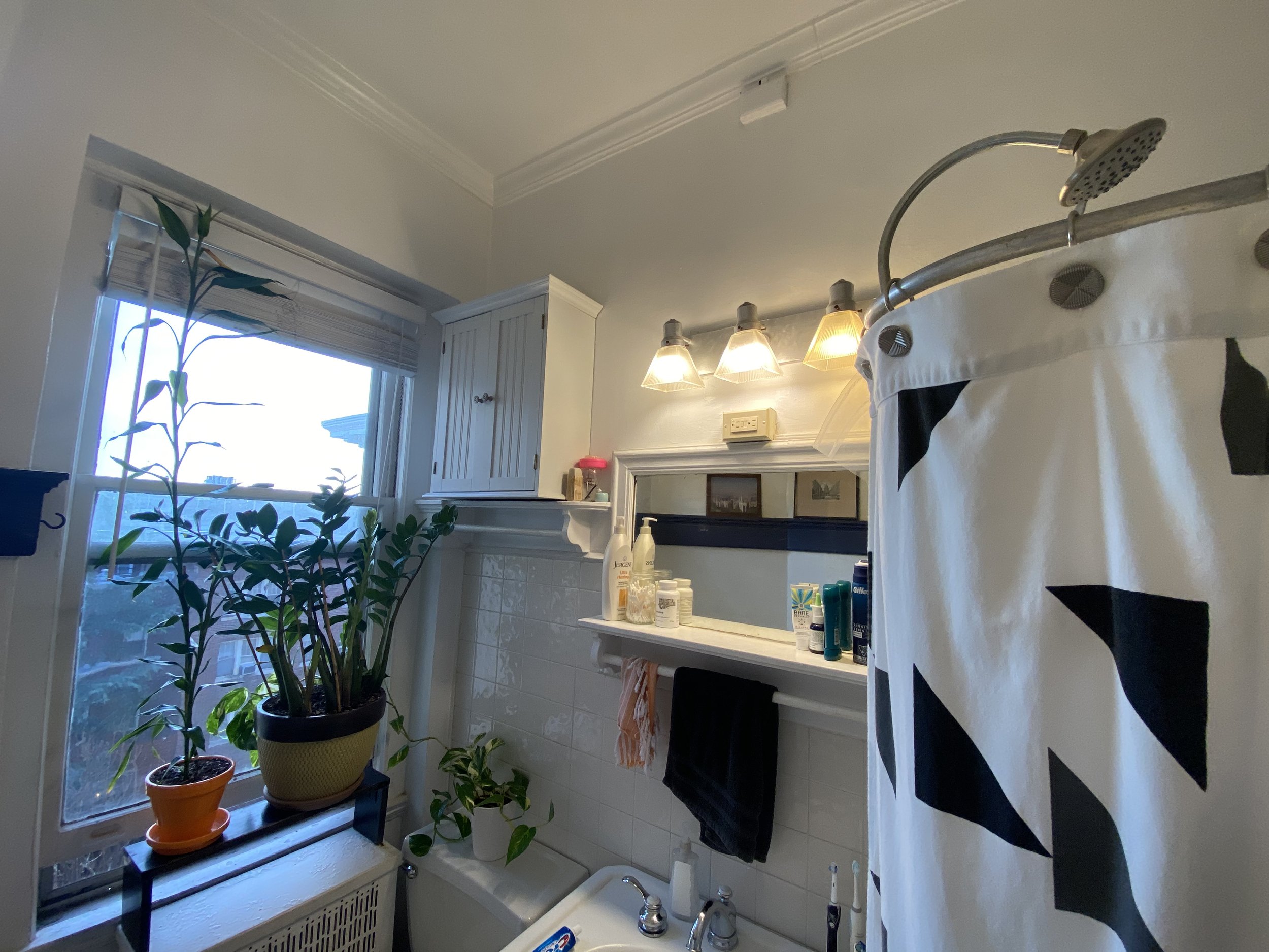
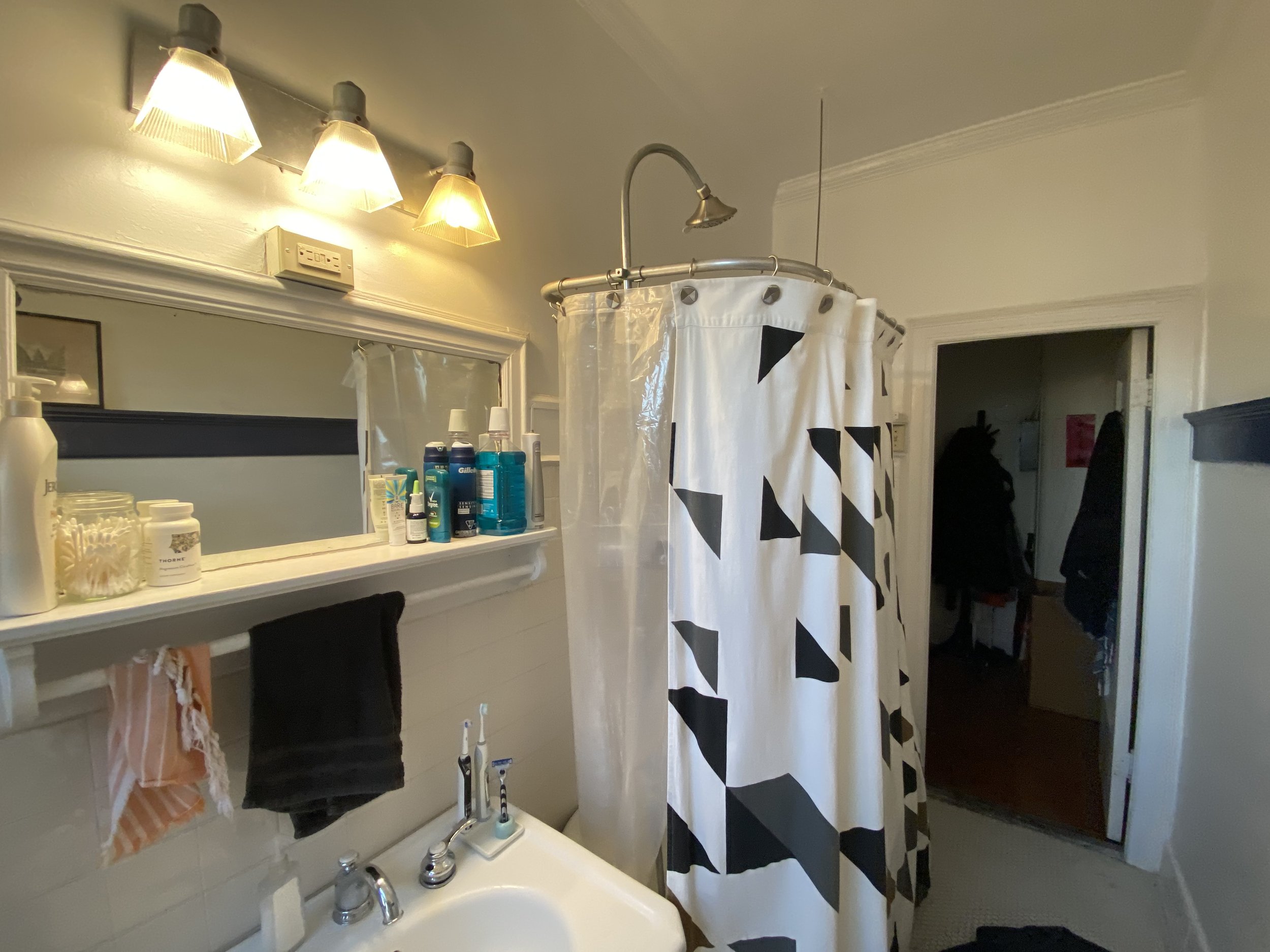
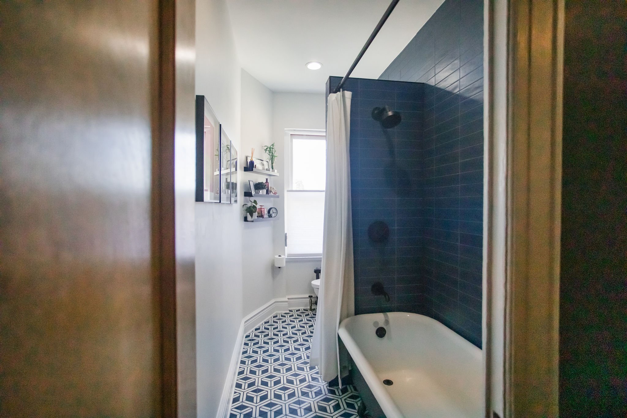
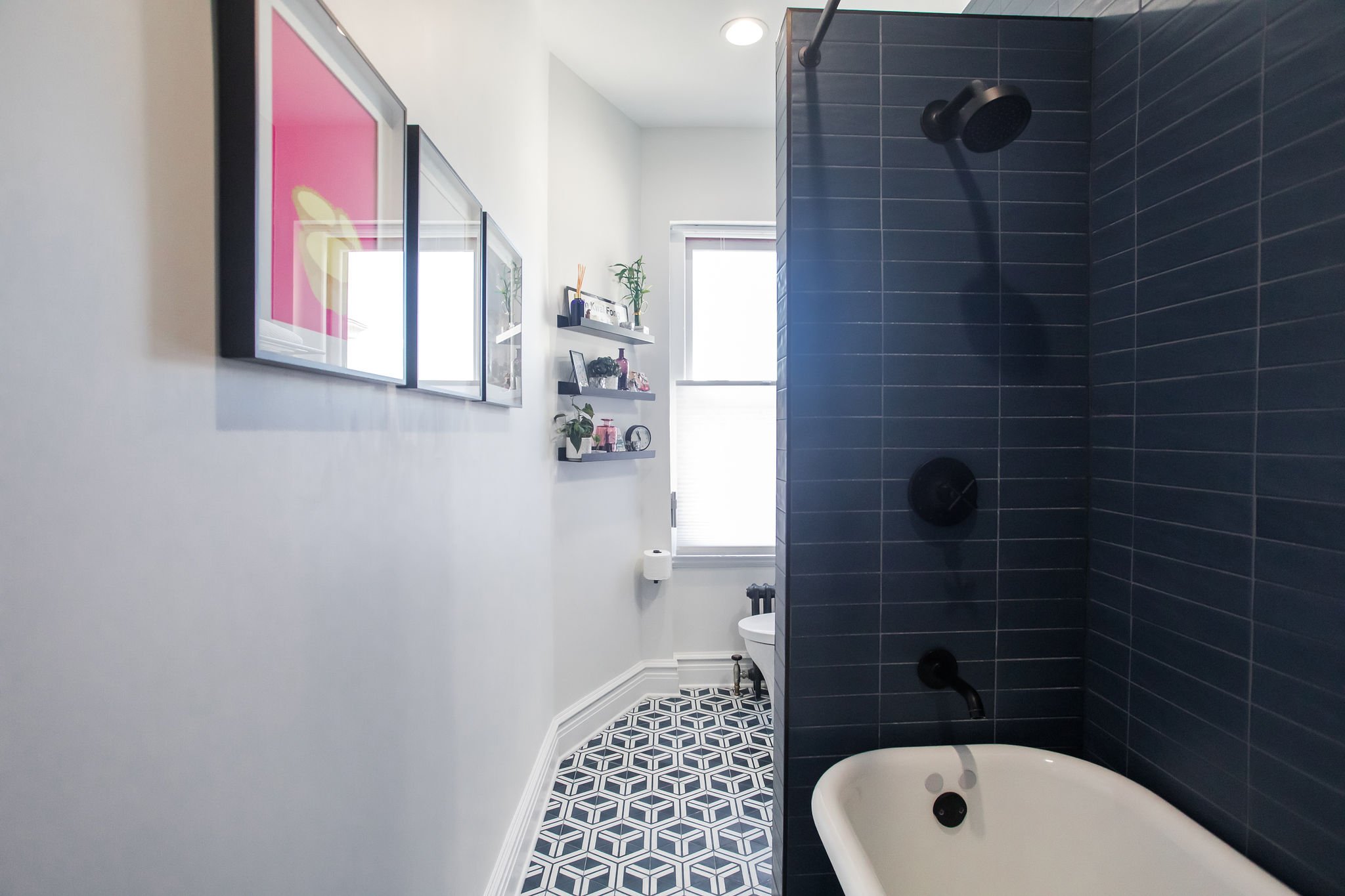
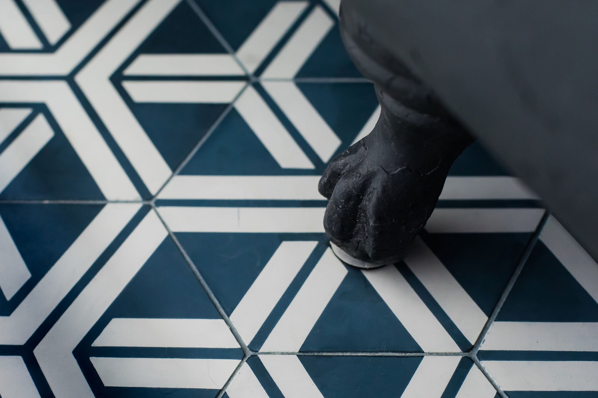
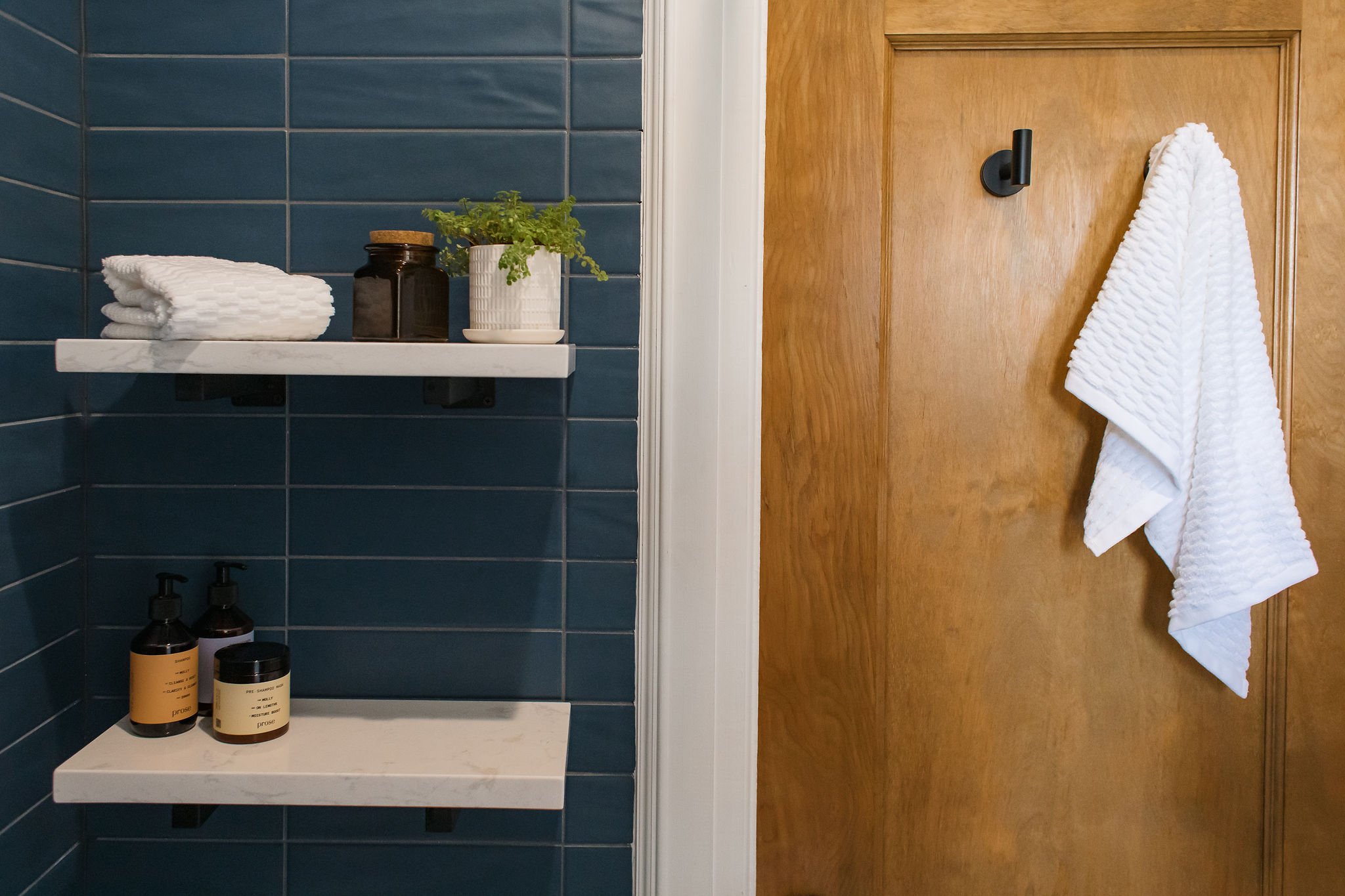
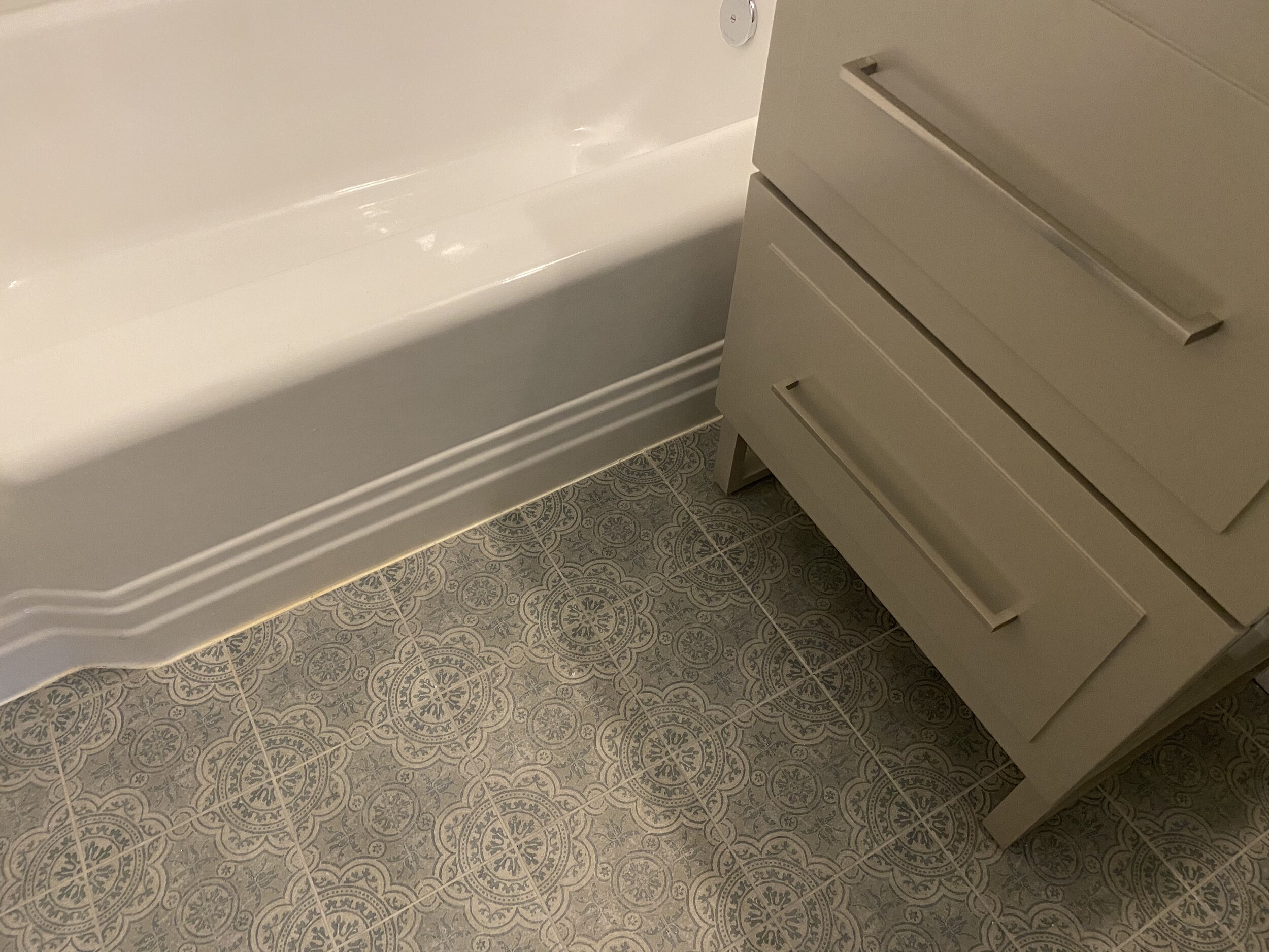
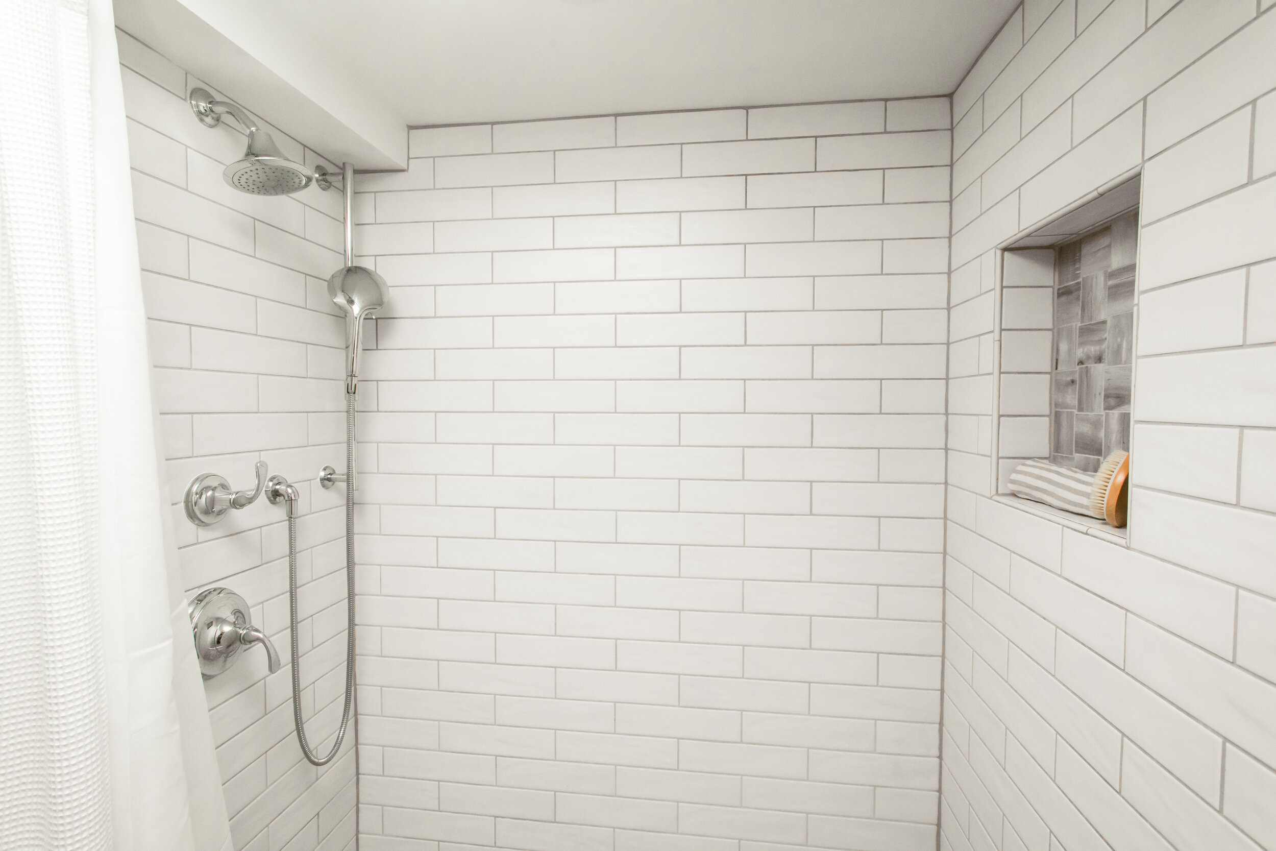
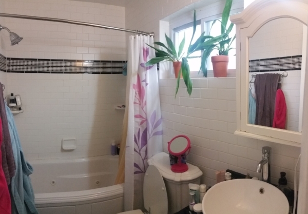
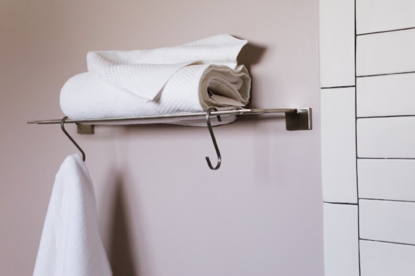
Small bathrooms are not uncommon in DC rowhomes and condos but one of my latest bathroom renovation partnerships presented some new challenges…and opportunities! Molly & Sam reached out last winter as they were planning ahead for a summer remodel of the bathroom in their historic Wardman-built 1917 DC coop near Dupont Circle. Long and narrow with soaring ceilings and wonderful natural light, the bones were there but smaller spaces, especially in older buildings, require some creativity and willingness to roll with surprises (like penny tile held in place not by grout but by cement).
The Before
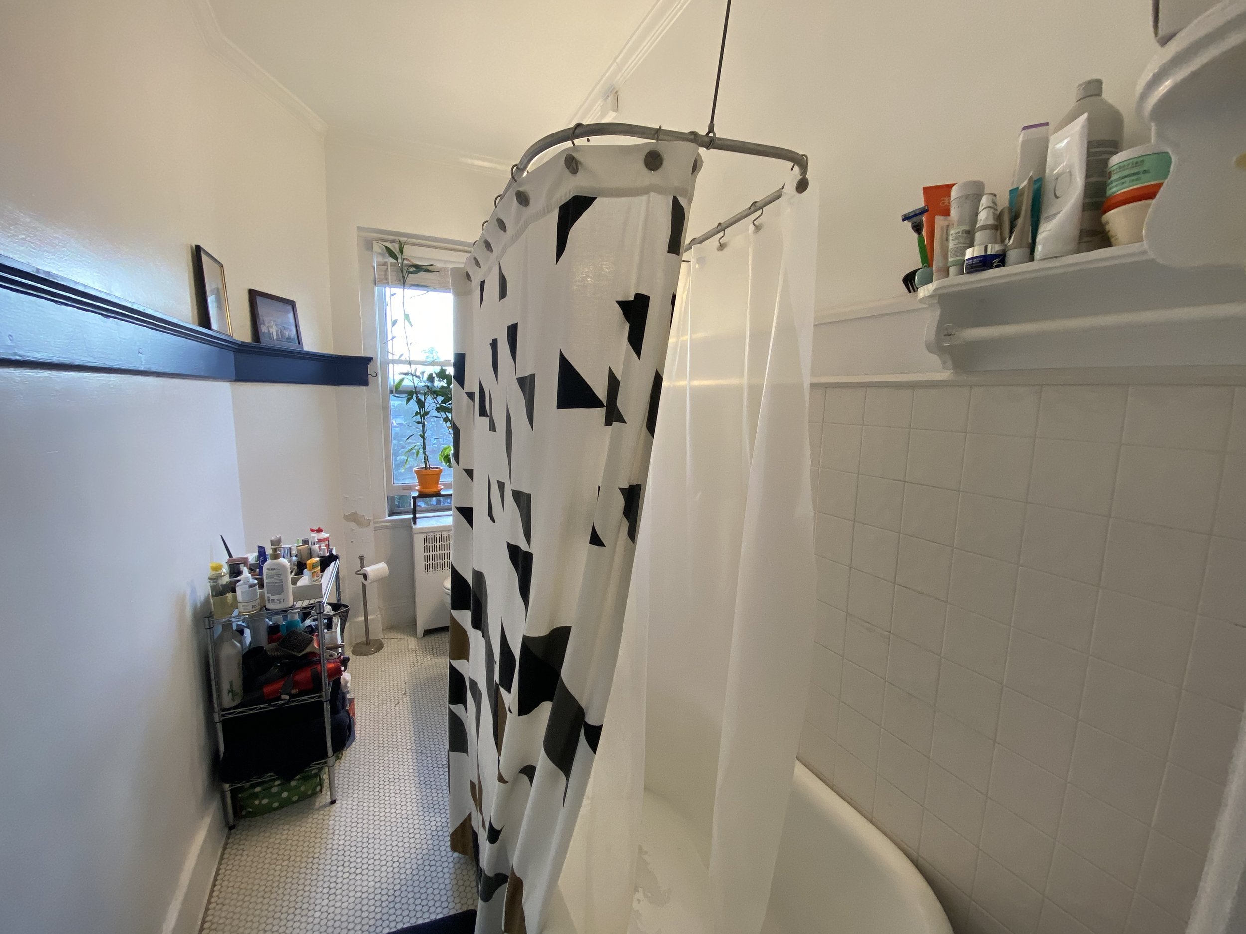
With a beautiful clawfoot tub in place and staying (after being refinished), we had little room to modify the layout, so we made a series of little changes (and one big one) to modernize and make the most of the space:
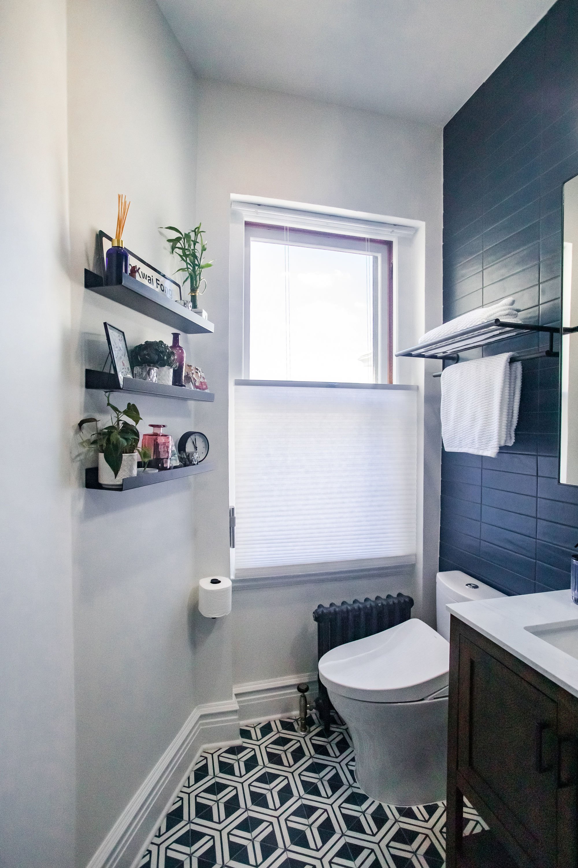
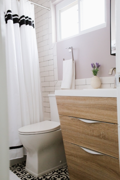
Inch by Inch: With limited ability to change positioning of plumbing, we worked with H&C Construction to identify small modifications to gain space, including shifting the tub a few inches closer to the wall opposite the window to gain vanity space (and room to add the pony wall).
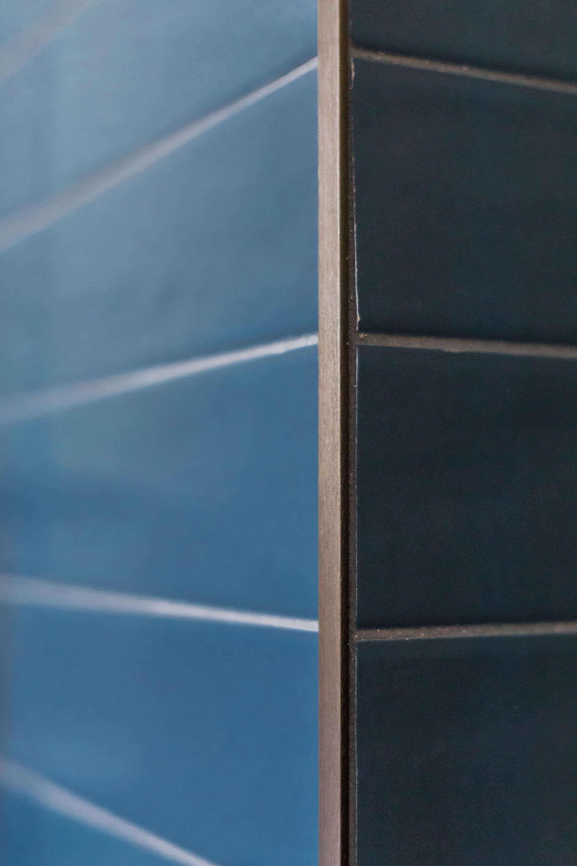
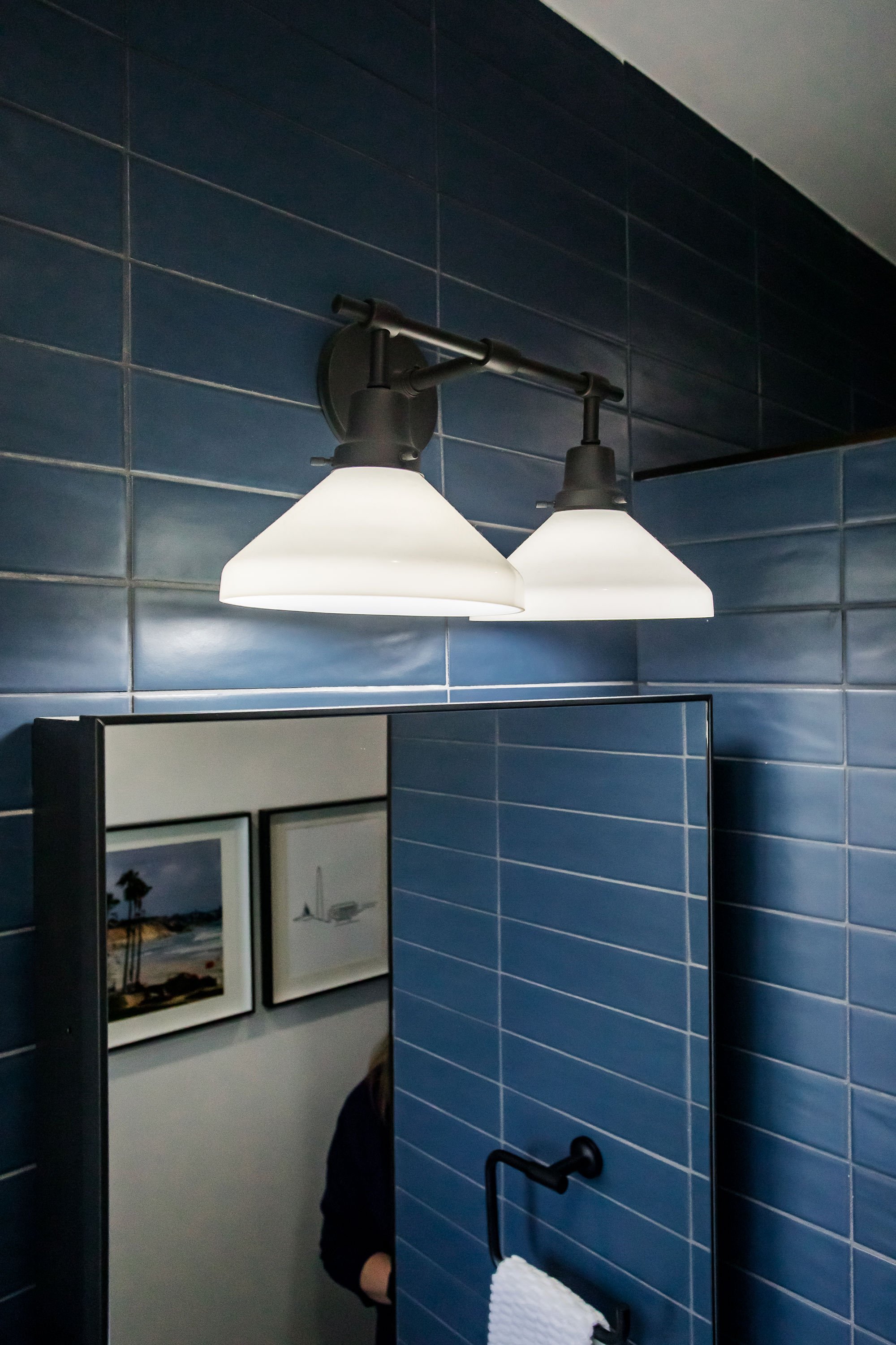
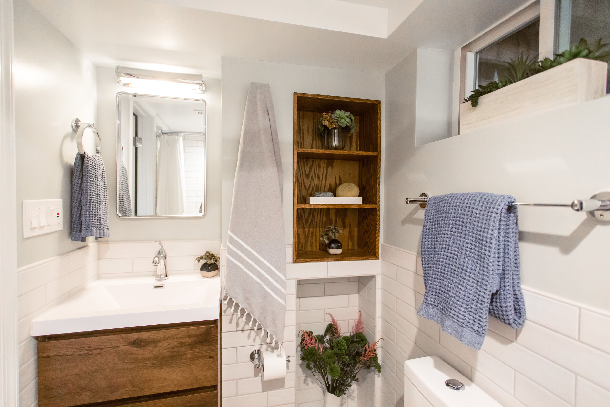
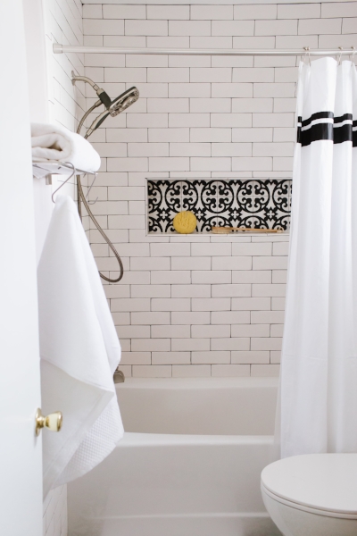
Height and Light: By removing molding and shelves that interrupted the vertical planes and adding recessed lighting, the space feels grander. To further emphasize this, we took the rich blue wall tile all the way to the ceiling on the side of the room that hosts all our fixtures.
Wonderwall: In tight spaces, most often the best approach is to remove walls and other separations that make it feel more cramped. However, in this case, I proposed adding a tall pony wall to create an enclosure around the clawfoot tub, house the shower/tub plumbing and further define the vanity space. I knew with the ceiling height and added recessed light, the space could support this…and Molly & Sam trusted the vision thankfully!
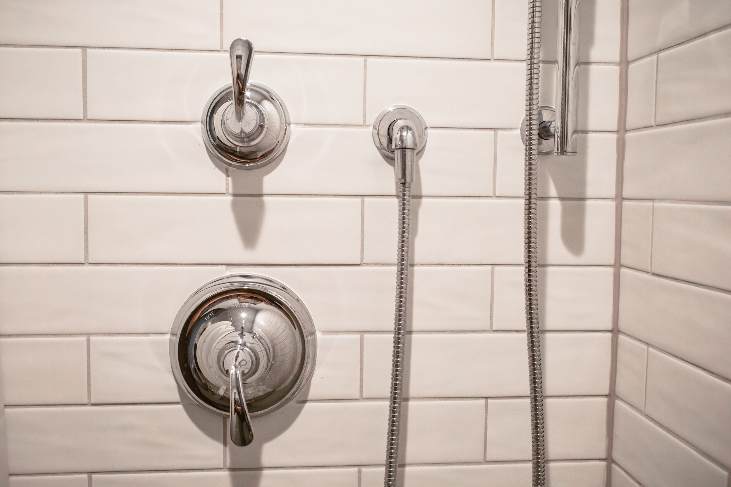
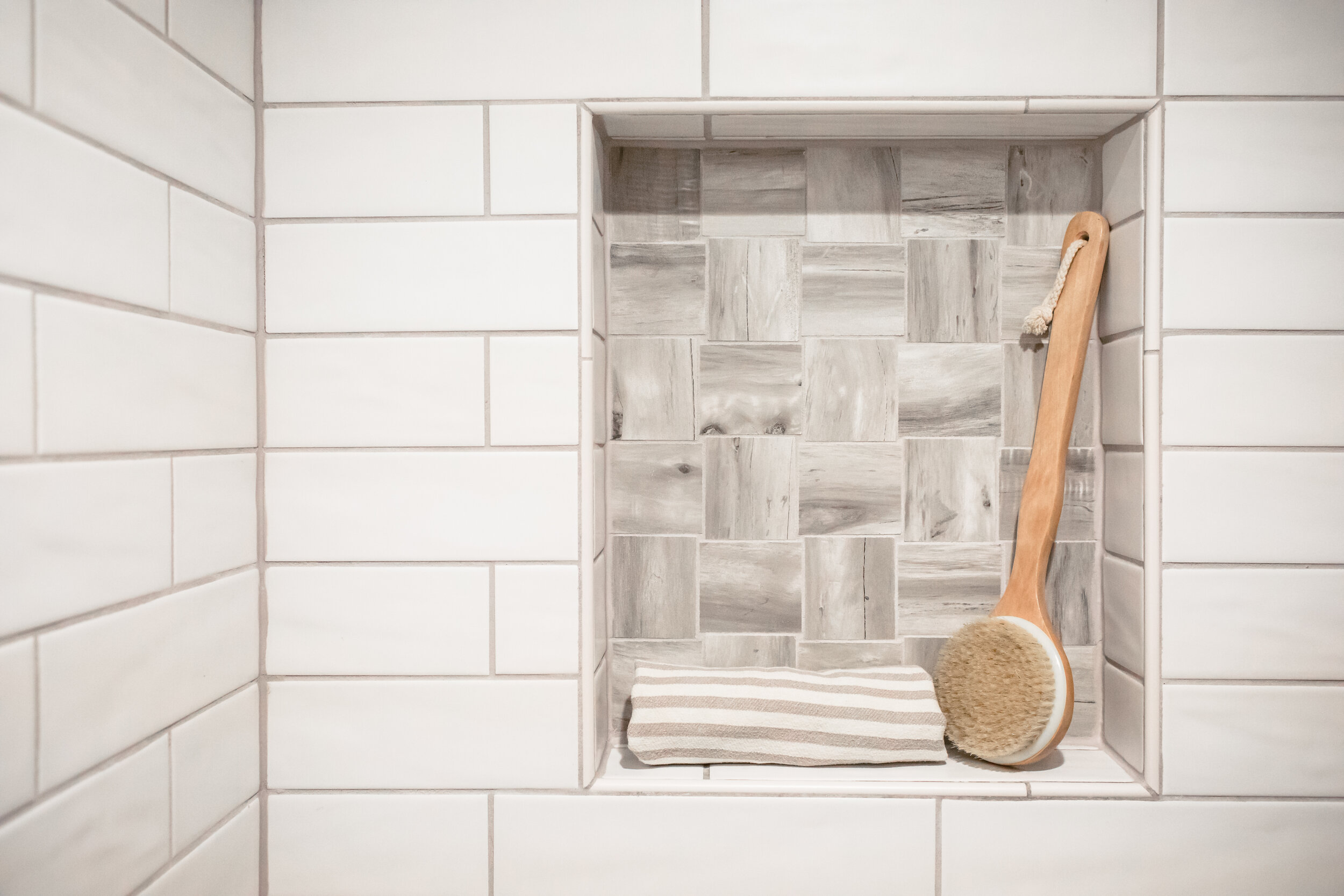
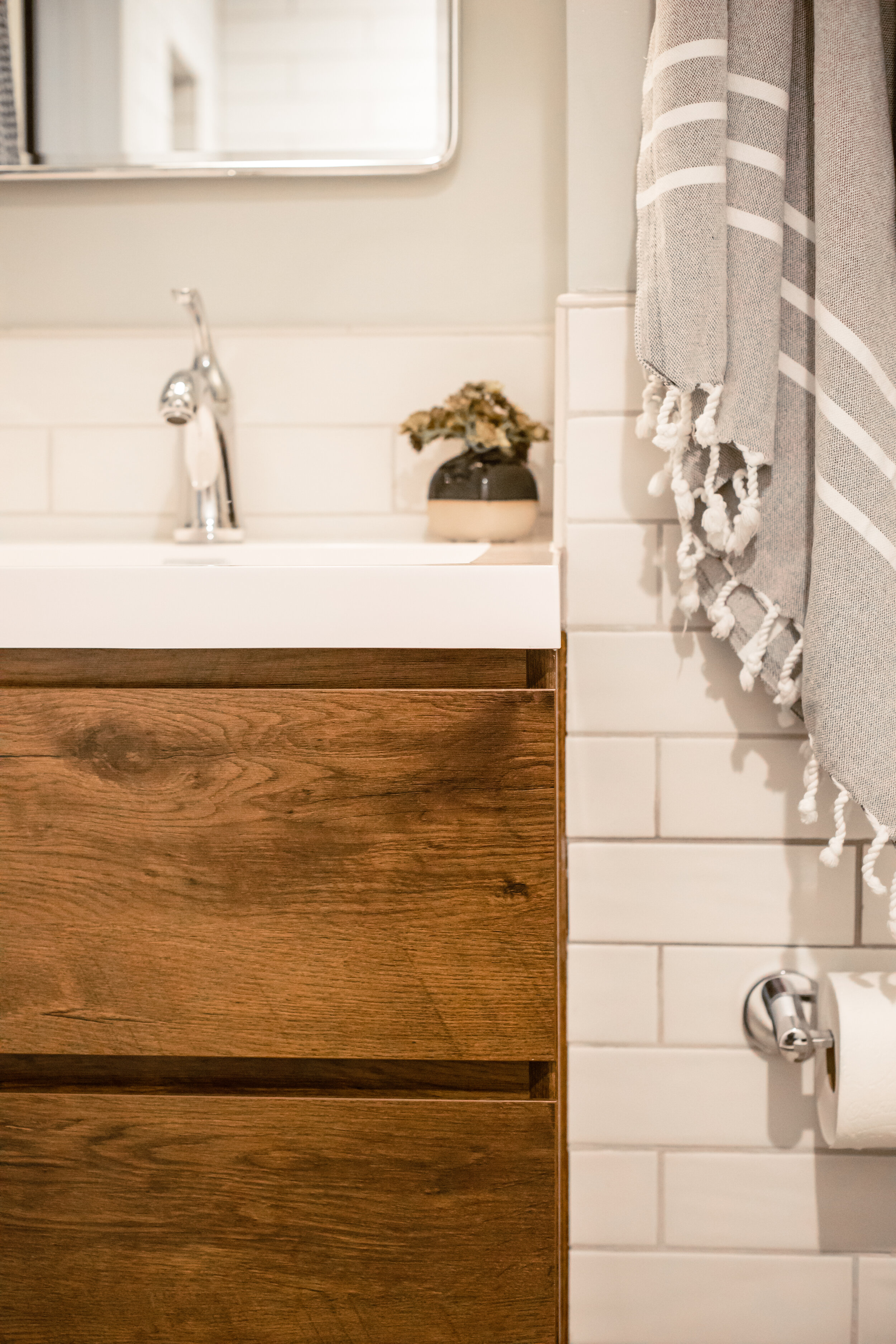
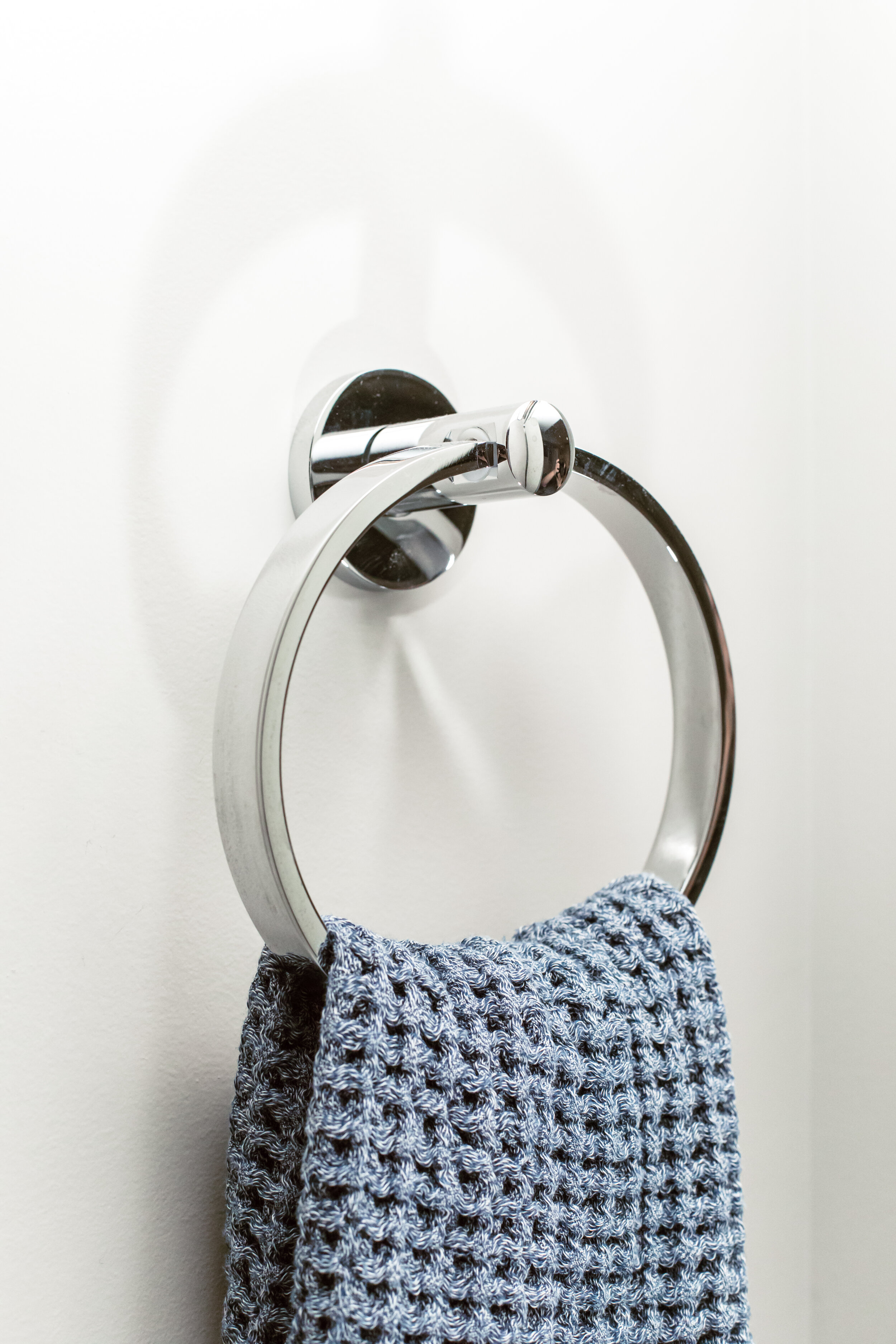
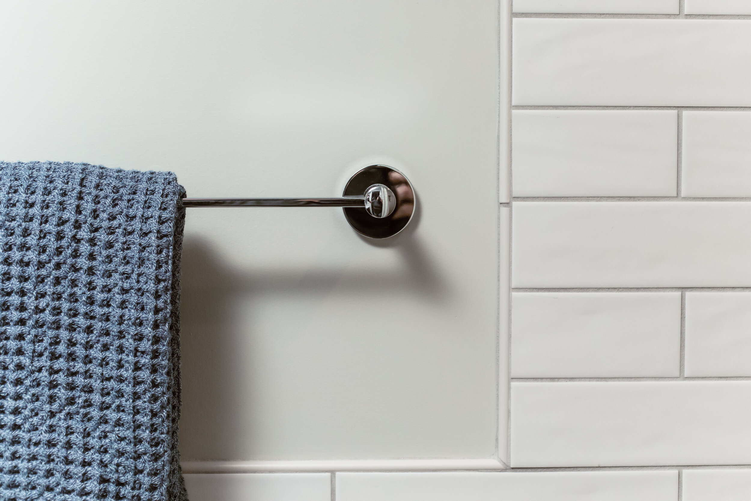
Smart Storage: Since the depth of the walls didn’t allow us to add shower niches or recess the medicine cabinet, we found solutions that worked with the cards we were dealt, like floating quartz shelves in the tub/shower area and modern wall-mounted medicine cabinet. Robe hooks provide the perfect anchors for towels where traditional towel bars may not work.
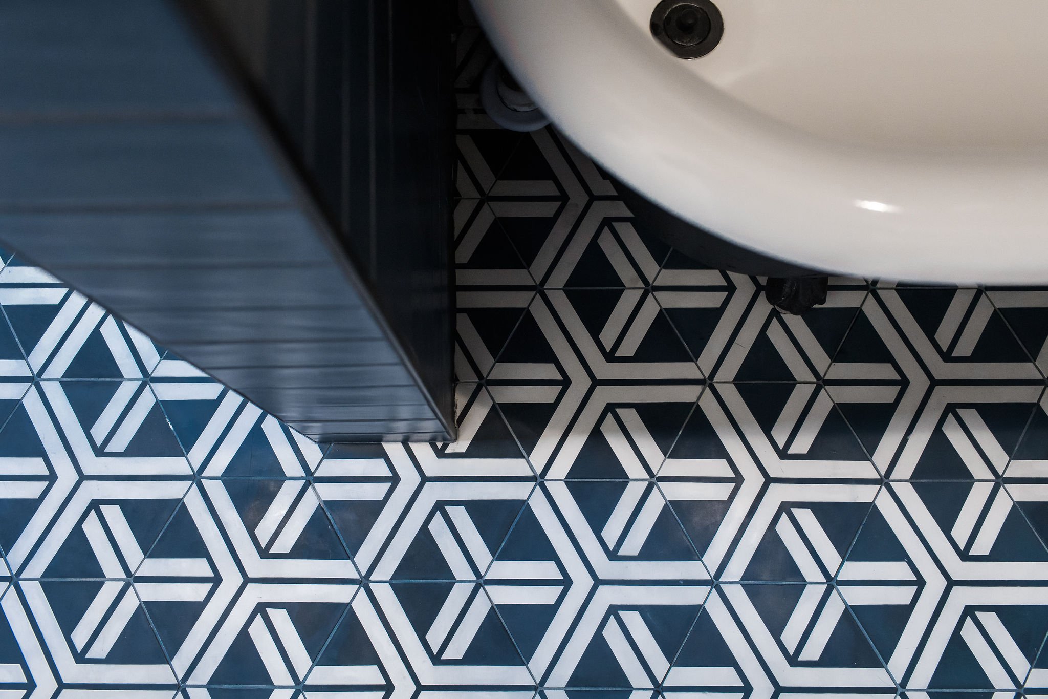
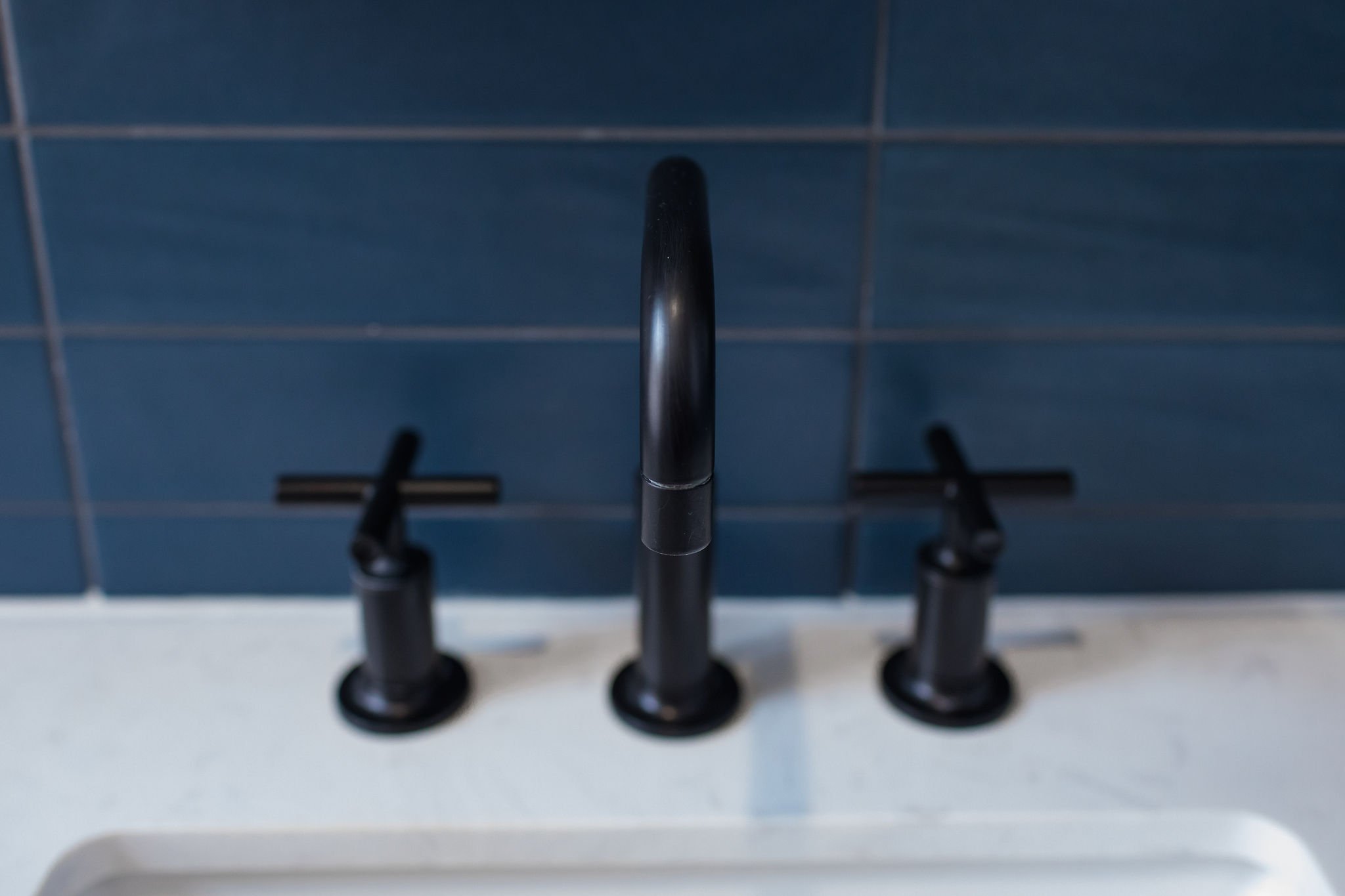
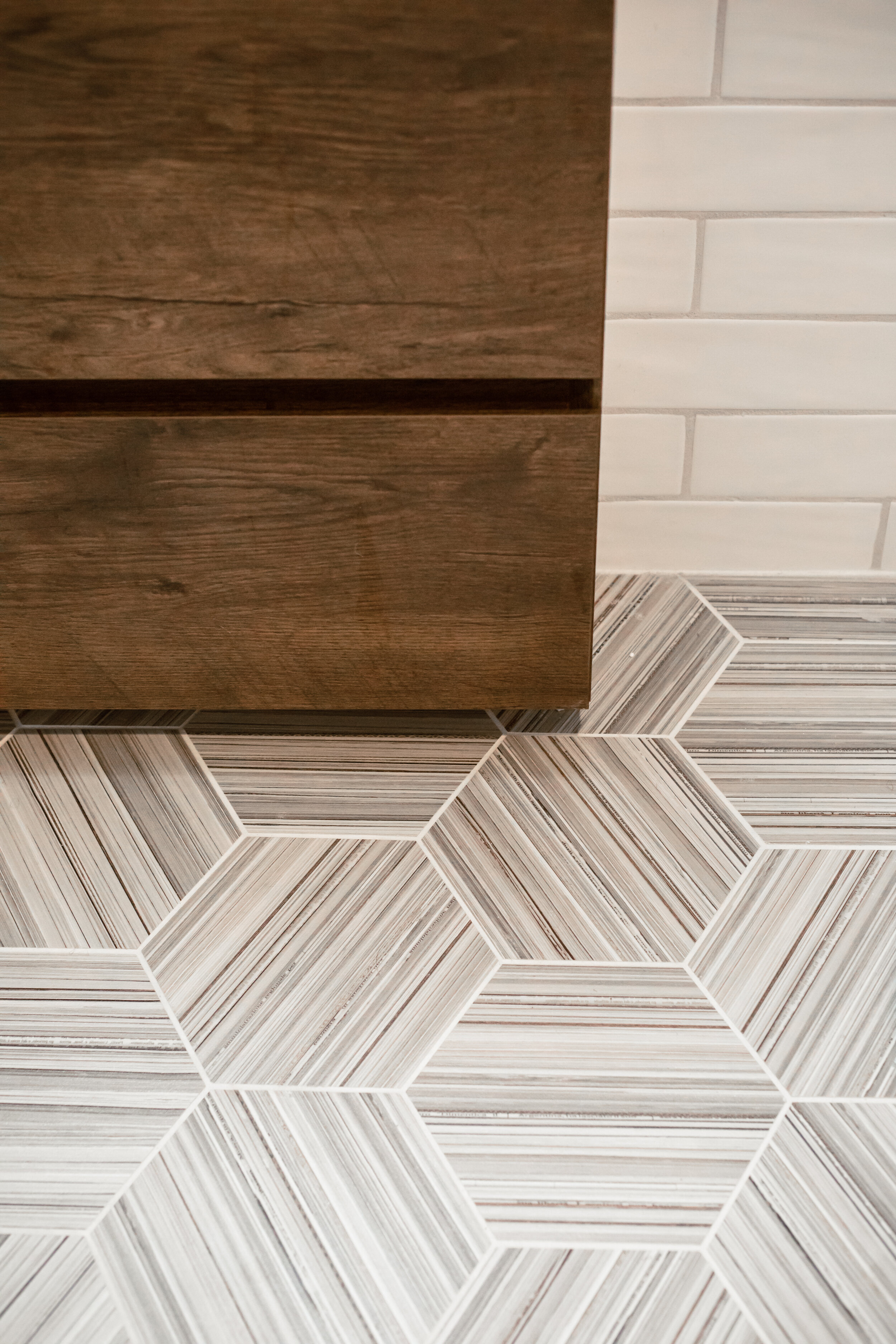
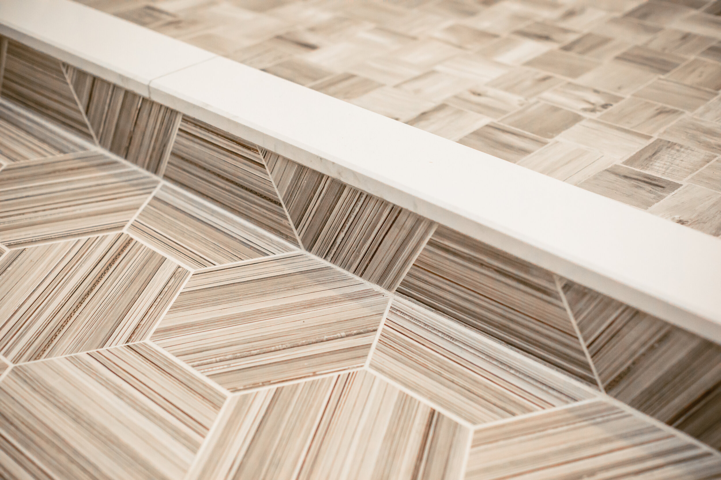
For the palette and over aesthetic, deep blues are offset by clean whites and matte black finishes, with a wood vanity adding warmth. The hex floor tile has a retro feel and the matte finish of the Kiln & Penny Petrolio wall tile with a coordinating grout (thanks to the Architessa team) and stacked installation complements the floor and adds drama without detracting from other details. The formerly all white clawfoot tub was refinished in a matte black on the outside to tie into the design. And small touches, like the faucet shape play nicely with the floor tile pattern.
Dream clients, Molly & Sam also took the project to another level with additional updates — from the reproduction of dramatic baseboards and trim in the original profiles and a beautiful door stripped of years of paint to a restored window and an updated radiator from Castrads that saved a few inches and complemented into the design with its black finish. And they further personalized by selecting personally meaningful art and photography for the gallery frames and curating floating shelves with plant babies and other trinkets to tell their story.
Check out the slideshow below for more of the “after” (thanks, as always, to Beth Caldwell for capturing)…and reach out if you need ideas for your next bathroom update — small or large!


Get the Look
3x12 Kiln & Penny Petrolio Tile (Architessa)
8x8 Hexagon Collection Natural Rete 3H Field Tile (Architessa)
Belleair 30” Single Sink Vanity in Espresso (Pottery Barn)
Eastmoreland 2-1/4” Fitter Double Wall Sconce with in Oil-Rubbed Bronze with 8” Opal Shades (Rejuvenation)
Kohler Purist 1.2 GPM Widespread Bathroom Faucet with Pop-Up Drain Assembly (Build.com)
Kohler Purist Tub and Shower Trim Package (Build.com)
Signature Hardware 66" Straight Brass Shower Rod in Matte Black (Build.com)
Kohler Purist Bathroom Accessories (Build.com)
Mercury Cast Iron Radiator (Castrads)
Brushed Gunmetal Wall Frames (Crate & Barrel)
10-Inch Floating Shelf Brackets (Amazon)
Pure White Paint (Sherwin Williams)
Amber Harris is the owner of At Home DC, an interior decorator and a licensed real estate agent with Keller Williams Capital Properties working with clients in DC, Maryland and Virginia.
Re-Imagining a Deep Creek Retreat

A Blend of Rustic and Modern in Deep Creek
While I consider my self a hands on partner to my decorating and real estate clients, the COVID-19 pandemic made the in-person aspects of my work much less common (for good reason). Especially as a decorator and design consultant, there really is no substitute for seeing a space in person — understanding the charming details and pain points, seeing how light plays in the space, etc.
I have worked with clients in New York and New Jersey remotely but this past year gave me the opportunity to take on my biggest design project to date — a 4,400 square-foot vacation home right on Deep Creek Lake in Swanton, Maryland (and to do it almost entirely remotely, save one site visit on a rainy September day). Earlier this month, I had a chance to finally see the fruits of our collective labors, the Ar’ya Relaxed Chalet, in person (in addition to inviting along the talented Beth Caldwell to capture it).

BEFORE: The pre-renovation kitchen blended in, was smaller and allowed less opportunity for family and friends to gather (Photo Courtesy of Taylor-Made Deep Creek Vacations & Rentals)

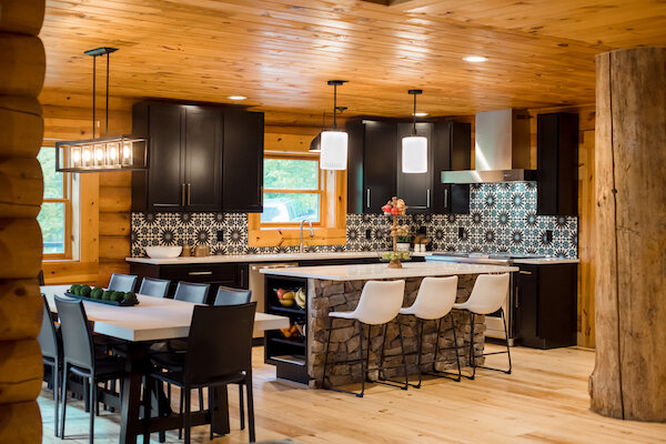
AFTER: The renovated kitchen offers more storage, seating and a modern twist with a funky tile and sleek quartz countertops; the stone was repurposed from the peninsula (Photo: Beth Caldwell)
First off, this is a log house (we won’t call it a cabin, Dave). There is no changing that…not that anyone wanted to. The vision we crafted for the vacation home (which is also a rental/investment property) was to create cohesive spaces that infused modern sensibilities without being at odds with the rustic nature of the home. While my clients purchased the property pre-pandemic and Deep Creek has long drawn vacationers year-round from the region, we wanted to make a departure from the country quilts and appeal to new and return urban dwellers looking for an escape. So, what did this mean in terms of the approach?
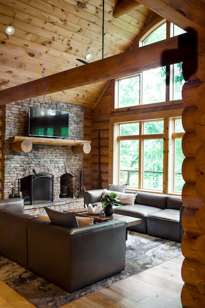
Striking a Balance: The logs and overall wood tone (which is warm and on the orange/red part of the spectrum) wasn’t going to change. We needed to balance it out with a complementary palette (lots of cream, blue and gray with flashes of green) and fixtures in matte black, for example, that feel simultaneously modern and rustic. We also kept in mind that pieces can be moved around between rooms and spaces and still “work” (as my clients reminded me that things often grow legs when guests arrive).
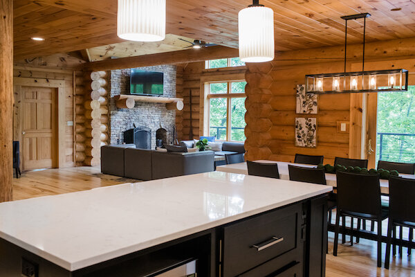
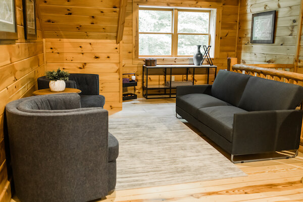
Form AND Function: As with all my projects, we focused on both form and function. The final product had to be a showstopper but we had to make sure it could comfortably welcome 12 guests — so we needed enough sleeping, dining and sitting spaces for them (and we were able to do that without the previous bunk beds). We also wanted surfaces that were easy to keep clean and fresh looking, like quartz and darker grouts (contrasting or not).
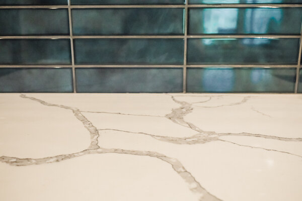
Mix High and Low: While a family vacation home, this is also a rental (scroll down to the end for a link to make your reservation!). As much as we may have wanted to splurge on furniture pieces and elevated design elements, we had to keep in mind the heavy use and eventual replacement. Most of our furniture pieces came from Ashley, Wayfair, HomeGoods, etc. (sourcing a new house of furniture during a time of supply chain issues when you had guests coming was a challenge). However, where it was warranted, bigger investments were made — like the custom concrete quartz dining table and quartz countertops throughout, beautiful KitchenAid gas range and custom cabinetry and the large vegan-leather sofas.

BEFORE: The largest bedroom featured built-in bunk beds… (Photo Courtesy of Taylor-Made Deep Creek Vacations & Rentals)

AFTER: The re-decorated bedroom uses black accents in the bed frames and other furniture pieces to create a fresh look when paired with cream linens, and soft rugs, pillows and cozy accent chairs (Photo: Beth Caldwell)
Rather than try to recount every detail, let’s look at a few pics of the project below with more detail in the captions. We ran out of time to capture every space (including the fun mudroom with a big pop of color and the primary bedroom — awaiting a final piece) but you get the gist! Special thanks to Beth Caldwell for visiting and capturing the stunning “afters”.


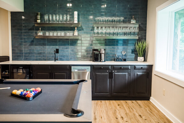
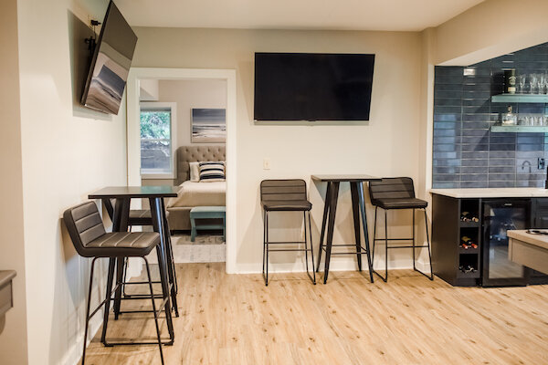

There are too many fixtures and finishes to list out (although I have noted some in the captions) but I will add that all the tile all is from Floor & Decor and the beautiful pool and shuffleboard tables are from West Penn Billiards in Pittsburgh. Finally, let me give a big shout out to my clients, Alpa & Dave, Tim Reed and his team at BILT Construction, UPS and FedEx for all the deliveries, and the namesake of the home, Arya, who kept every Zoom consultation interesting and personally re-set every stone on the front face of the island (as she’ll tell you)!
If you’re intrigued by this project, want to know more about a fixture or finish or are contemplating a renovation and/or redecoration of your own, reach out! And if you want to escape to this beautiful home…
Amber Harris is the owner of At Home DC, an interior decorator and a licensed real estate agent with Keller Williams Capital Properties working with clients in DC, Maryland and Virginia.
Project Spotlight: Renovating for Renters
One way many smart investors build incremental wealth is by becoming a landlord. Whether investing outright or converting a former primary residence to a rental, it’s important to strike the right balance in your finishes so that the home or unit appeals to as many potential renters as possible, while also remembering that the property is (or now is) an investment. While you may love luxury lighting fixtures or bold colors, you should instead focus on solid choices that will stand up to tenants for years to come but not break the bank.
Recently, after working with my client’s daughter and her husband, I had the opportunity to help her freshen up this Cathedral Heights co-op, which had been rented by the same tenant for many years and was ready for a facelift. The renovation increases the rate the unit can draw on the market and will ensure its appeal for the future (especially in a market where buyers and tenants are hyper-focused on “new”).
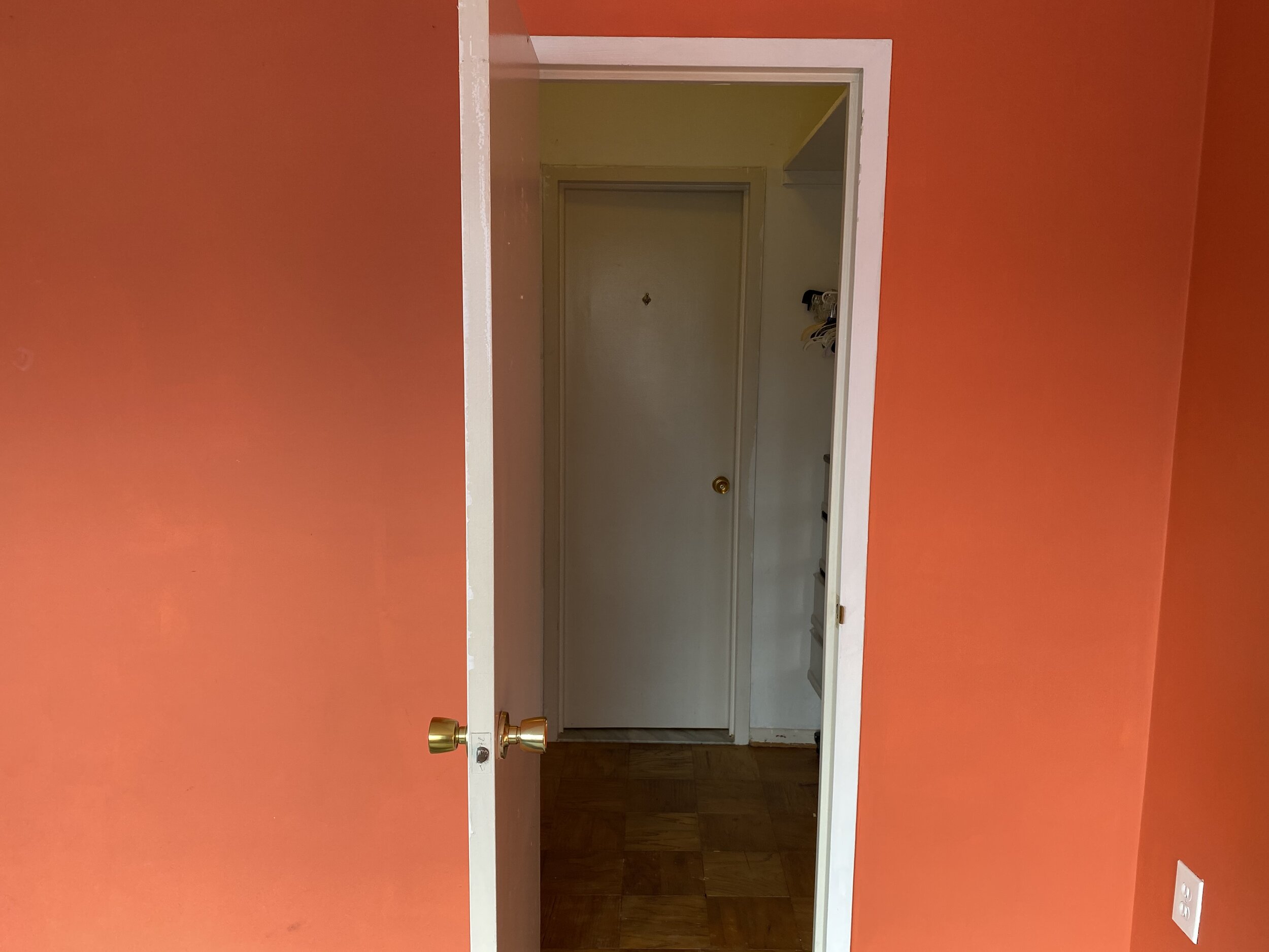
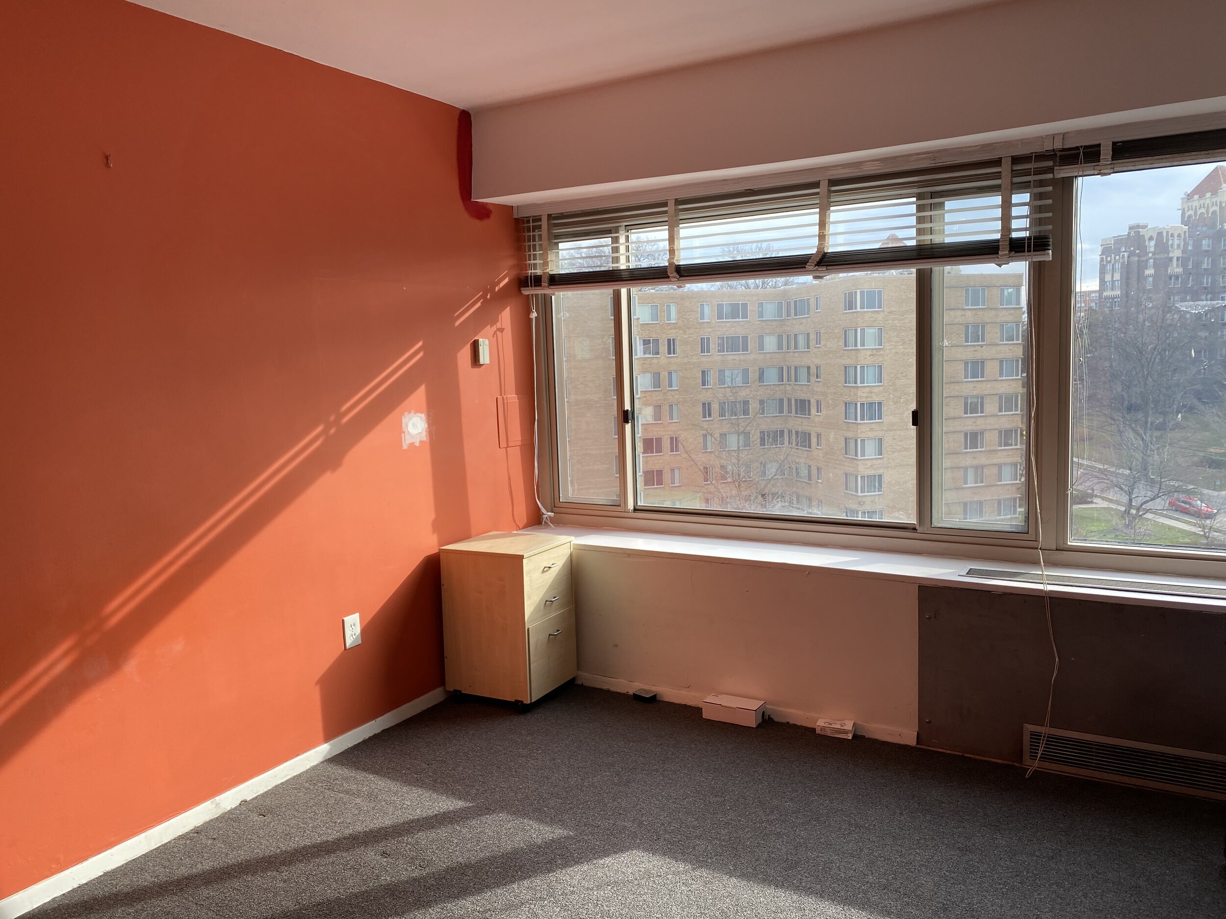
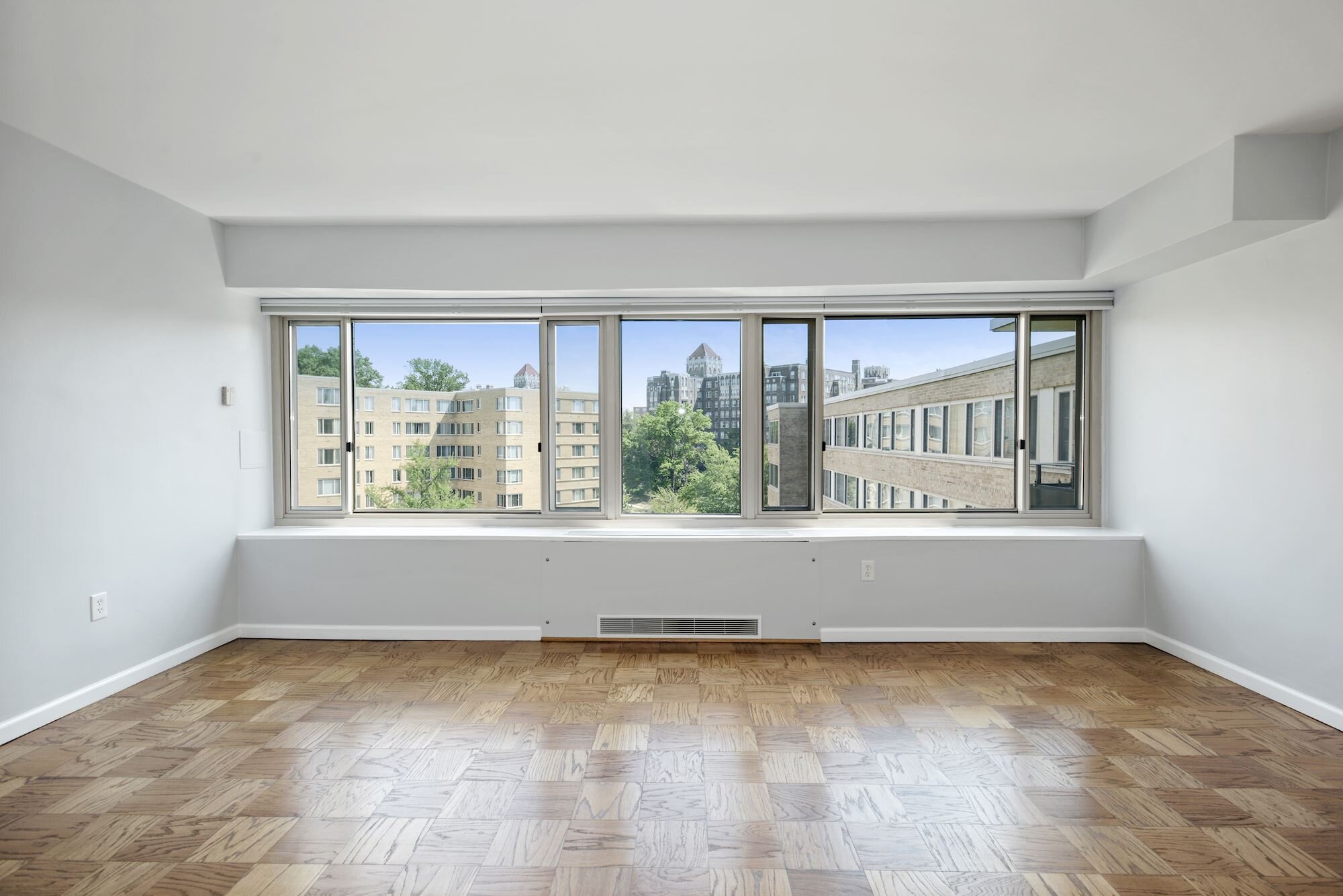
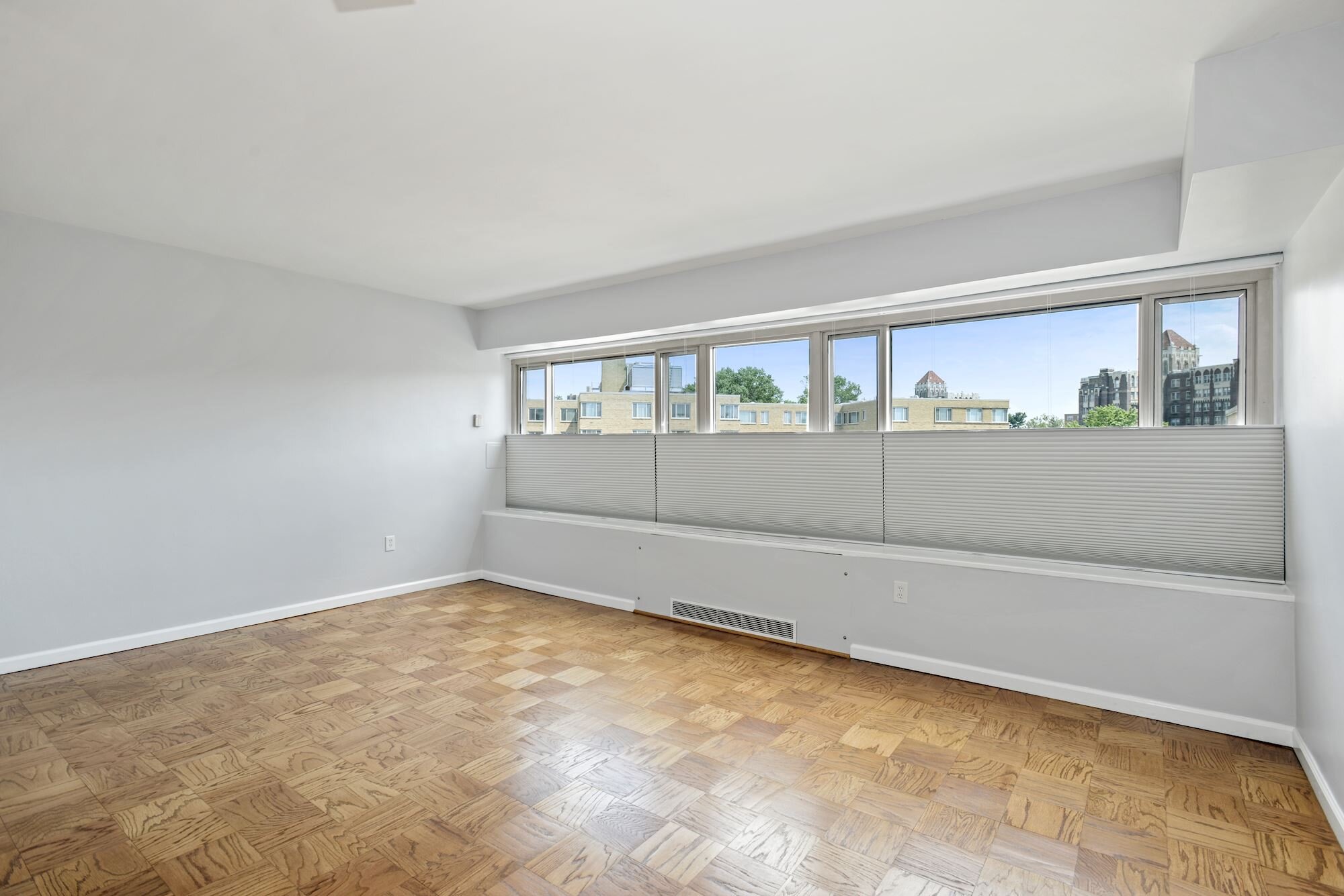
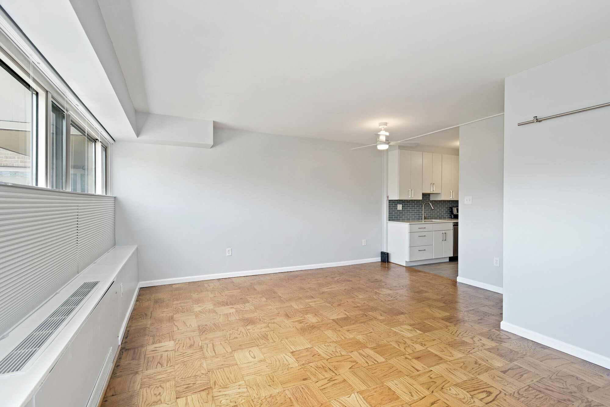
With approximately 500 square feet, the studio is in a 1960s northwest DC co-op building and had original features throughout — from brown Quaker Maid kitchen cabinets and an integrated toothbrush/cup holder to original parquet floors (under carpet). Most of our work focused on updating finishes, but we also made some additions and subtractions to enhance functionality, of note:
Adding a dishwasher to the kitchen (a modern must), as well as an an above-range microwave (freeing up counter space)
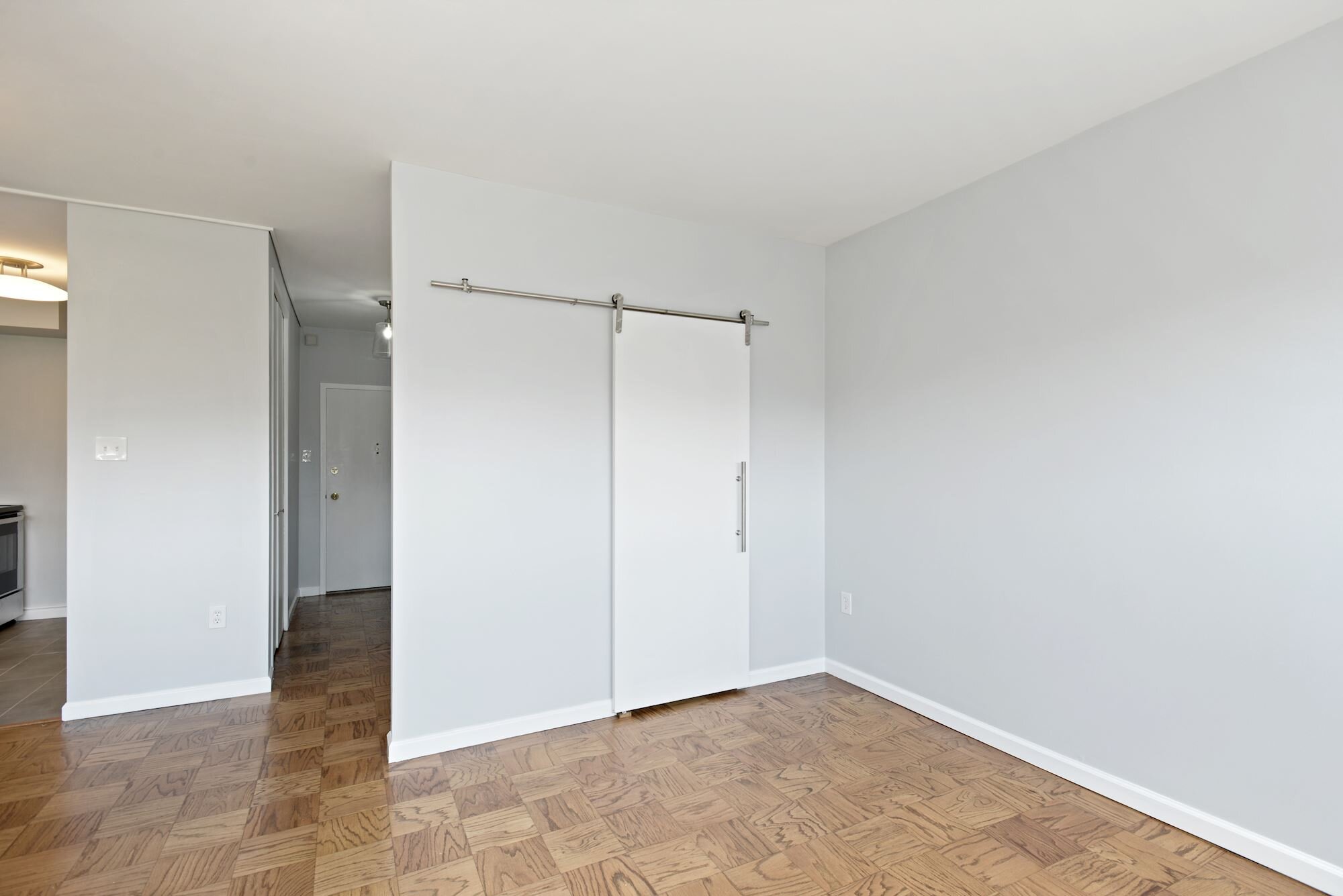
Removing a door from the closet to the bathroom to create one entrance vs. two, while converting that door to a sliding door — enhancing usable spaces in the walk-in closet and living area
Adding top down-bottom up blackout shades to ensure the dual-use living/sleeping space could function for both while not losing the top-floor views
Removing sliding glass doors on the shower for a cleaner, more open (and easy to clean) look
Take a look at the slideshow below for “after” pics (and scroll down further for info on the affordable finishes we selected). This unit also is currently for rent, so reach out if you’d like to know more!

Get the Look
Overall/Living Area
Minwax Stain in Early American (Lowes)
Olympus White Paint (Sherwin-Williams)
48" Latimore 3-Blade Standard Ceiling Fan with Remote & Light Kit in Matte White (Wayfair)
Nightfall Grand Cell Top Down, Bottom-Up Shades in Glacier (3 Day Blinds)
Kitchen
HomeCrest Cabinets in Ranier Maple with Alpine Opaque Finish (Cabinet Discounters)
Amerock Riva 6-5/16 Center-to-Center in Satin Nickel (Wayfair)
Emerstone Quartz Cararra River (Architecture Stones)
Spa 2” x 6” Glass Mosaic (Floor & Decor)
21” x 18” x 10” Standart PRO Undermount Stainless Steel Single Bowl Kitchen Sink (Wayfair)
Friho Brushed Nickel Pull Down Single Handle Kitchen Faucet (Wayfair)
12” x 24” Adessi Resin Gray Contemporary Porcelain Tile (Floor & Decor)
Ara 20” One-Light Semi Flush Mount by Kichler Lighting (Capitol Lighting)
Bathroom
Stardew Paint (Sherwin-Williams)
8x8 Moda Del MarCalisto Matte Porcelain Tile (Floor & Decor)
4x16 Metro White Polished II Ceramic Tile (Floor & Decor)
17” x 27” Kensington Recessed Medicine Cabinet in Satin Nickel Finish (Pottery Barn)
Sussex Double Tube Sconce in Satin Nickel Finish (Pottery Barn)
Moen Align 1.2 GPM Single Hole Bathroom Faucet with Pop-Up Drain Assembly in Brushed Nickel (Wayfair)
Moen Align Tub and Shower Faucet in Brushed Nickel (Wayfair)
Moen Align Bath Accessories (Moen)
Amber Harris is the owner of At Home DC, an interior decorator and a licensed real estate agent with Keller Williams Capital Properties working with clients in DC, Maryland and Virginia.
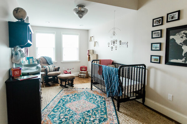
Project Spotlight: Setting the Scene for a Life of Adventure
While I have heard some speculate that we may see a baby boom in the next nine months thanks to household quarantines (if so, a joyful outcome after these challenging times), I wanted to take some time to look back at a nursery I had the privilege of helping neighbors and friends Alpa & Dave complete as they awaited the arrival of their precious daughter.

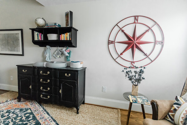
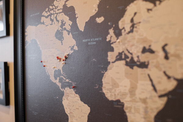
As a multicultural family and travel aficionados, our conversations quickly turned to a travel-inspired theme but not in the sense of airplanes, cars and boats or a kid-like interpretation of it. Instead the final design captured all the excitement of exploring the world and cultures in a more bohemian and fluid form. By mixing textures and textiles and using a neutral background and pieces paired with pops of color, the resulting space is warm and welcoming but hardly cookie cutter…and it has room to evolve as Alpa & Dave’s daughter grows up and they travel together as a family.
Check out the slideshow below for a peak into this space (and some ideas you can pull from the project…if you need them now or in nine months)!
To learn more about some of the pieces you see featured, check out “Get the Look” below…and thanks, as always to the talented Beth Caldwell for capturing this special space!
Get the Look
DaVinci Jenny Lind 3-in-1 Convertible Crib in Ebony (Amazon)
Huron Glider and Ottoman Set in Espresso & Beige (Dutailier)
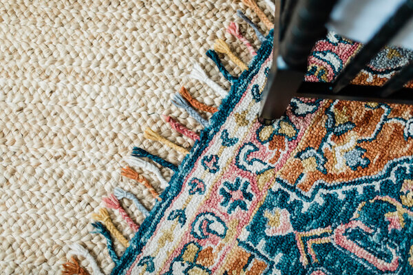
Alex Fringe Area Rug (Grandin Road)
Canvas Earth Toned World Travel Map (Push Pin Travel Maps)
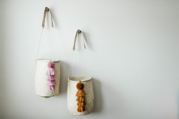
Hanging Baskets and Tassels (Xinh & Co.)
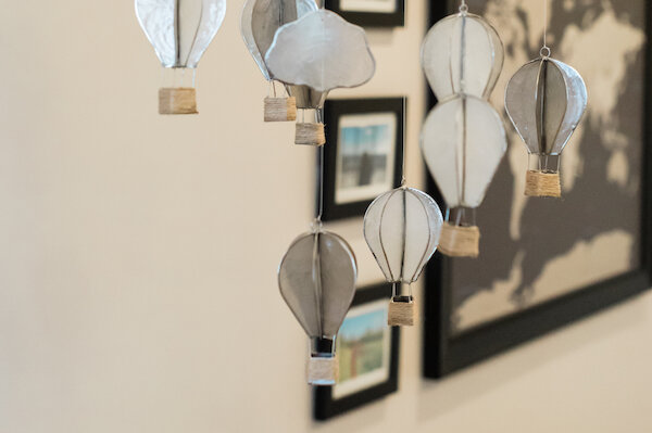
Capiz Hot Air Balloon Mobile (Pottery Barn Kids)
Punched Metal Flushmount (Pottery Barn Teen)
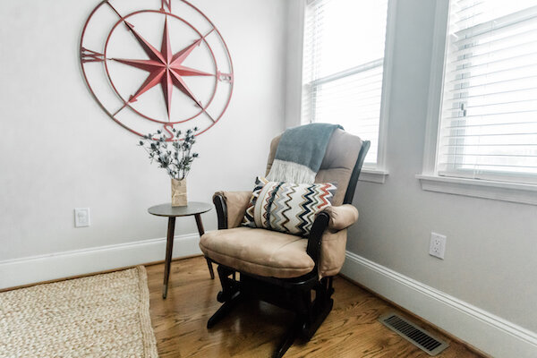
Round Metal Compass Wall Decor in Red (Wayfair)
Paint Color: Natural Linen (Sherwin-Williams)
No Longer Available
Vintage Dresser/Changing Table (Miss Pixie’s)
Shelf Unit (Wayfair)
Greene Hand-Woven Natural Area Rug (Wayfair)
Baby Blankets (Sari Bari)
Diamanta Throw in Indigo (The Citizenry)
Zigzag Velvet Lumbar Pillow (World Market)
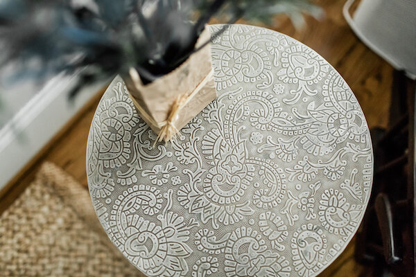
Embossed Azaria Round Accent Table (World Market)
Amber Harris is the owner of At Home DC, an interior decorator and a licensed real estate agent with Keller Williams Capital Properties working with clients in DC, Maryland and Virginia.
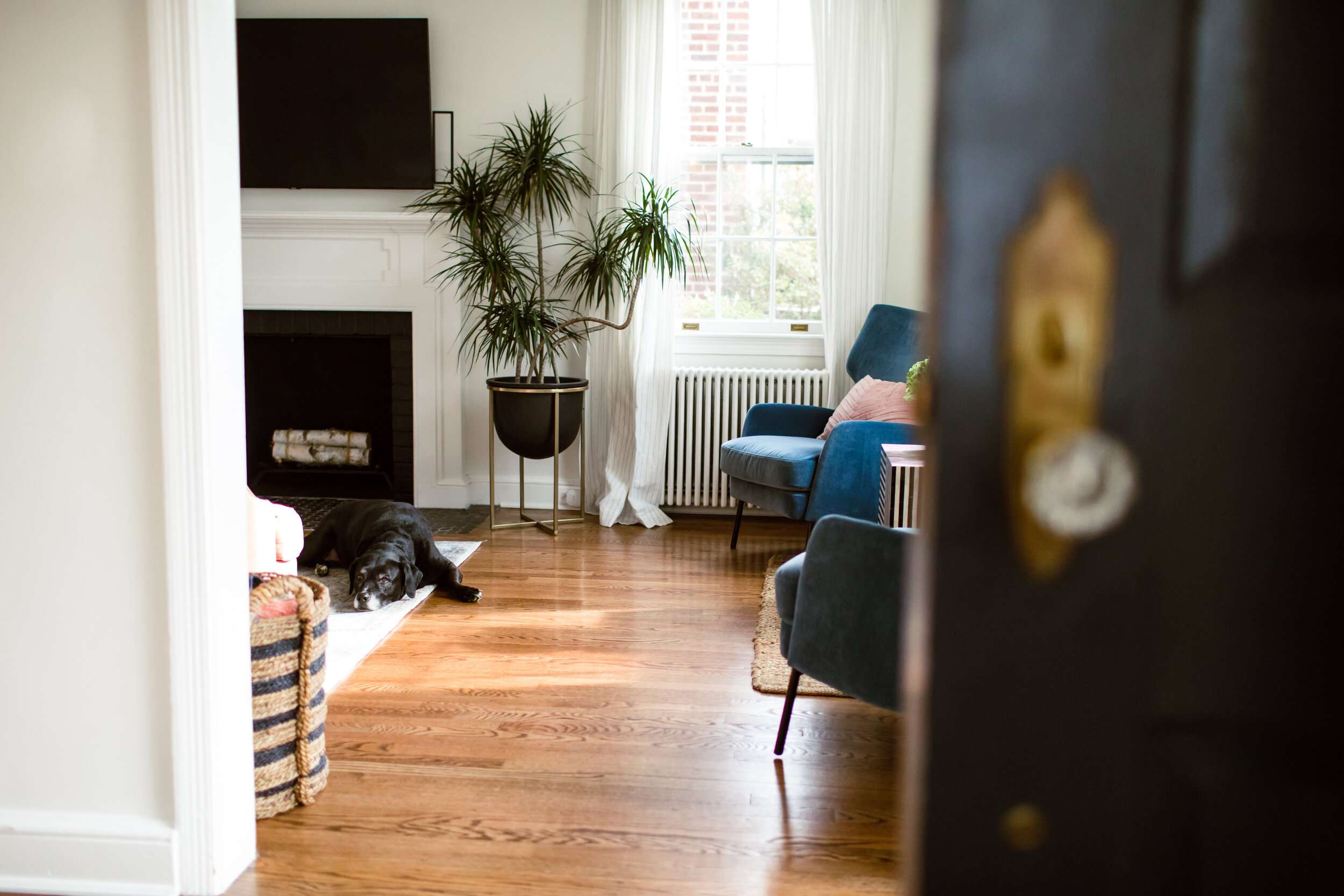
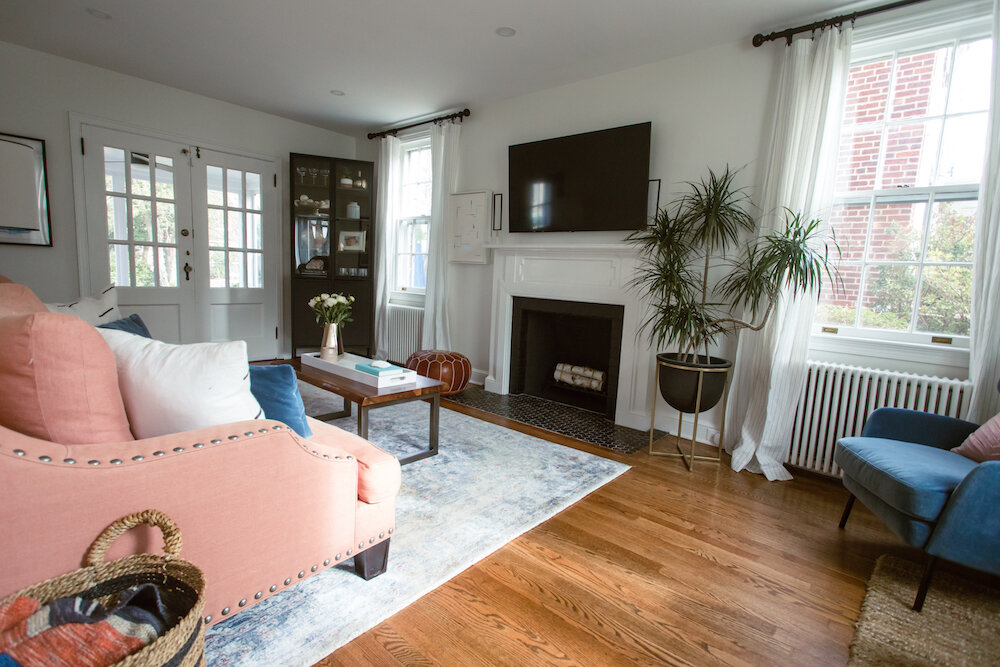
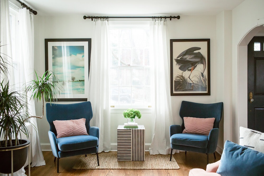
Project Spotlight: New Home, Fresh & Fun Look
One of the best compliments is when past clients connect me with future clients and last year I was lucky to have the opportunity to partner with Audrey & David to help make their new home in American University Park (built in 1937, mind you) the perfect “at home” for their young family of five (plus one furry friend).

Whimsical Windom
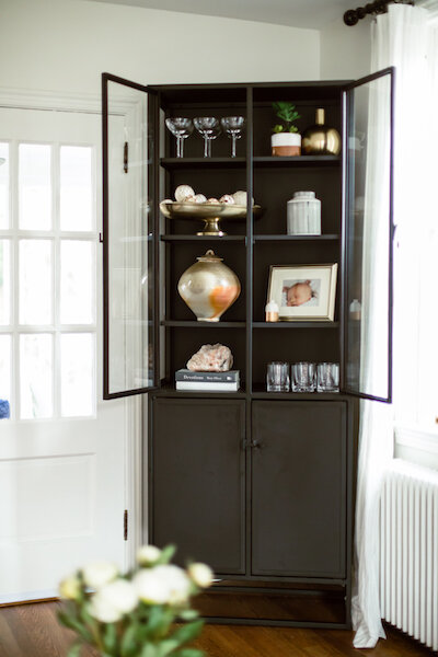
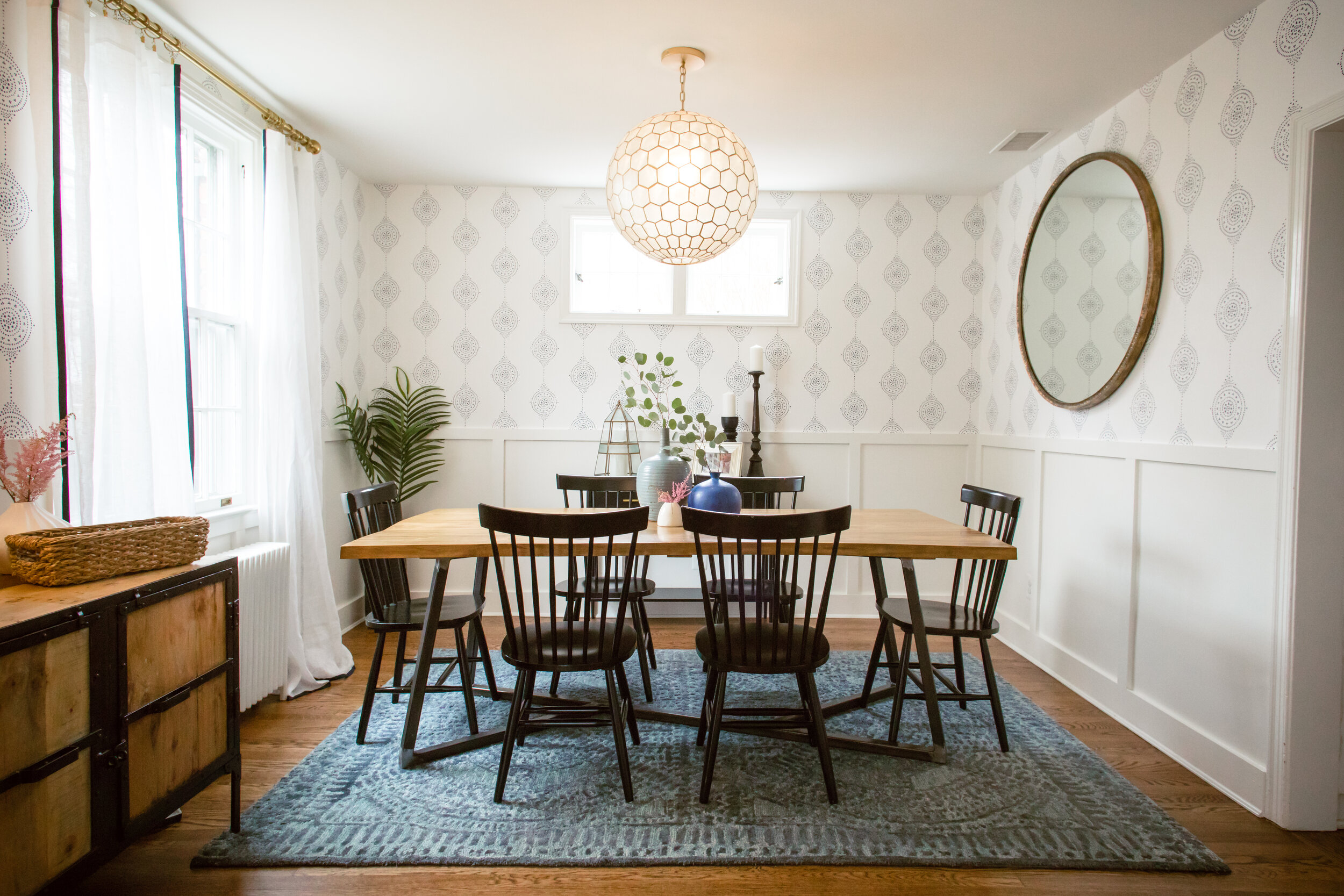
While my clients already had a few projects in mind for their main level living areas (such as refinishing the hardwood floors, painting and adding recessed lighting), we made a few additions — including installing a modern wainscoting to the dining room topped with a fun wallpaper and making the front door pop on the inside in a beautiful deep blue. However, we spent most of our time focusing on fixtures and finishes that would be updated, family friendly and stylish and complement this DC colonial.
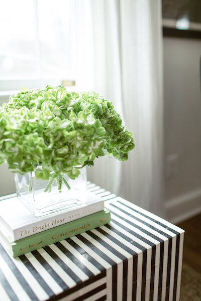
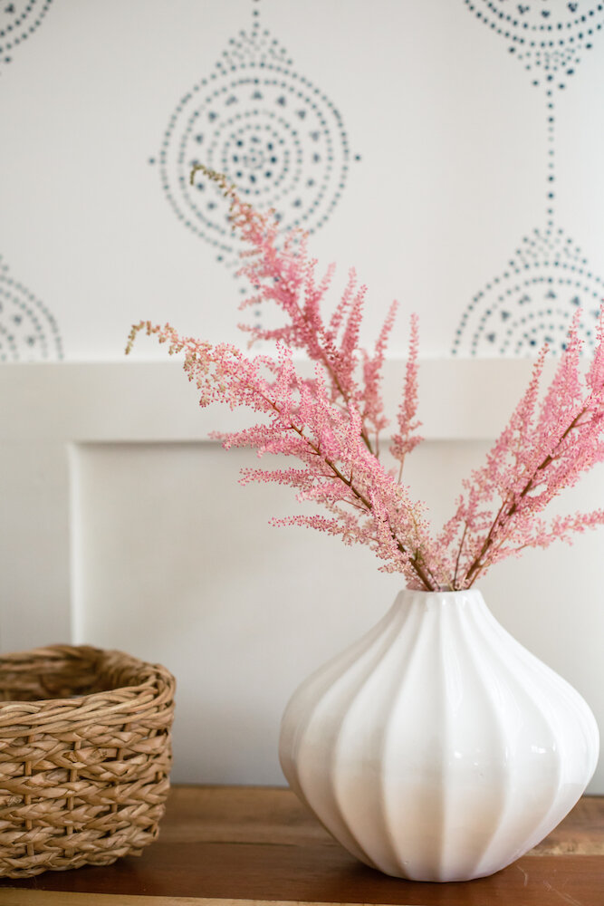
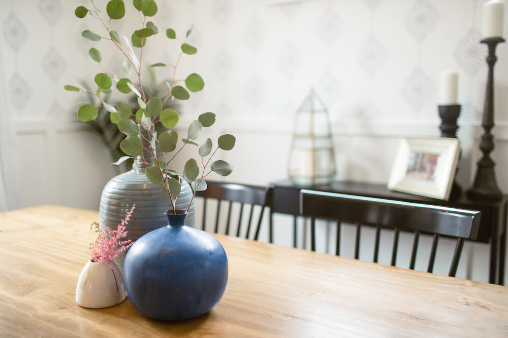
Working with pieces that would be moving to their new home, including a well-loved sofa and beautiful dining room table, the ultimate goal was an eclectic but timeless space where modern touches could play with rustic and bohemian accents. For our palette we focused on blending tones of blue and blush while adding structure with black and white accents (which you’ll see in curtain hardware, that amazing inlay accent table and even subtle pinstriping in the curtains) and warmth with gold tones.


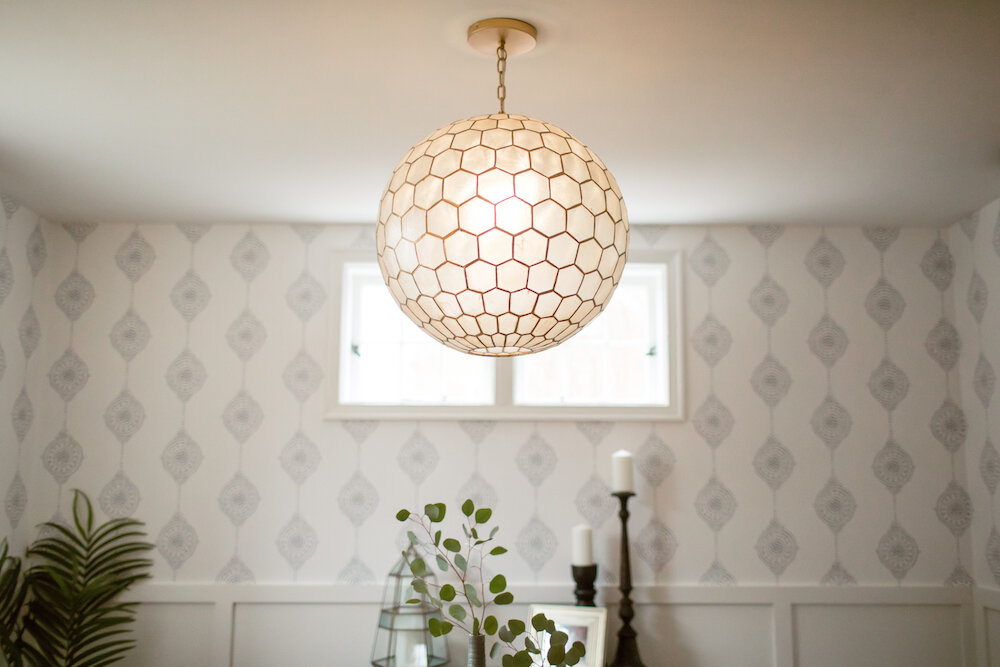
We also played with shapes, and you’ll see a theme of hexagons throughout, balanced with round accents (from side tables and mirrors to finials) and organic edges in pieces like the coffee table. And, while not an open concept space, we wanted spaces to talk to each other but each have have own feel. Above you’ll see before and after shots of the living and dining rooms, and you can scroll down for a slide show with more details. And, while we shopped for decorative accents to complete the spaces, I love how we were able to include pieces of art from the family’s collection to complete the look.

To wrap things up, let me give a shout out to Beth Caldwell for the beautiful photography…and you can find out more about the pieces and finishes below!
Get the Look
Living Room
Alex Navy Blue Accent Chairs (Crate & Barrel)
Heather Chenille Jute Rug (Pottery Barn)
Drapery Rods, Finials & Rings (Ballard Designs)
Joanna Gaines Isabel Rug (Anthropologie)
Casement Black Tall Cabinet (Crate & Barrel)
Laquer Wood Tray (West Elm)
Eden Cross Base Standing Planter (West Elm)
Moroccan Leather Pouf (West Elm)
Marble Round Nesting Side Tables (West Elm)
West Elm + Rejuvenation Cylinder Floor Lamp (West Elm)
Assorted Accessories: HomeGoods & Target
Sofa & Art: Client’s Own
Dining Room
Capiz Honeycomb Chandelier (Serena & Lily)
Luna Stripe Wallpaper (Serena & Lily)
Maze Rug (West Elm)
Markel Mirror (Ballard Designs)
Metalwork Console (West Elm)
Drapery Rods, Finials & Rings (Ballard Designs)
Linen Sheer Trim Curtain in White/Navy (Pottery Barn)
Spin Floor Vase (CB2)
Linen Textured Ceramic Lamp (Target)
Assorted Accessories: HomeGoods & Target
Dining Room Table, Chairs & Cabinet: Client’s Own
Entryway
Cedar & Moss 3-Arm Semi-Flush Chandelier (Rejuvenation)
Amber Harris is the owner of At Home DC, an interior decorator and a licensed real estate agent with Keller Williams Capital Properties working with clients in DC, Maryland and Virginia.
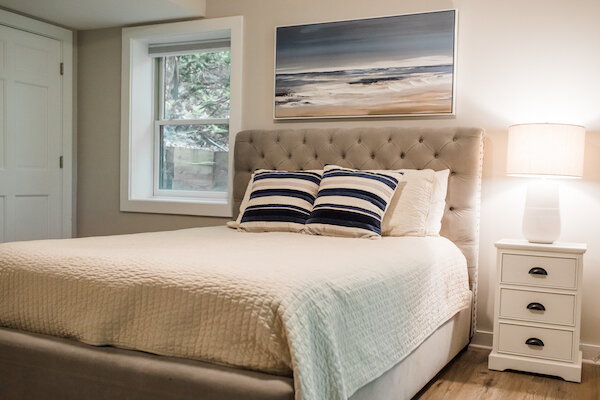
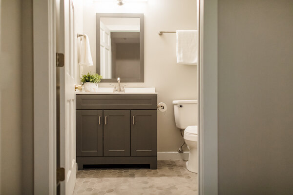
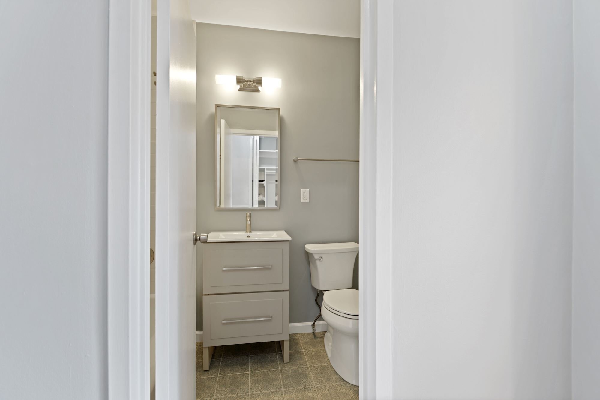
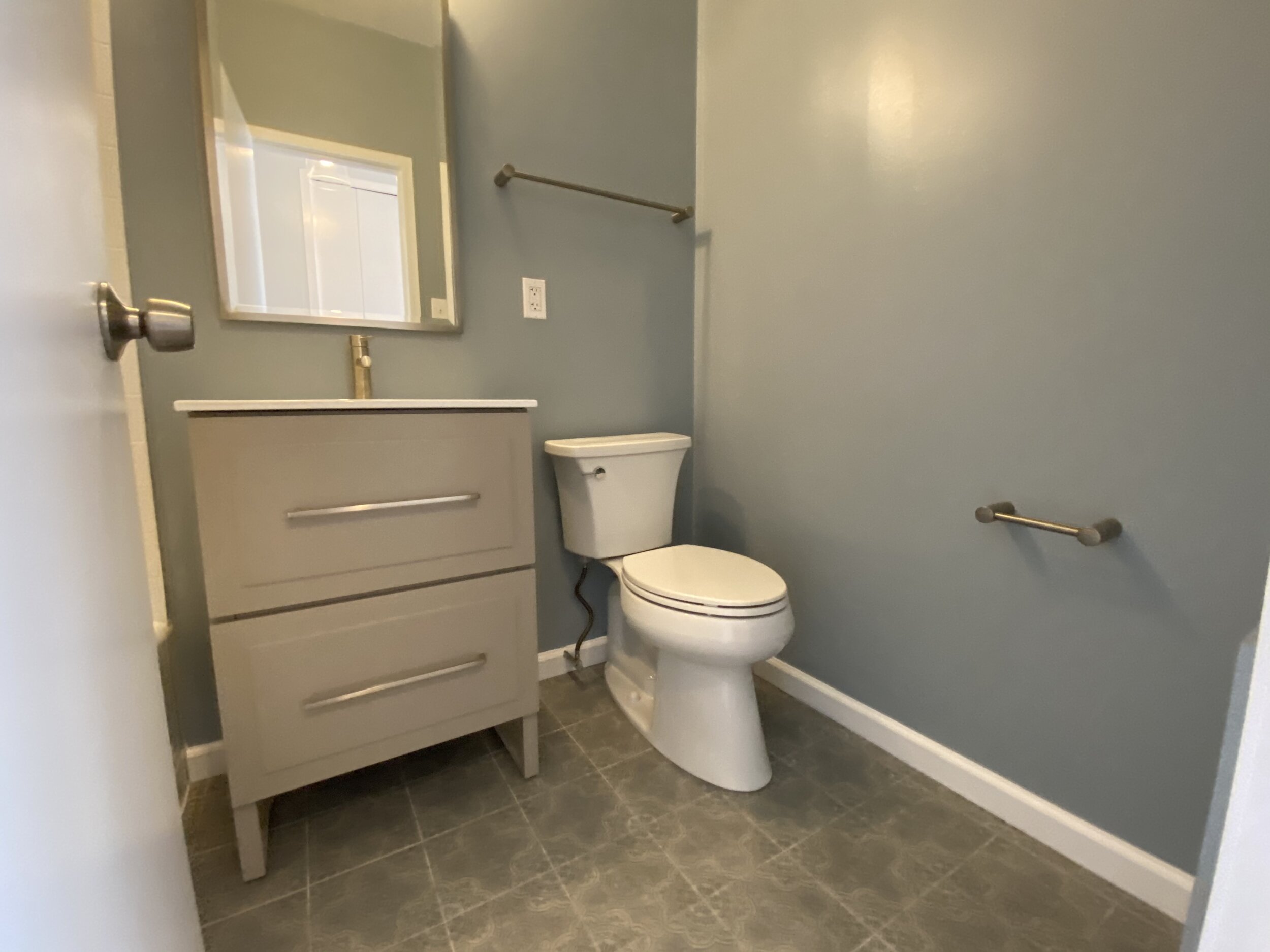
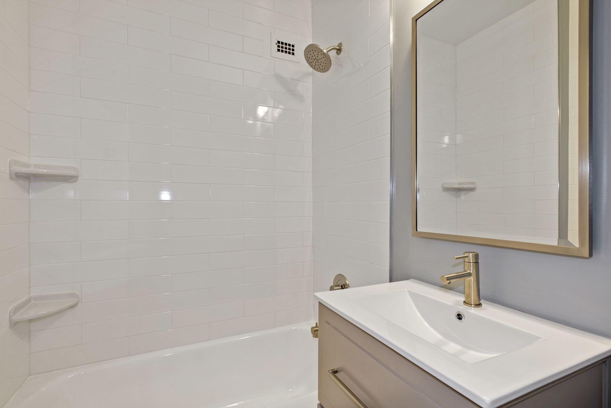
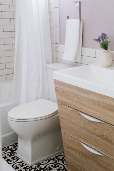
Project Spotlight: Elevating a Basement Bathroom

Ready for Guests…and the Homeowners (Photo Credit: Beth Caldwell)
According to a range of surveys and accompanying articles (I’ll leave you to Google these), we spend around an hour a day in the bathroom. That statistic would seem reason enough to make sure the bathrooms we own are as lovely as the other spaces in our homes. And, while choosing vanities and toilet paper holders may not be as sexy as a new sectional or chandelier, taking a little extra time to make smart selections can greatly enhance the feel and function of these spaces we enjoy (privately).
Recently, I had the chance to partner with Dave and Molly as they planned a renovation of their basement, including the second full bathroom in their charming Takoma Park home. With limited space (like other clients), they had already been brainstorming ideas to modify the small footprint when we teamed up to take things to the next level (working with general contractor Jose Serrano and architect Maria Wright) — including modifying the approximately 3’ square glass-enclosed shower stall to a larger open shower and pushing back a wall a few inches to add critical space and function.
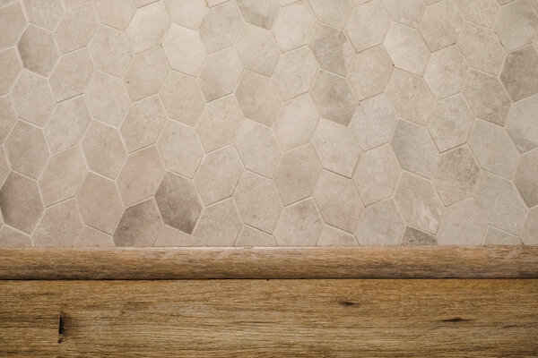
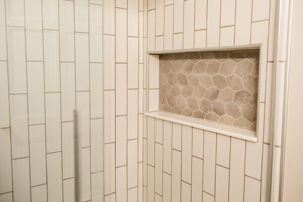
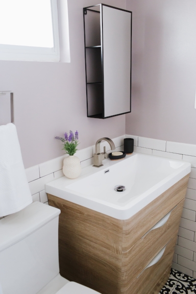
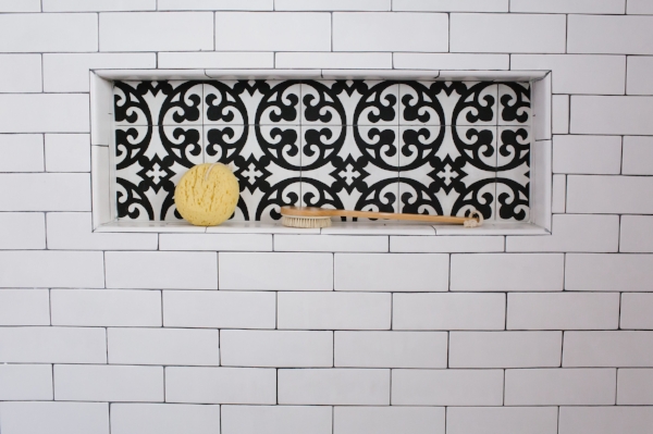
Tile selection was central to the finished product and, as I’ve said before, it’s worth it to splurge on something unique in small bathrooms (as the incremental cost won’t be much but the impact will be substantial). We started with a special tile I had seen on a previous trip to Architectural Ceramics, the Hexagon Deco Chronicle in Paper Bianco. The tile print is of pages of paper layered on top of each other, and you can actually make out Italian text on some of those pages (che meraviglia!). To contrast the cooler tones in the tile and pick up on the variation and contrast within it, we went with warmer wood accents in the vanity and custom shelving (which was stained to match the vanity).

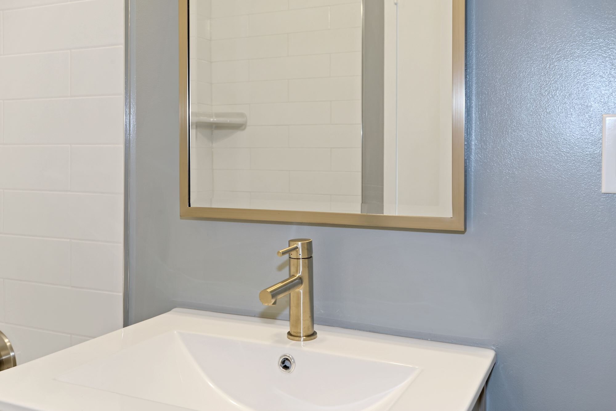
To complement the floor tile, I chose a Kiln & Penny subway tile with a matte white finish paired with the Estonia mosaic tile, which has more organic striations that go well withe the hex floor tile. Utilizing two different tones of gray grout, we minimized the contrast between tiles on both floor surfaces, while adding it to the shower and bathroom walls. To round out the palette, I wanted to keep things neutral to maintain the focus on the floor tile and wood accents by using Conservative Gray from Sherwin Williams for the walls.
While matte black finishes would have made a nice complement, my clients loved adding a modern touch with polished chrome accents in the medicine cabinet/mirror, vanity sconce, fixtures and hardware. We mixed pieces from Restoration Hardware, Pottery Barn, Schoolhouse and Kohler by aligning the finishes and designs featuring curved elements (contrasting the geometric tile). In the end, we created a space that is welcoming to guests but that, word has it, has become the favored bathroom for my clients (the best compliment).
So, what nuggets can you take away from this project if you are looking to embark on your own bathroom reno? Here are a few:
Build on a finish or feature you absolutely love and that makes the space feel special. In this case, we started with the floor tile and went from there.
Plan and pay attention to details. With such an intricate tile, we had to ensure it was laid meticulously — from the direction of the tiles to how they met the shower edge (check out the photo above with the split hex tiles). We also ensured the vanity drawers would clear the door trim easily by modifying how the tile was laid by the vanity.
Don’t be afraid to mix and match. From three different tile shapes and types to lighting, hardware and accessories from different vendors, the best finished spaces don’t look like you pulled them out of a page of a catalog.
Finally, thank you to Beth Caldwell for capturing this stunning “after”…and stay tuned for more project spotlights soon!
Finishes Guide
Hexagon Deco Chronicle Tile in Paper Bianco (Architectural Ceramics)
3x12 Kiln & Penny Gesso Natural Field Tile (Architectural Ceramics)
Vintage Recessed Medicine Cabinet in Polished Chrome (Pottery Barn)
Royale Adjustable Sconce in Polished Chrome (Restoration Hardware)
Maxwell Bathroom Accessories in Polished Chrome (Schoolhouse)
Amber Harris is the owner of At Home DC, an interior decorator and a licensed real estate agent with Keller Williams Capital Properties working with clients in DC, Maryland and Virginia.
Project Spotlight: Small But Unboring Bathrooms
While we've previously covered a small bathroom makeover on this blog, today's post expands on it by digging into ways to inject personality into private spaces that are best known for function over form.
Earlier this year, I worked with my clients in Rockville to help them add new life to two of the bathrooms in their lovely home. While it would be easy to go with a standard 3x6 subway tile surround and standard pre-fab vanity, these homeowners were open to ideas and finishes that would add style to these smaller spaces. (You can see one of the before and afters below.)

While each homeowner and space is unique, I want to challenge you (whether you are working with a designer/decorator or not) to take these tips to heart before you start your own bathroom project:
1. Find At Least One Feature/Finish to Splurge On: As with any room, you want to have a focal point or feature that draws the eye initially and that is complemented by the rest of the design. In small bathrooms, one easy way to do this is through floor and accent tile. In both of these bathrooms, we chose conversation-worthy tiles — a black and white cement tile for the hall bathroom (LiLi's Marrakesh 1 from Architectural Ceramics in Chevy Chase) and a blue-toned marble chevron tile from TileDaily for the master bathroom.

LiLi's Marrakesh 1 Tile in Bathroom Niche (Also Used on Floor)
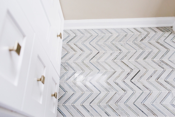
Chevron Mix Blue Marble Mosaic Tile from TileDaily
2. Make Small Changes That Feel Custom: You may not have the budget for custom cabinetry but consider swapping the hardware or adding a custom countertop to a pre-built unit. In the master bathroom, we swapped out the silver hardware for a square-shaped brushed gold finishes to match the other hardware and paired it with a quartz top (Emerstone Quartz Carrara White from Architectural Stones in Rockville) that matched the in-shower bench added during the renovation. Other ways to add a custom feel without spending too much include using tiles in different shapes (we used 3x9 in the hall bathroom and 3x12 in the master bathroom) or with a contrasting grout (as we did in the hall bath to complement the cement tile floor).

Strasser Woodenworks Vanity (from Wayfair) with Updated Hardware
Custom Quartz Countertop Added to Pre-Fab Vanity
3. Include Contrasting Elements to Add Interest: As in other spaces in the home, don't hesitate to play with tone and texture to add personality. In the hall bathroom, we paired a more modern natural wood vanity with the starker black and white tile work. My client chose to go with brushed silver hardware but another option is to add matte black/iron finishes to tie together the modern vanity and the vintage-feeling tile. Contrast can also come in the form of color, like the Behr Vintage Mauve paint in the aforementioned bathroom or the blue towels in the master bath (bringing out the blue tones in the chevron tile and contrasting with the Behr Sandstorm paint).

LiLi Cement Tile from Architectural Ceramics Contrasts with Fresca Milano Vanity (from Wayfair)
Behr Vintage Mauve Contrasts with 3x9 Goose Down Matte Tile from Sonoma Tilemakers via Architectural Ceramics
Many thanks to Beth Caldwell of Beth Caldwell Photography for capturing the "afters" above. I hope these tips will help you as you think about future projects and how to be anything but boring but stick to a budget. Happy remodeling!
Finishes Guide
Hall Bathroom
- LiLi Marrakesh 1 8” x 8” Ceramic Tile
- Sonoma Tilemakers 3x9 Stellar Tile in Goose Down Matte
- Fresca Milano 31.5" Single Sink Modern Bathroom Vanity Set in White Oak
- Umbra Cubiko Mirror & Storage Unit
- Pottery Barn Mercer Double Horizontal Sconce
- Delta Vero Single Handle Centerset Bathroom Faucet in Stainless
- Delta Ashlyn Monitor 17 Series Shower and Tub Combo in Stainless
- Delta Vero Bathroom Accessories in Stainless
Master Bathroom
- TileDaily Chevron Mix Blue Marble Mosaic Tile
- Walker Zanger 3x12 Knit Brick Tile in Cotton
- Landmark Ceramics Attitude Mosaic A Tile in Simply Grey
- Strasser Woodenworks Simplicity Vanity in White
- Emerstone Quartz in Carrara White
- Hickory Hardware Skylight Cabinet Knob in Elusive Golden Nickel
- Mirror (Borrowed from Hall Bathroom Vanity Set)
- Rejuvenation West Slope LED Sconce in Aged Brass
- Delta Vero Fixtures and Bathroom Accessories in Champagne Bronze
Amber Harris is the owner of At Home DC, an interior decorator and a licensed real estate agent with Keller Williams Capital Properties working with clients in DC, Maryland and Virginia.
Project Spotlight: Focusing on Function & Family in Southeast DC
While interior design is thought to primarily be concerned with aesthetics, some of the biggest transformations when working with a designer or decorator are measured by the function of the space for the person(s) that call it home.
That is exactly the case with the family I had the pleasure of working with in southeast DC recently. While they loved their DC rowhome, with two rambunctious kids, the space (and more importantly the furniture) they had did not match their style or need for flexibility. At the heart of this challenge was a beautiful, traditional six-seat dining room table that rarely was used partially for fear of it falling prey to adorable but potentially destructive young hands. This piece was creating a physical and emotional block that was preventing the space from meeting their needs.
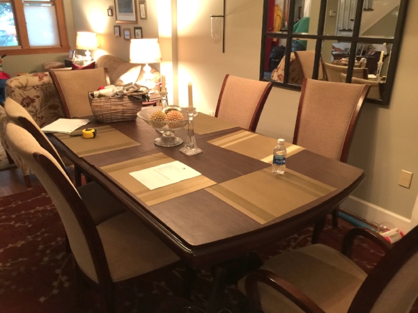
Other challenges that came up through our consultation included:
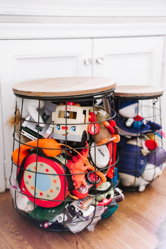
- Frantic feel when you entered the house and a need for organization;
- Limited space for kids to play (especially important with all the rainy days we've had lately);
- Multiple dining spaces but none of which met all their needs; and
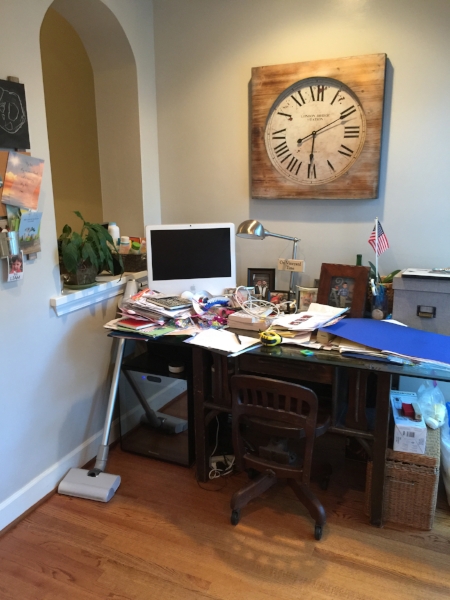
- Untapped space in the kitchen that housed a mostly unused desk turned drop area.
To tackle these problems, we identified a few keys tasks and pieces that would transform the design and function of the home:
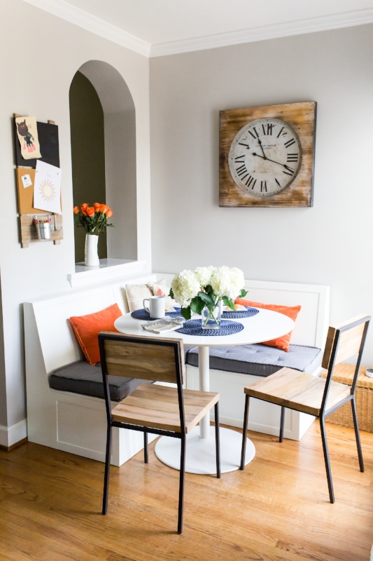
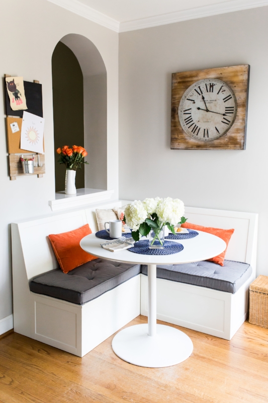
- Consolidate dining spaces from three to two, including adding a cost-effective dining nook and new, kid-friendly drop-leaf dining room table (allowing the dining room to become a larger playroom, when needed);
- Bring more modern lines and finishes to the space, playing into existing wrought iron elements and adding more casual/weathered wood elements;
- Modernize the color palette, while working with the existing wall color (Benjamin Moore's Spanish Olive);
- Incorporate flexible pieces that can work in multiple spaces and be moved easily, as well storage options (primarily for toys); and
- Add sophistication by juxtaposing patterns and textures.
And here's where we are now (photos by Beth Caldwell):
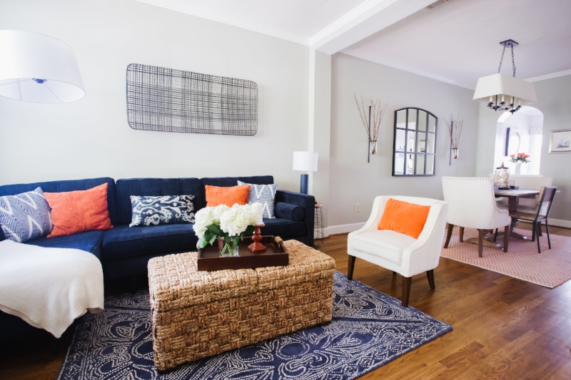
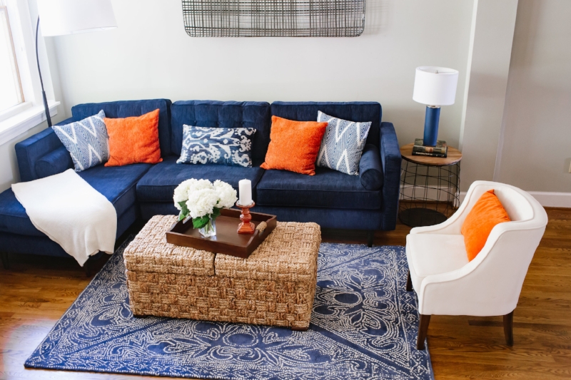
While there is still room for some more touches (new/updated upholstered cornices above the windows, removing baseboards in dining nook for a more custom look with the benches, adding a console in the dining room for extra serving space, etc.), the transformation has helped my clients enjoy their home even more...which is always priority number one from the outset.
Goods Guide
Living Room
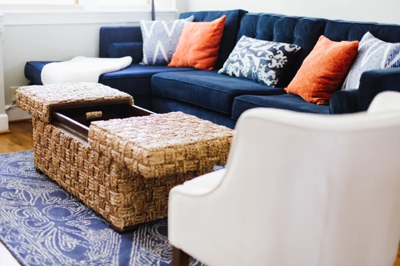
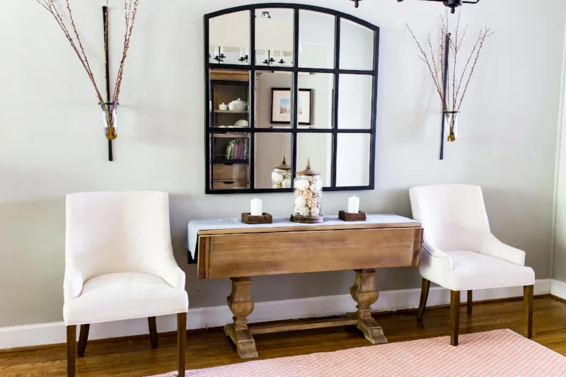
- Braxton Sectiona in Bentley Indigo with Mocha Legs (Joybird)
- 5’ x 7’ Mirabelle Rug in Indigo (Serena & Lily)
- Andros Sliding Trunk (Grandin Road)
- Molly Accent Chair in Stella Ivory (Grandin Road)
- Tobacco Basket Metal Wall Art (Crate & Barrel)
- Three-Piece Metal and Wood Basket Set (Wayfair)
- Modern Cylinder Ceramic Table Lamp in Navy Blue (Shades of Light)
- Loden Arc Floor Lamp (World Market)
- Oliver 100% Cotton Throw Pillow in Navy (Wayfair)
- Lindon Spice Throw Pillow (Pier 1)
- Lindon Spice Lumbar Pillow (Pier 1)
- Printed Indigo Throw Pillow (World Market) - No Longer Available
Dining Room
- Bradding Collection Drop Leaf Natural Stonewash Dining Table (Pier 1)
- 6' x 9' Safavieh Handmade Boston Flatweave Orange Cotton Rug (Overstock)
- Aimee Accent Chair in Stella Ivory (Grandin Road)
- Raw Mango Rustic Dining Chair (West Elm)
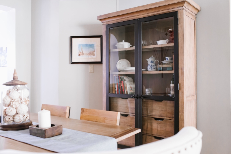
- Fort Oglethorpe Lighted China Cabinet (Birch Lane) - No Longer Available
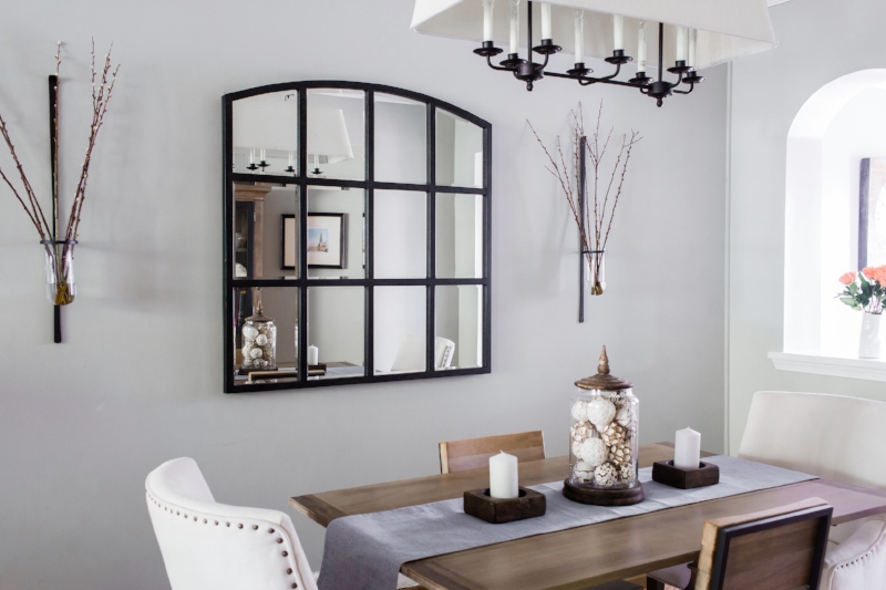
- Pre-Existing Wall Mirror, Sconces & Chandelier
Dining Nook
- Breton Banquette - Two 30" and One Corner (Ballard Designs)
- Odyssey White Dining Table (CB2)
- Raw Mango Rustic Dining Chair (West Elm)
- Embroidered Rue Pillow (Anthropologie)
- Lindon Spice Lumbar Pillow (Pier 1)
- Custom Banquette Cushions; Pre-Exising Wall Clock
Amber Harris is the owner of At Home DC, an interior decorator and a licensed real estate agent with Keller Williams Capital Properties working with clients in DC, Maryland and Virginia.