Even if we only spend a fraction of our day there, we place a premium on bathrooms. It's not uncommon for many of DC's row homes to lack a dedicated master bathroom but, often when they do have one, it's hardly a spacious five-piece en-suite.
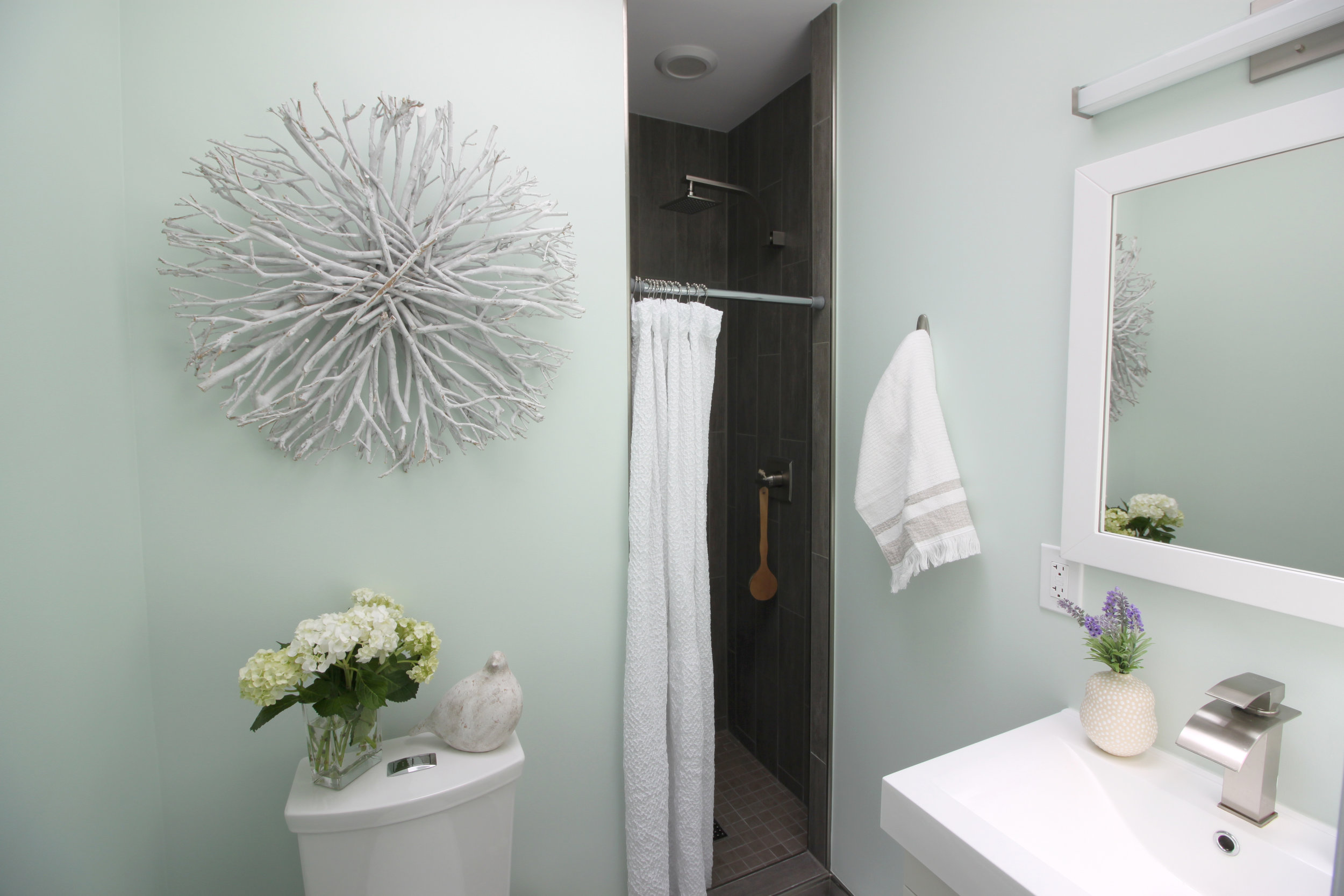
My clients recently had the chance to move to a larger home in the Brightwood Park neighborhood of Washington, DC, but their new-found master bath was dated and hardly a retreat (see below). While the small space meant there weren't any options for reconfiguring the layout (without undertaking a major renovation), we were able to radically change the feel of the space with new tile, new fixtures and combining some Scandinavian inspiration with natural elements.
Before...
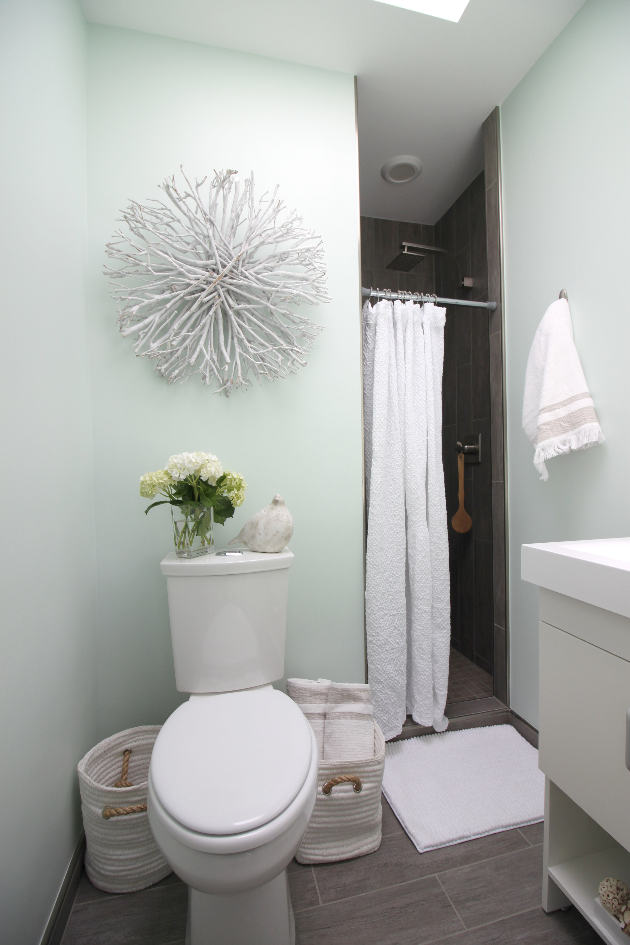
You can see the end result further down, but I wanted to share a few tips and tricks that helped us create this miniature master spa bath:
- Keep your color palette simple. Less is more in terms of color when creating a serene space, especially a bathroom. While white is the go-to for a spa-like feel, adding a contrasting but muted color (in this case a lighter shade of Sherwin-Williams Bonsai Tint, created by mixing in a little more white to tone it down) with a lighter wood tone (via our tile) takes this bathroom from basic to custom.
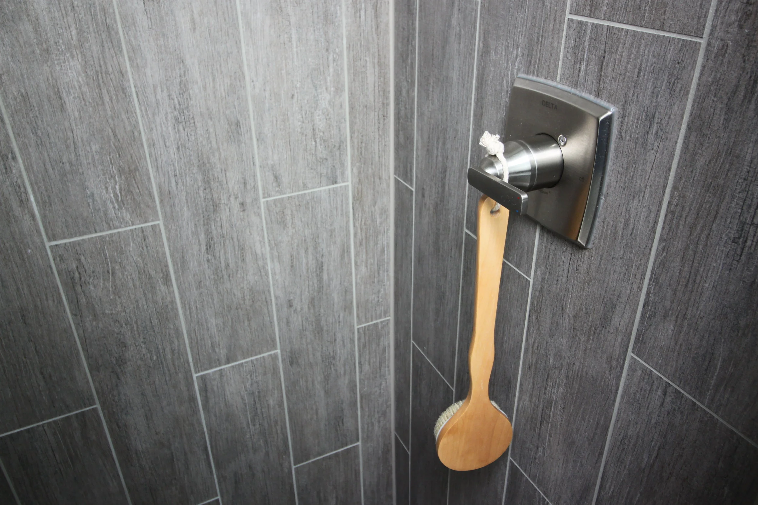
- Limit the type of tile (color, size and shape) to create a more spacious feel. For this bathroom, we used a 6" x 24" Driftwood tile (in Greywood) from Architectural Ceramics. Meant to simulate wood planks, the tile was laid vertically in the shower to make the tight stall feel larger and horizontally along the floor to make the space feel wider. We did use a smaller scale 2" square tile for the shower floor, but you also could up the spa-feel by opting for a pebble floor (check out Island Stone's awesome options).
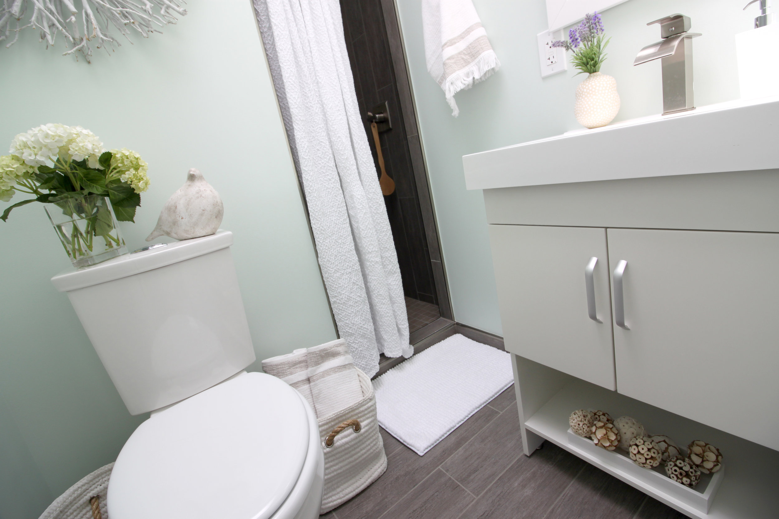
- Choose smart storage options. While less than 19" deep, the vanity selected features plenty of storage - concealed behind doors and using the open shelf at the bottom. While it may be tempting to add shelves above the toilet (as before), these would contribute to making the space feel smaller; alternatives, like a multipurpose baskets (as pictured below), allow you to store extra towels and toiletries in a stylish, mobile and contemporary way.
- Blend modern lines with organic materials and shapes. A clean-lined vanity and rectangular tiles could easily read cold but adding in natural textures, such as the twig-based wall art and the rope details on the waste basket and accompanying storage basket (all from HomeGoods), off sets the harder edges without going too country or rustic.

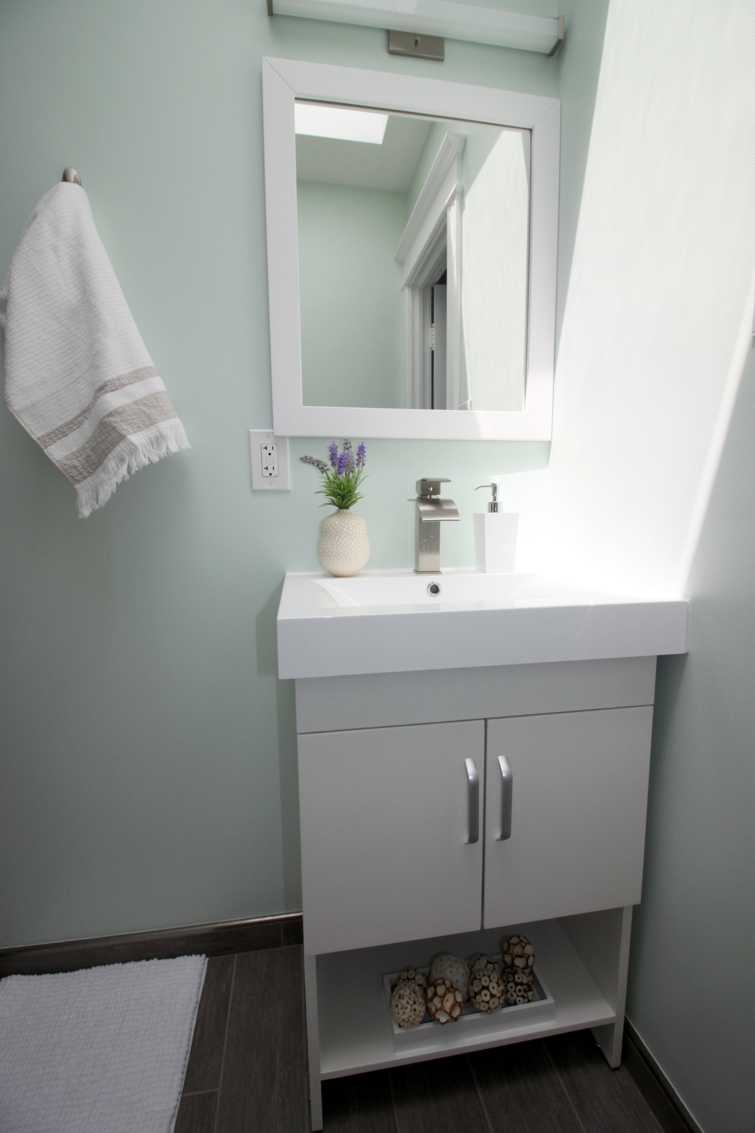
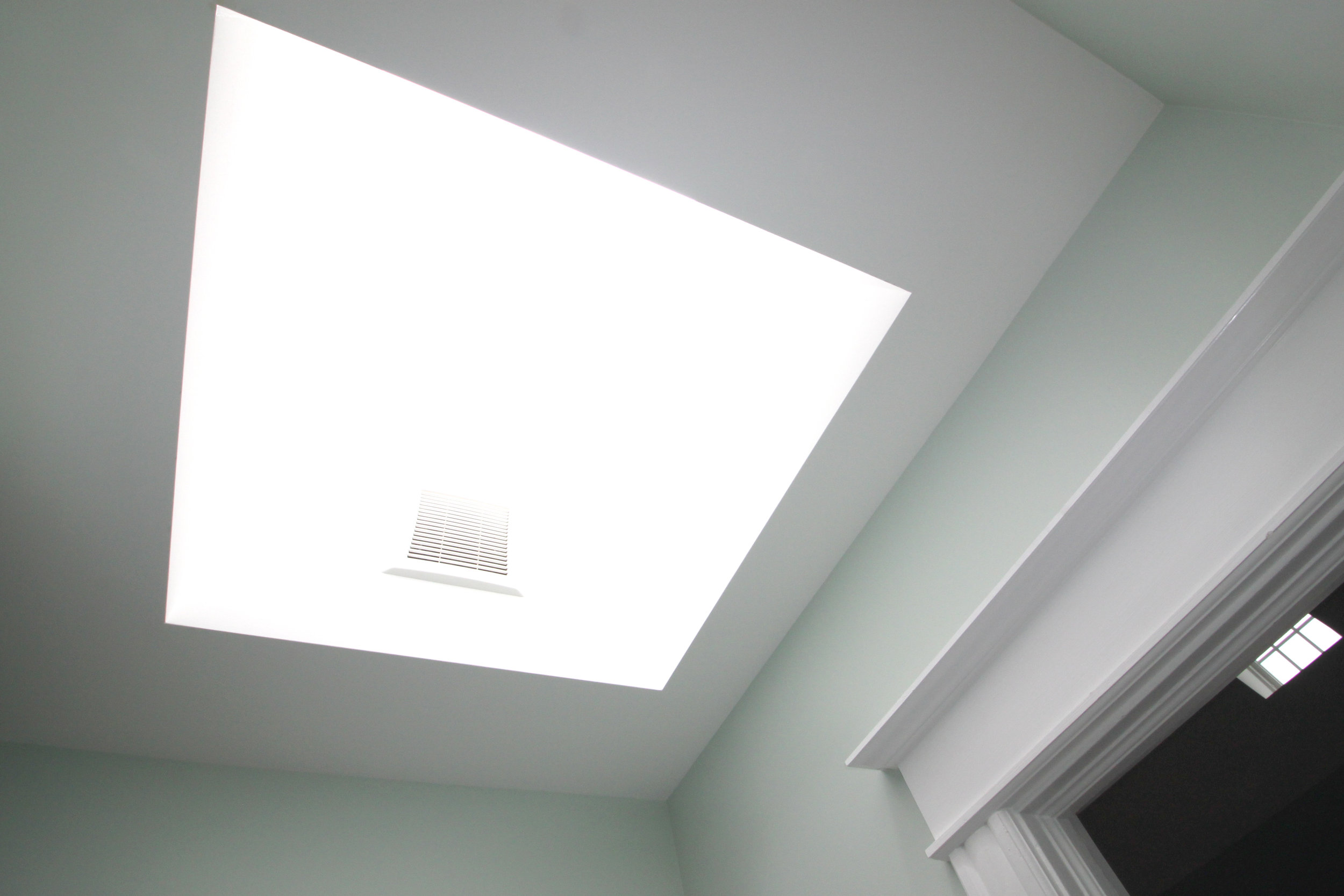
All in all, I just love the way we were able to create a personal spa in such limited space for these deserving clients.
Amber Harris is the owner of At Home DC, an interior decorator and a licensed real estate agent with Keller Williams Capital Properties working with clients in DC, Maryland and Virginia.

