One way many smart investors build incremental wealth is by becoming a landlord. Whether investing outright or converting a former primary residence to a rental, it’s important to strike the right balance in your finishes so that the home or unit appeals to as many potential renters as possible, while also remembering that the property is (or now is) an investment. While you may love luxury lighting fixtures or bold colors, you should instead focus on solid choices that will stand up to tenants for years to come but not break the bank.
Recently, after working with my client’s daughter and her husband, I had the opportunity to help her freshen up this Cathedral Heights co-op, which had been rented by the same tenant for many years and was ready for a facelift. The renovation increases the rate the unit can draw on the market and will ensure its appeal for the future (especially in a market where buyers and tenants are hyper-focused on “new”).
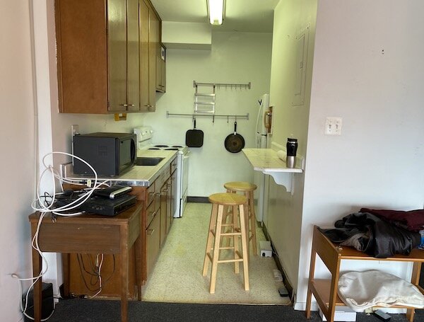
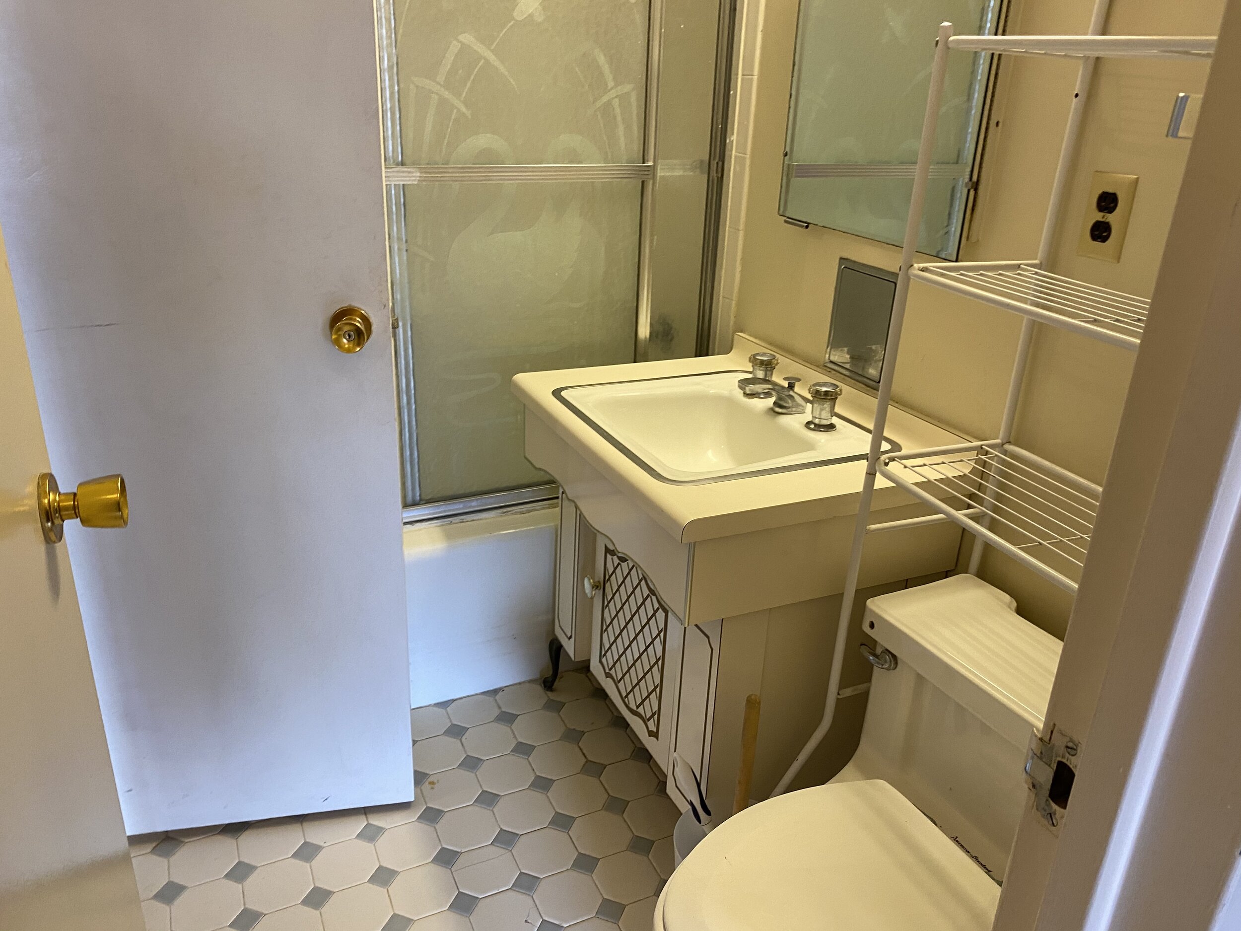
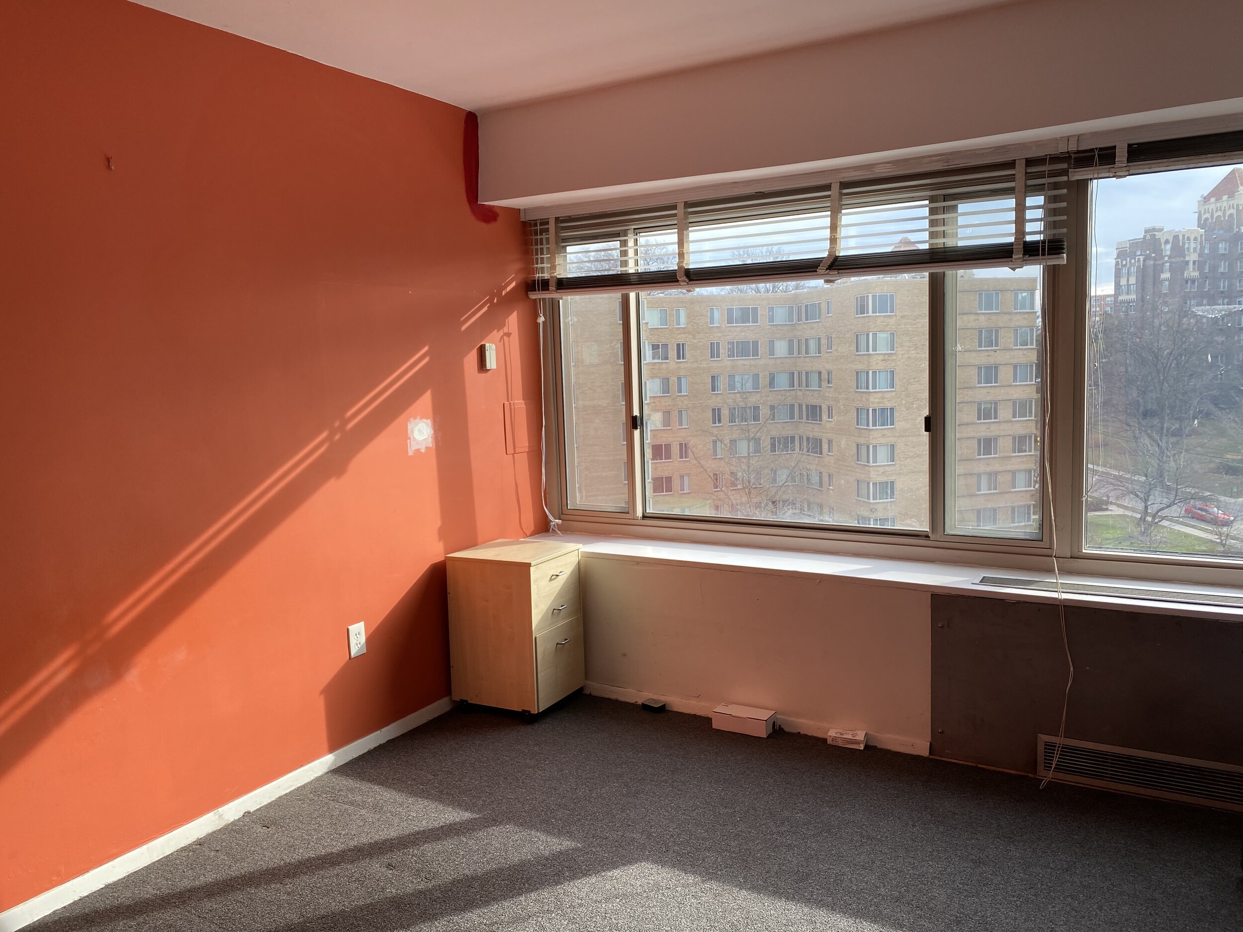
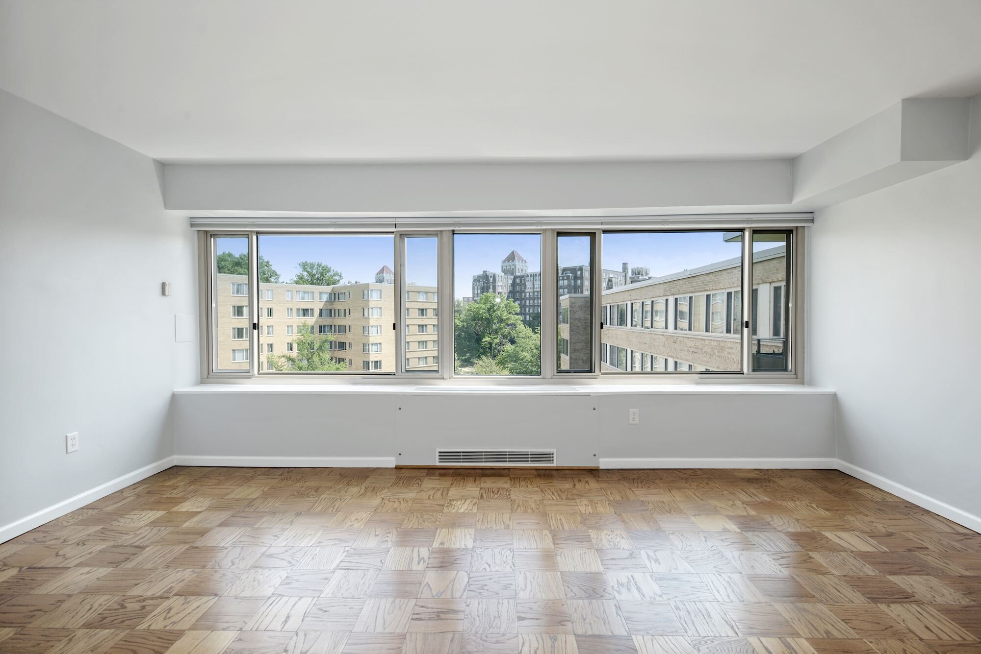
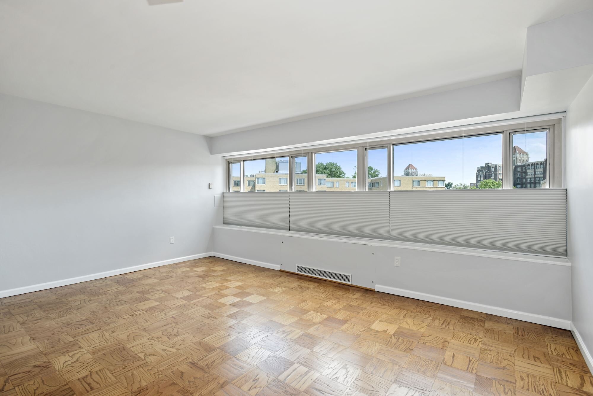
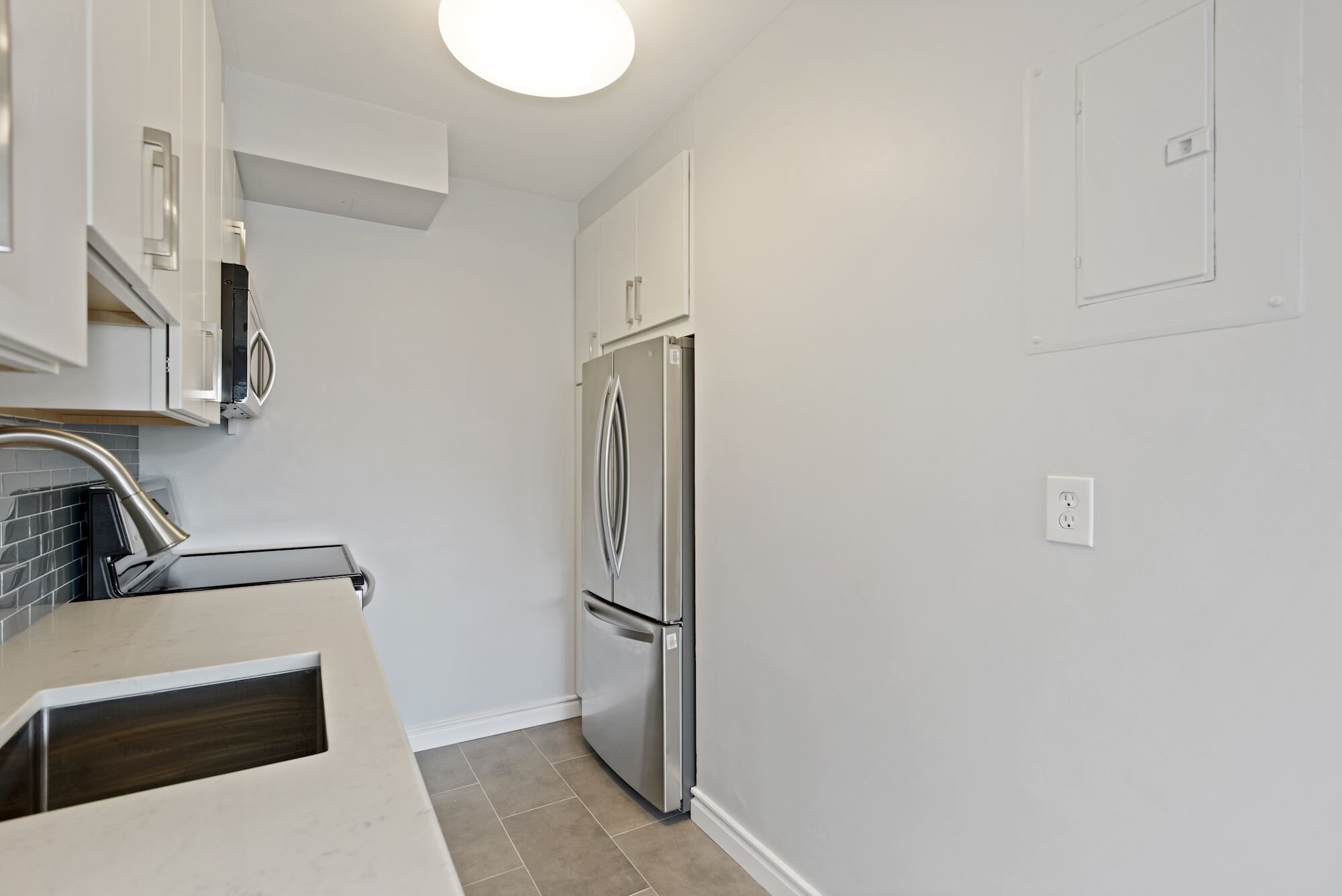
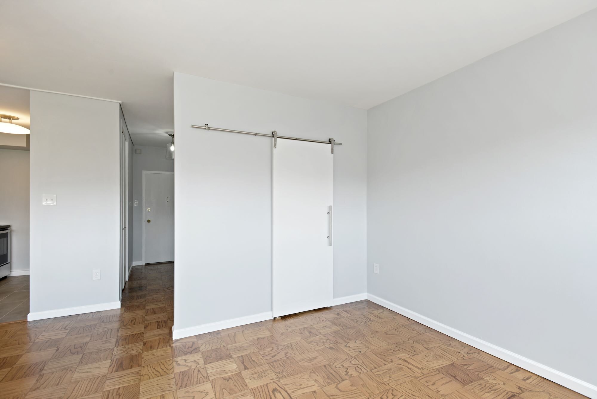
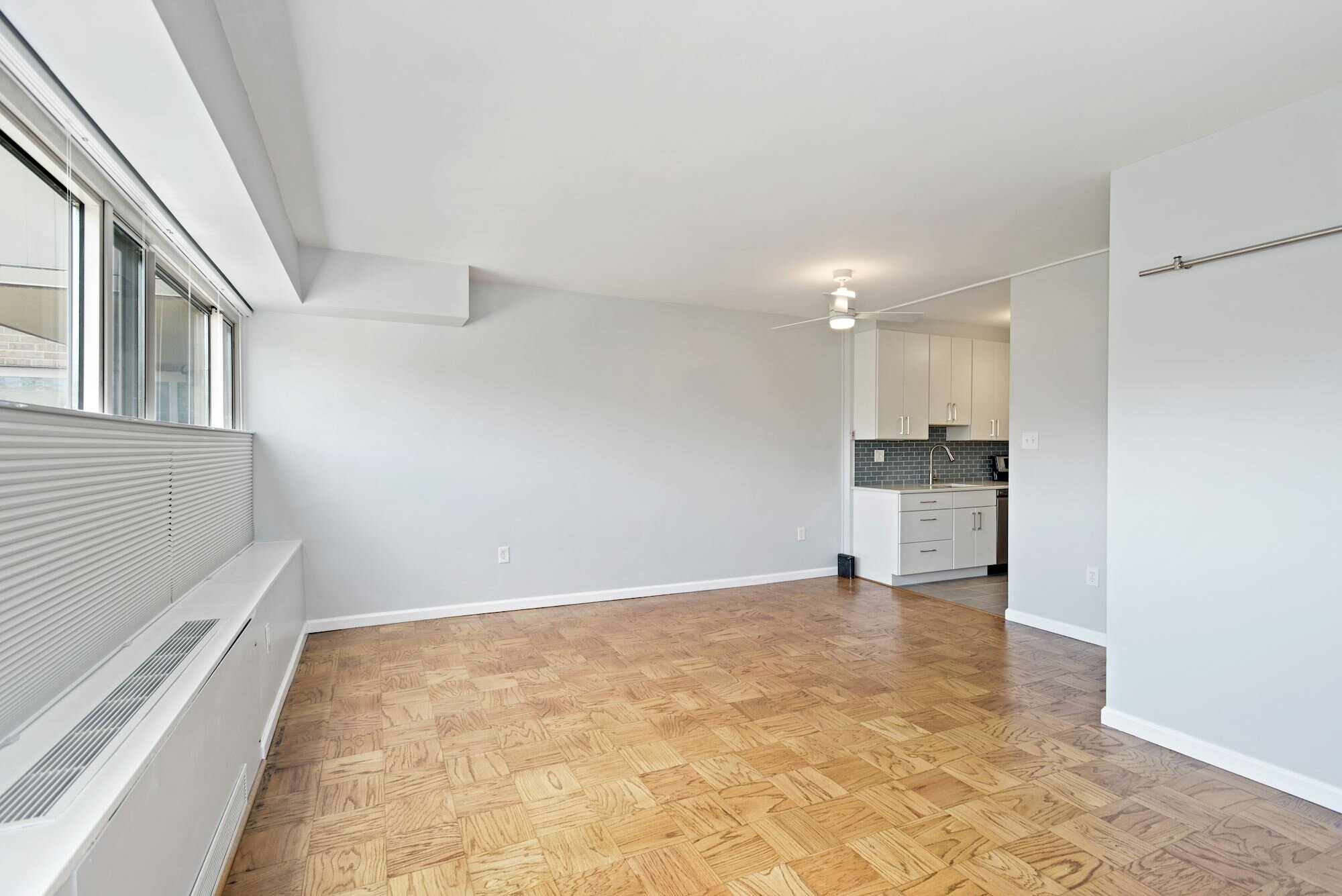
With approximately 500 square feet, the studio is in a 1960s northwest DC co-op building and had original features throughout — from brown Quaker Maid kitchen cabinets and an integrated toothbrush/cup holder to original parquet floors (under carpet). Most of our work focused on updating finishes, but we also made some additions and subtractions to enhance functionality, of note:
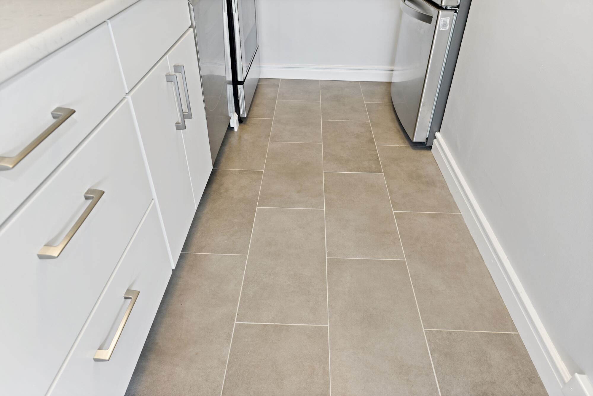
Adding a dishwasher to the kitchen (a modern must), as well as an an above-range microwave (freeing up counter space)
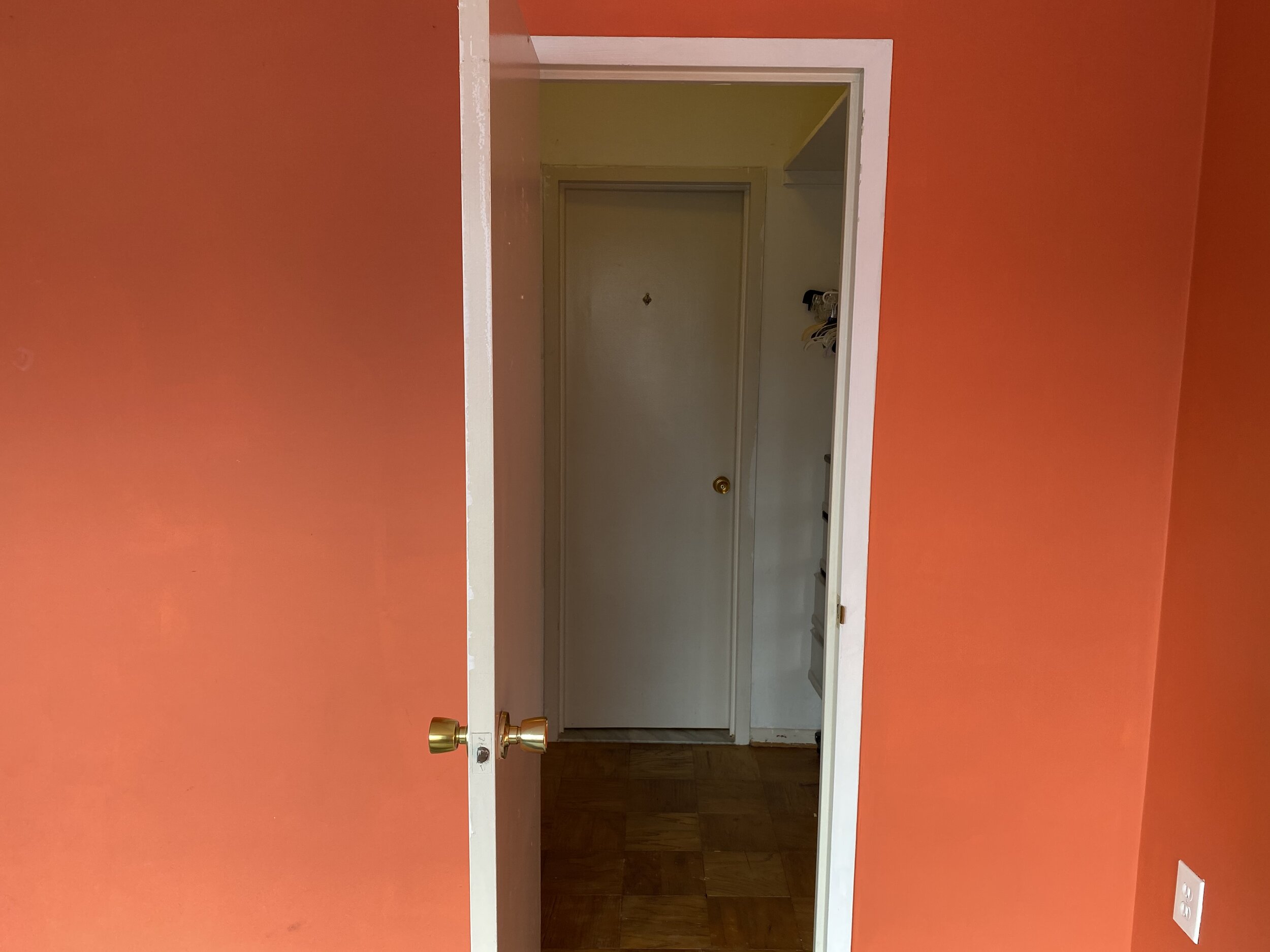
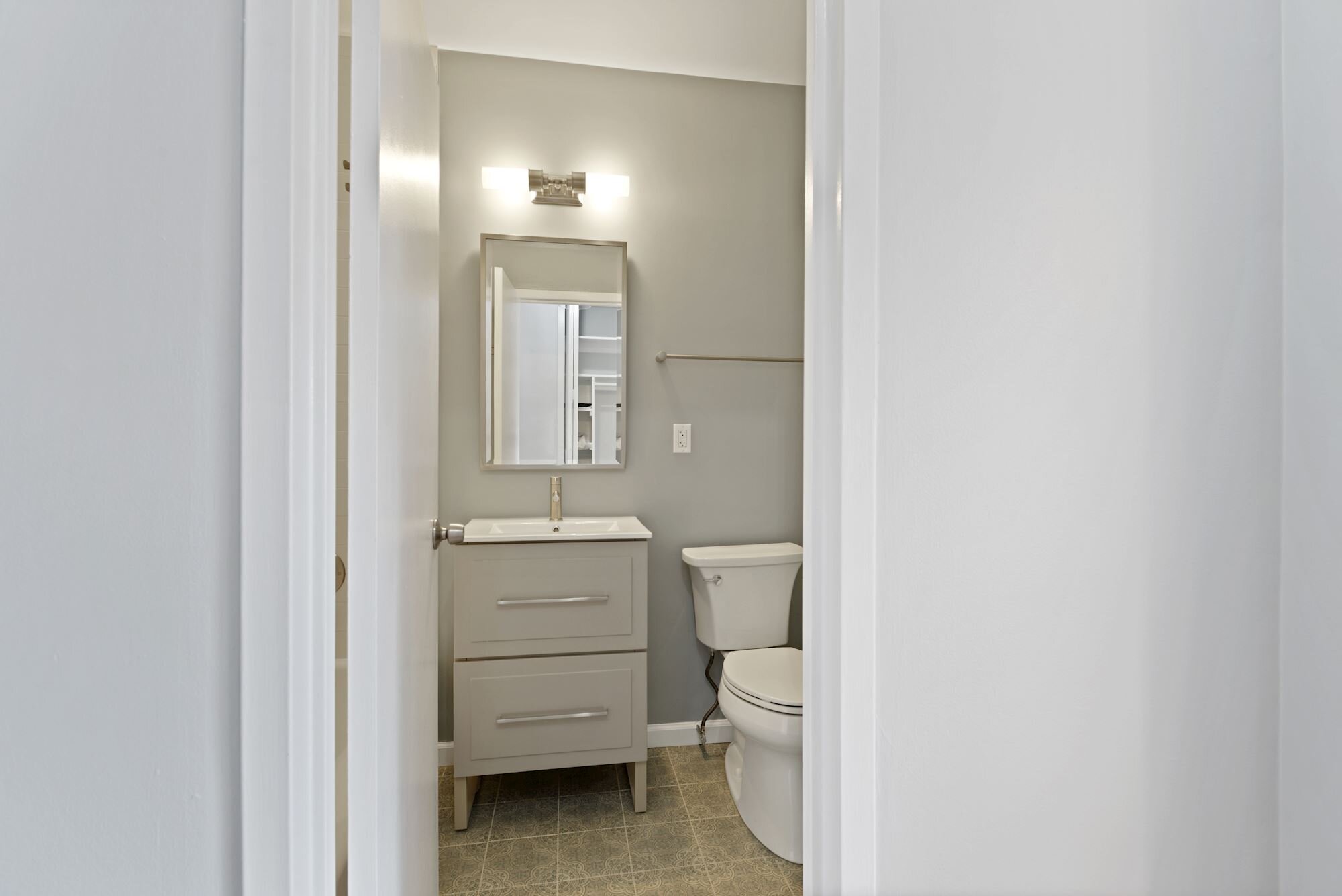
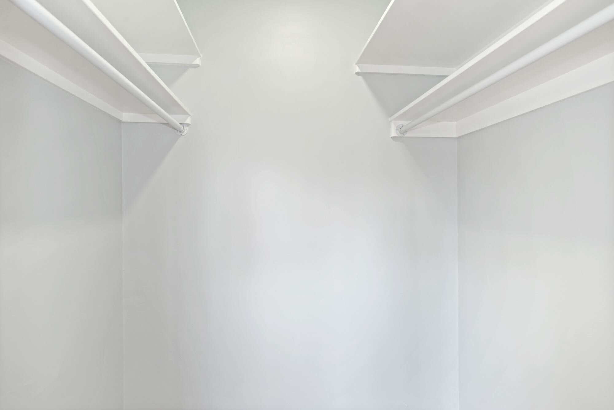
Removing a door from the closet to the bathroom to create one entrance vs. two, while converting that door to a sliding door — enhancing usable spaces in the walk-in closet and living area
Adding top down-bottom up blackout shades to ensure the dual-use living/sleeping space could function for both while not losing the top-floor views
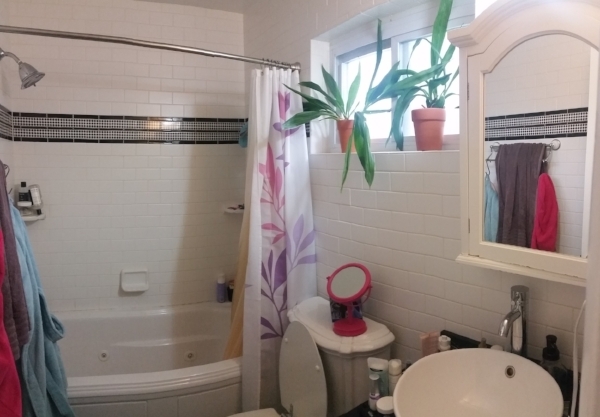
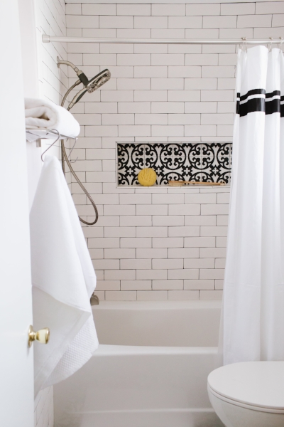
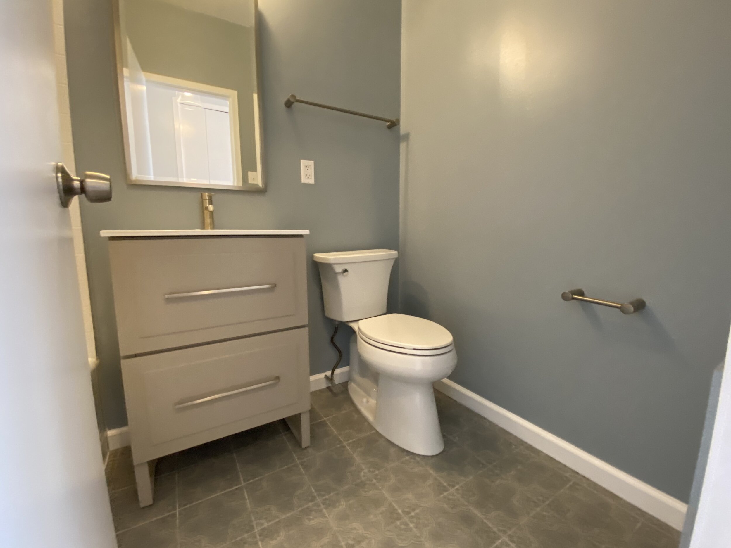
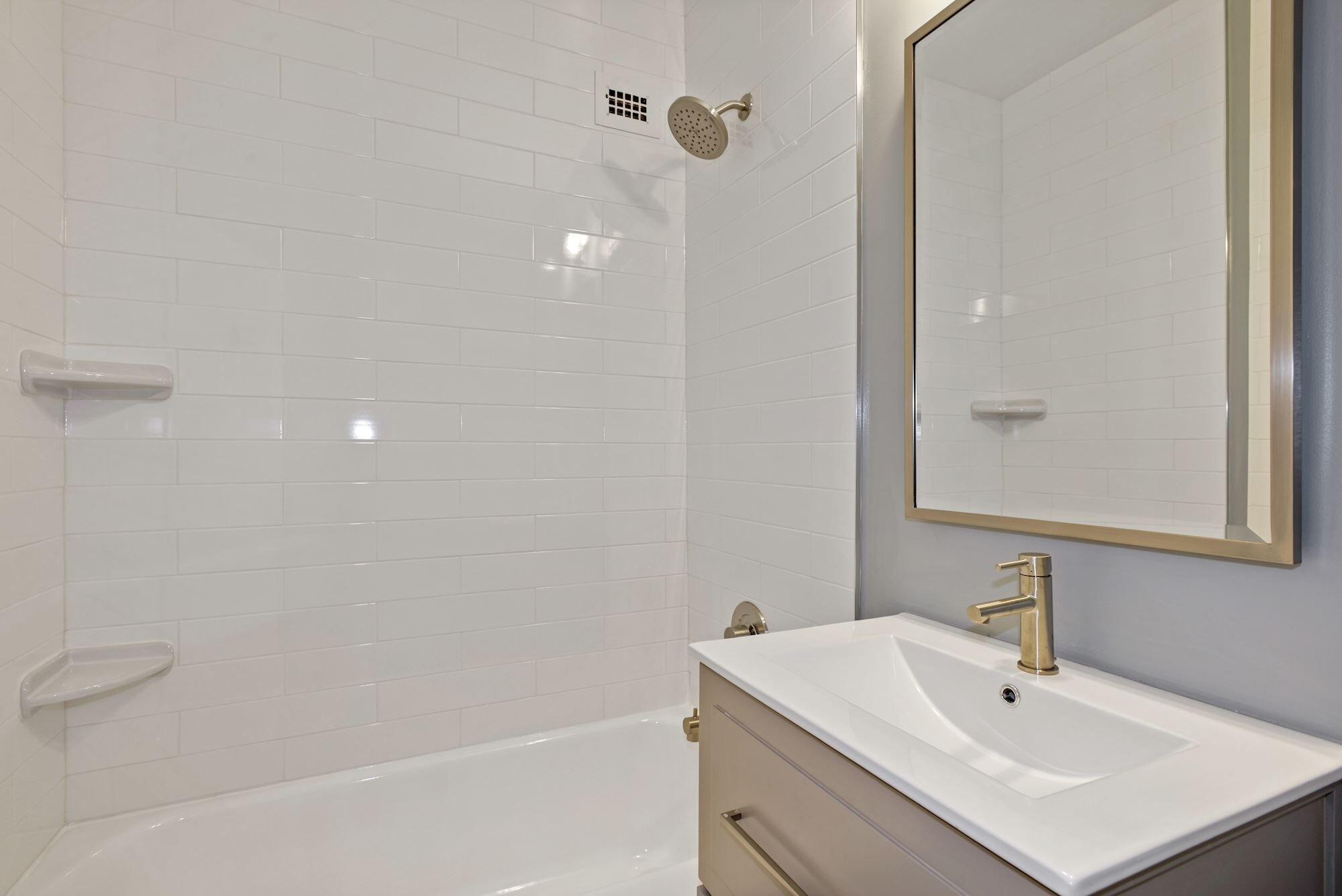
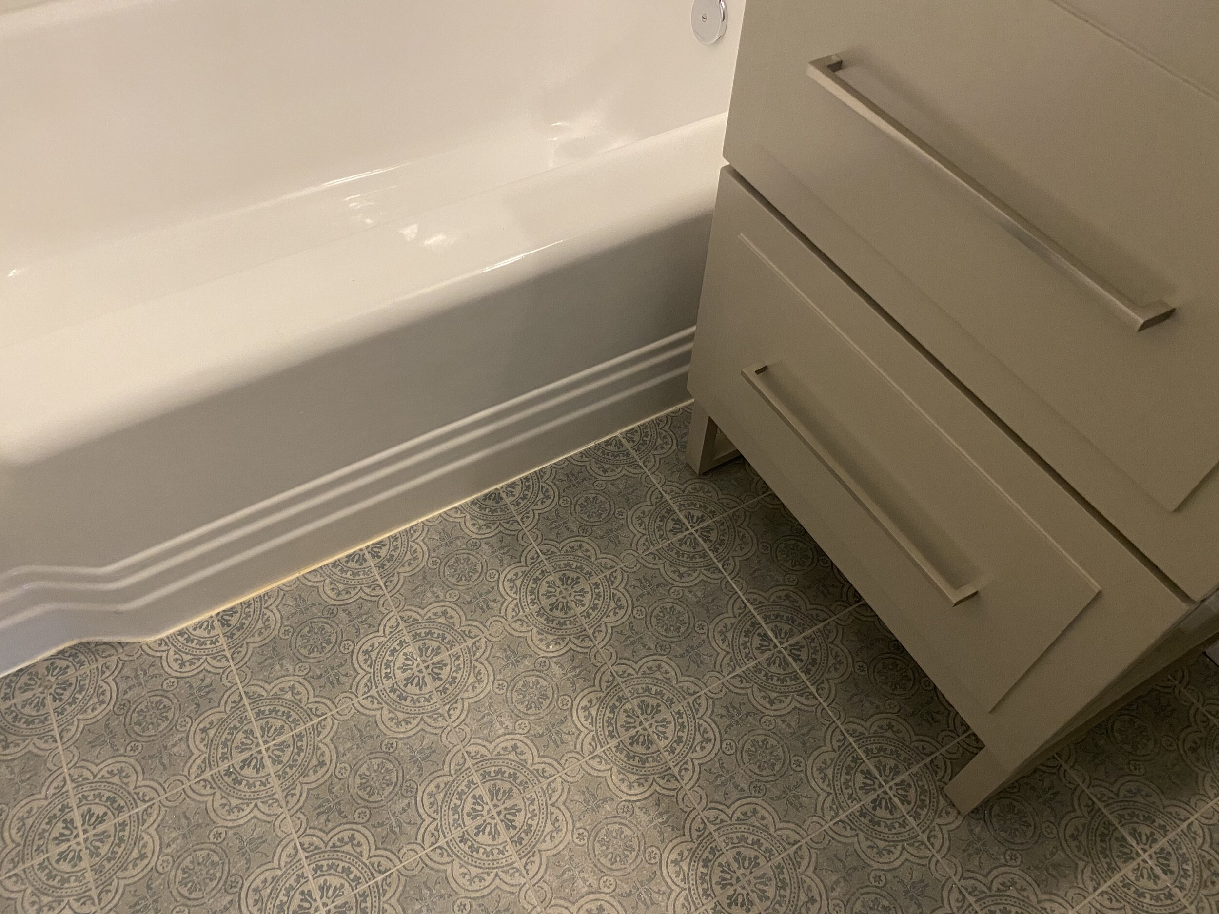
Removing sliding glass doors on the shower for a cleaner, more open (and easy to clean) look
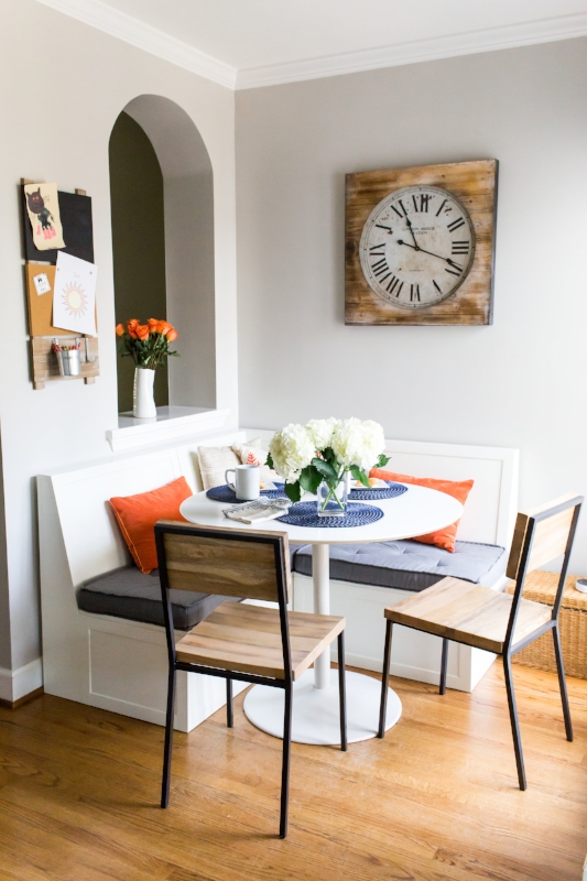
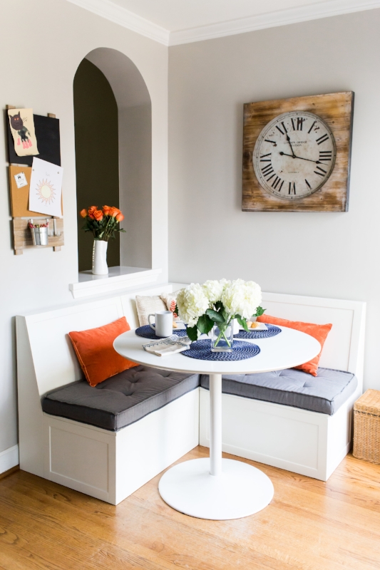
Take a look at the slideshow below for “after” pics (and scroll down further for info on the affordable finishes we selected). This unit also is currently for rent, so reach out if you’d like to know more!

Get the Look
Overall/Living Area
Minwax Stain in Early American (Lowes)
Olympus White Paint (Sherwin-Williams)
48" Latimore 3-Blade Standard Ceiling Fan with Remote & Light Kit in Matte White (Wayfair)
Nightfall Grand Cell Top Down, Bottom-Up Shades in Glacier (3 Day Blinds)
Kitchen
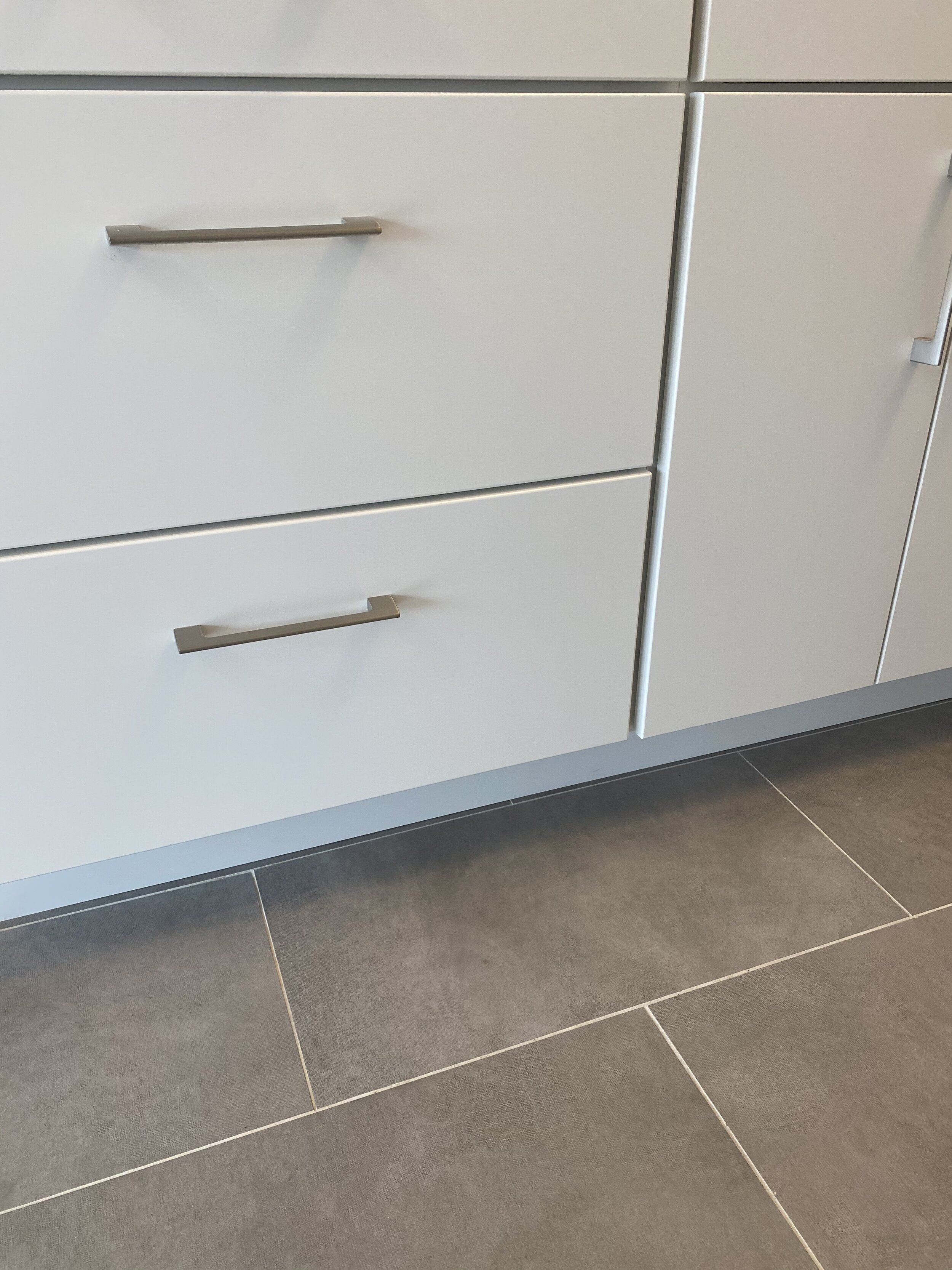
HomeCrest Cabinets in Ranier Maple with Alpine Opaque Finish (Cabinet Discounters)
Amerock Riva 6-5/16 Center-to-Center in Satin Nickel (Wayfair)
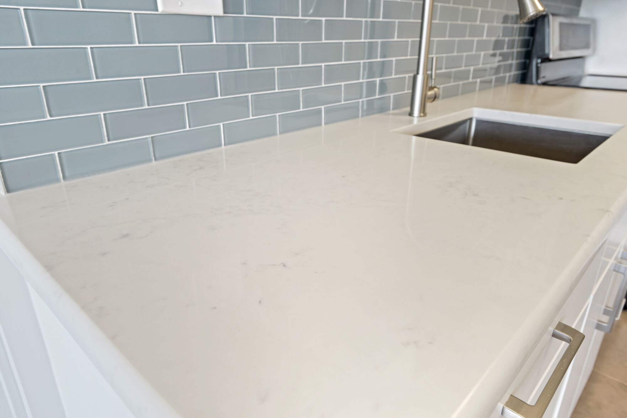
Emerstone Quartz Cararra River (Architecture Stones)
Spa 2” x 6” Glass Mosaic (Floor & Decor)
21” x 18” x 10” Standart PRO Undermount Stainless Steel Single Bowl Kitchen Sink (Wayfair)
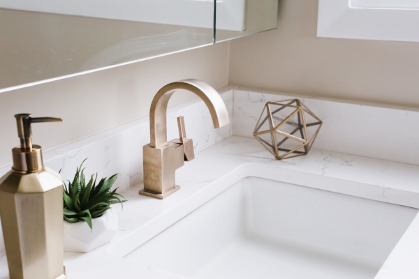
Friho Brushed Nickel Pull Down Single Handle Kitchen Faucet (Wayfair)
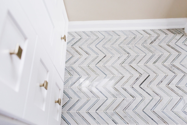
12” x 24” Adessi Resin Gray Contemporary Porcelain Tile (Floor & Decor)
Ara 20” One-Light Semi Flush Mount by Kichler Lighting (Capitol Lighting)
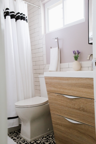
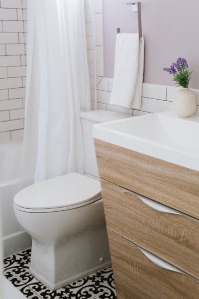
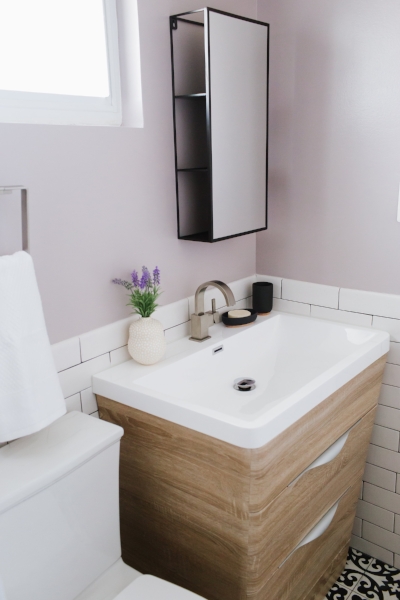
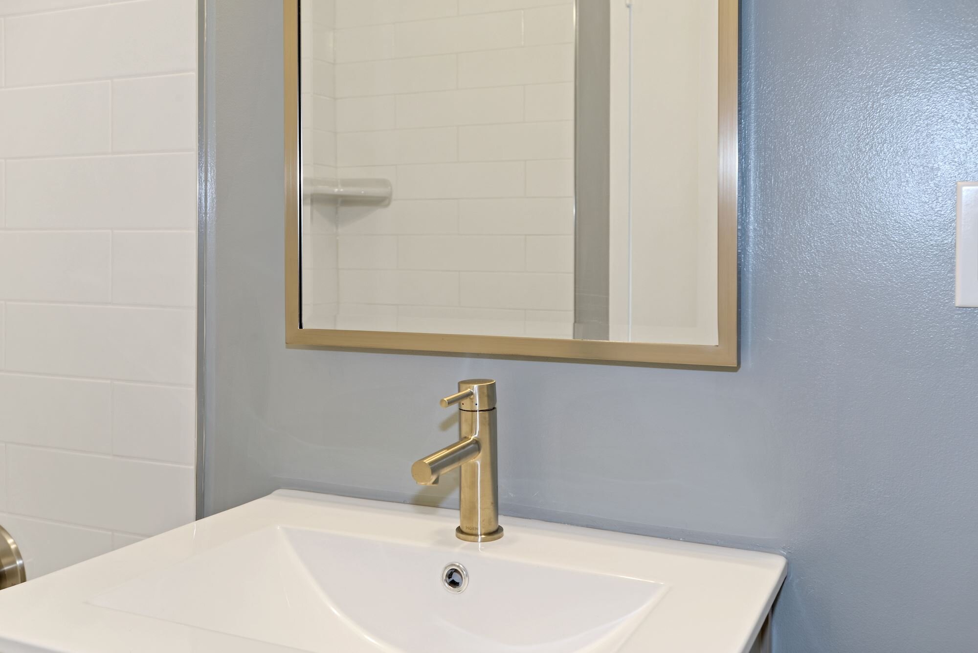
Bathroom
Stardew Paint (Sherwin-Williams)
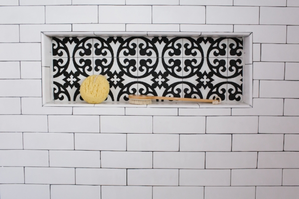
8x8 Moda Del MarCalisto Matte Porcelain Tile (Floor & Decor)
4x16 Metro White Polished II Ceramic Tile (Floor & Decor)
17” x 27” Kensington Recessed Medicine Cabinet in Satin Nickel Finish (Pottery Barn)
Sussex Double Tube Sconce in Satin Nickel Finish (Pottery Barn)
Moen Align 1.2 GPM Single Hole Bathroom Faucet with Pop-Up Drain Assembly in Brushed Nickel (Wayfair)
Moen Align Tub and Shower Faucet in Brushed Nickel (Wayfair)
Moen Align Bath Accessories (Moen)
Amber Harris is the owner of At Home DC, an interior decorator and a licensed real estate agent with Keller Williams Capital Properties working with clients in DC, Maryland and Virginia.