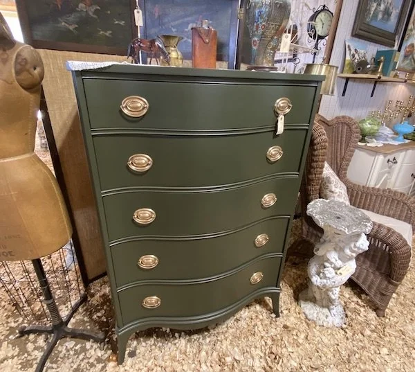
Whether it’s a love of history, a desire to live more sustainably and/or hoping to stay in budget (or avoid tariff impacts), shopping vintage is a great way to furnish or add style to your home. With a recent trip to the markets of Paris and my biannual Lucketts pilgrimage, I’ve been in many more conversations with clients and friends about buying previously owned pieces…and special considerations you may or may not have thought of. So, here are a few key tips as you go hunting at estate sales, flea markets and online…
Invest & Enjoy: Savvy Home Upgrades to Tackle Now with Your Future in Mind
More and more clients are coming to me for assistance with modest projects that will make their current house a better fit for their needs while also representing smart investments -- reaping benefits in potential sales price gains when they sell, enhancing rentability if they hold onto as an investment, or transferring to their new home when they move. Here are four ways you can make the most of today strategically…
Project Spotlight: Family Kitchen Goes from Black & White to Warm & Welcoming
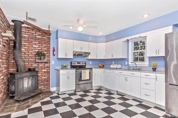
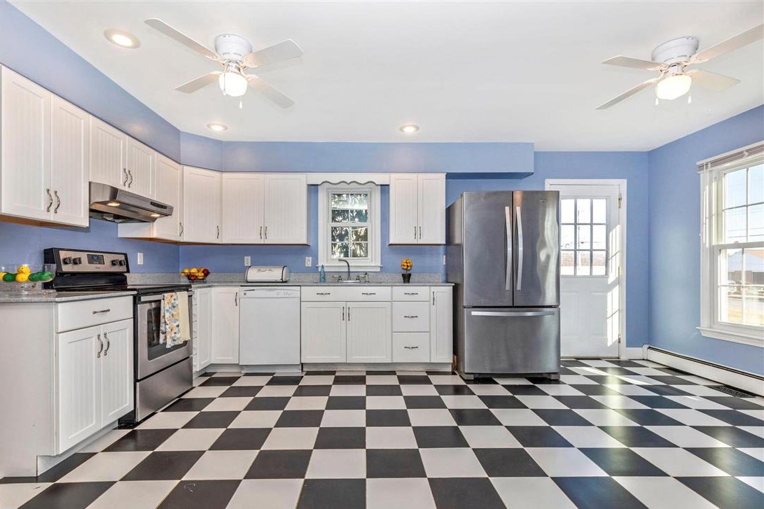
When Jessica and Joel first toured their new Montgomery County home, they knew it was the one for many reasons (I was there as their agent, so I saw it on their masked faces)…however, the kitchen wasn’t one of them. While large and with great natural light, the layout and look wasn’t them. Jess is a (fellow) baker and with an active boy at home, the space needed a blend of form (bye-bye brick and checkerboard floor) and function (hello storage and counter space).
How It Started… (Image Credit Kathryn A. Tucker, Keller Williams Realty Center)
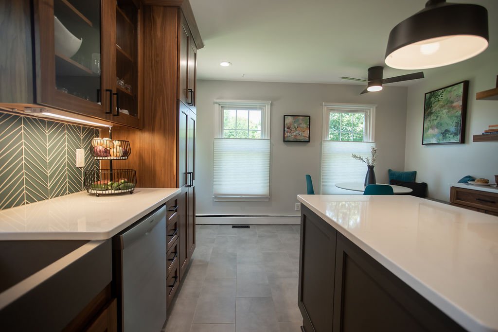
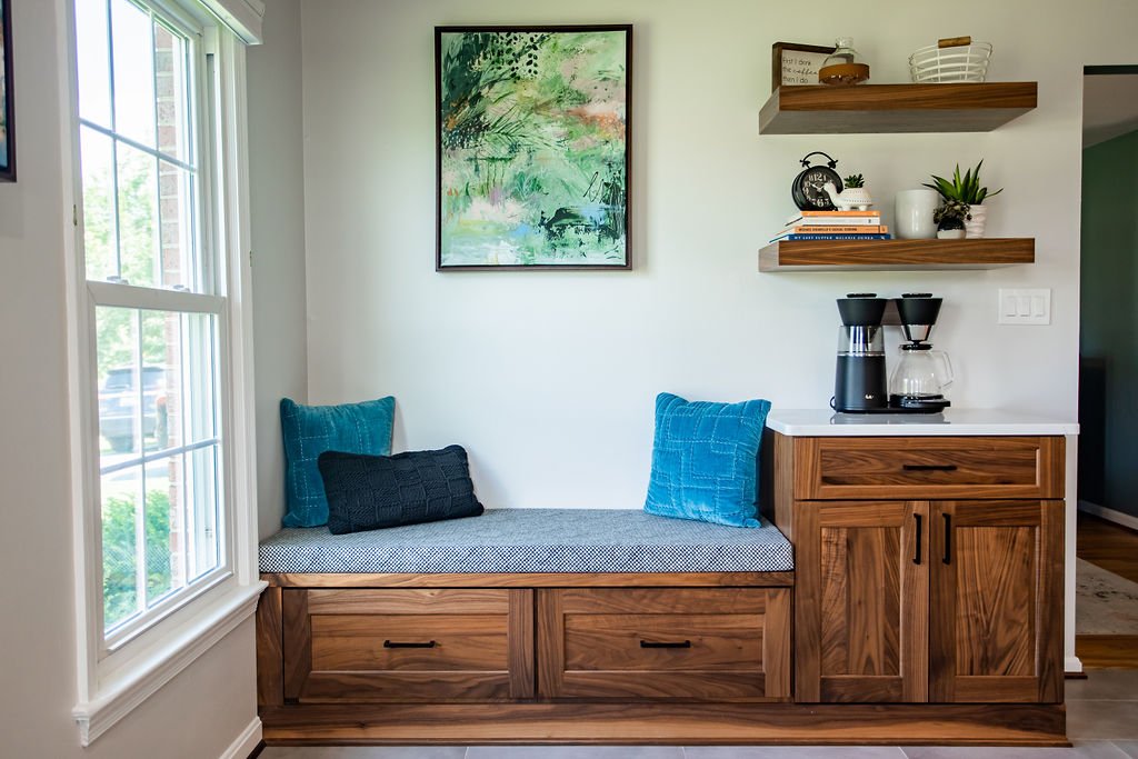
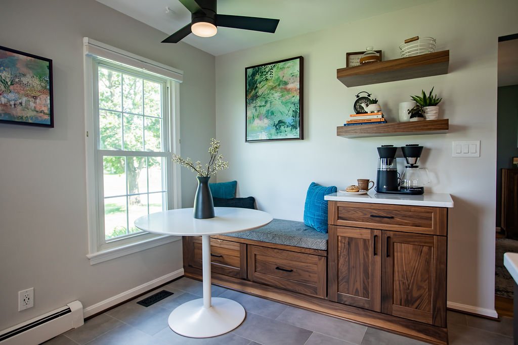
After settling into their home a bit more, J&J reached out to partner on this exciting transformation. From picking out cabinets to pouring over tile (my chosen pastime), the end result is not only beautiful but now serves as a favorite room for all. Keeping the same footprint (save shifting the opening to the dining room), we were able to confirm the brick could be removed (a messy but worthwhile update that extended into the living room) along with the soffit and — opening up layout options. By relocating the refrigerator, we achieved a beautiful stretch of cabinetry that welcomes you as you walk in and added a welcome pantry. We also created enough space for an island (including a microwave drawer tucked away) and an eat-in area with seating, storage and an essential coffee station!
How It’s Going…
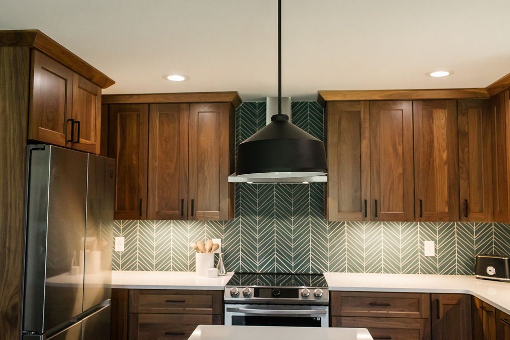
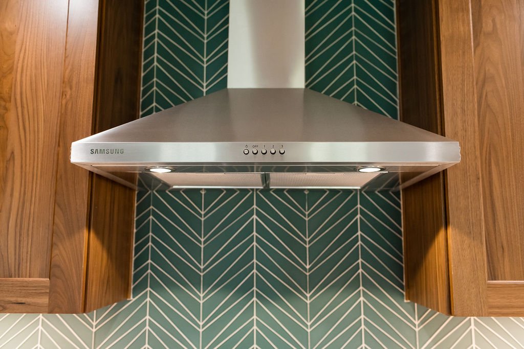
For the aesthetic, we focused on the cabinetry finish first, with the clients wanting a wood finish. Brighton Cabinetry had a beautiful walnut in a natural finish that we all loved in the Cascade style and paired with a contrasting island in Urban Bronze. For the backsplash, we knew there was an opportunity for a “wow” moment, so we went to my favorite local tile source, Architessa, and picked out Island Stone’s Palms tile in the Matte Lagoon finish. To round out the surfaces, we chose a clean matte gray field tile and a quartz countertop with subtle veining throughout the soft white background.
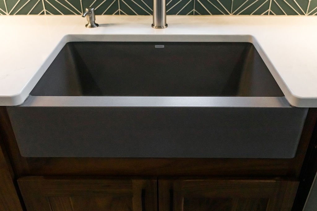
To pick up on the angles in the backsplash, we chose an island pendant and ceiling fan that mimicked the lines, in addition to a similarly styled range hood. Rounding out the design, we added a farmhouse-style Blanco sink in a complementary gray and matte black accents through the lighting and cabinet pulls. A suite of Samsung appliances in stainless steel and a faucet my clients had upgraded in the previous kitchen worked well with the overall look. The dining nook is a second home for their son and features a custom bench cushion in a fun Sunbrella print, CB2 tulip table and easy care chairs from Article, with crisp cellular shades from Smith & Noble and colorful artwork selected by the client. Check out more of the project (after photos by the talented Beth Caldwell) in the slideshow below!
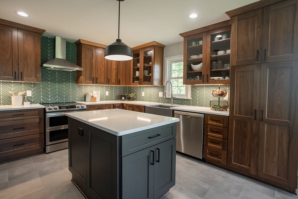
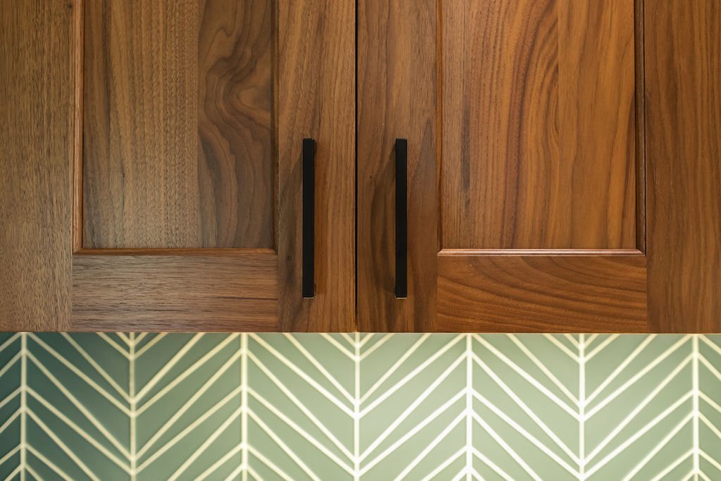
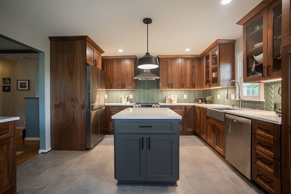
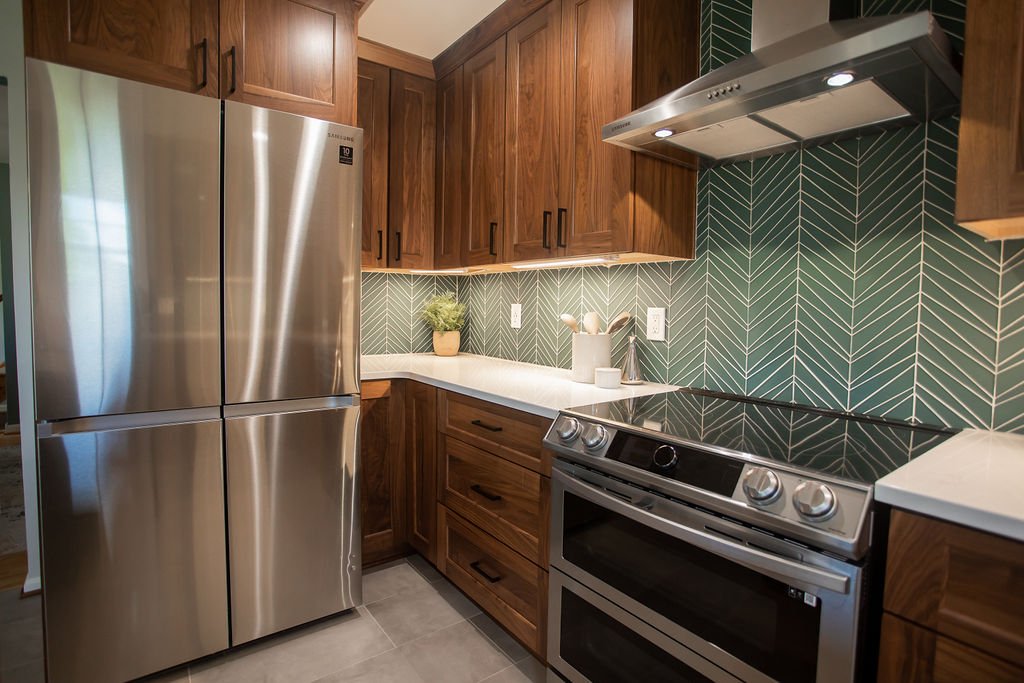

Thinking about a renovation and need a helping hand (and eyes)? Don’t hesitate to reach out and let’s chat!
Get the Look
Island Stone Palms Lagoon Matte (Architessa)
Brighton Cabinetry in Cascade/Walnut Natural & Urban Bronze (Cabinet Discounters)
Bench Cushion in Sunbrella Shibori Classic (Beni Services)
Sanctuary II Modern Metro 5" Center to Center Bar Pull in Matte Black (Wayfair)
Axis Outdoor Rated 44 Inch Flush Mount Fan with Light Kit by Modern Forms in Matte Black (Capitol Lighting)
Svelti Dining Chairs in Teal (Article)
Ethereal White Quartz (Corian)
12x24 New York Concrete Matte Field Tile (Architessa)
Holgate 14" Wide Deep Matte Black Dome Metal Pendant Light (Lamps Plus)
Odyssey White Dining Table (CB2)
Kichler 6u Series LED Undercabinet Lighting (Capitol Lighting)
First Star Paint (Sherwin Williams)
Amber Harris is the owner of At Home DC, an interior decorator and a licensed real estate agent with Keller Williams Capital Properties working with clients in DC, Maryland and Virginia.
Six Tips for Making the Most of Your Outdoor Space
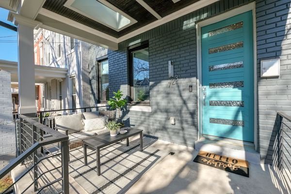
A Petite Petworth Front Porch — The Perfect Place for Afternoon & Evening Porch Sitting
The cherry blossoms are at full bloom in DC and spring is officially here this week…and, if you haven’t already, now is the time to make updates to your outdoor space to make the most of it for the months ahead.
Whether you have a small balcony or much more, here are a few things you may want to consider as you make your plans:
Know your needs. Even if if you have the most expansive deck, patio and yard, you’ll want to consider the primary ways you use your outdoor space. Do you want a place to relax with a morning cup of coffee (or evening cocktail), an outdoor dining room and/or a place to host bigger gatherings? With smaller spaces, design for your most frequent use case and, with larger spaces, create zones of function that flow well together and are connected stylistically through finishes, fabrics or otherwise.
Plan for the elements. If you don’t know already, identify the how the sun tracks with regard to your space(s) and ways you may need to block it to maximize enjoyment (and minimize burns). Whether a cantilevered umbrella, floating sunsails anchored to your house and fence, a pergola or a retractable awning, identify the best option for the scale of your space, your particular challenges and, of course, budget. If a bigger project is on your mind, consider a screened porch or gazebo to make the most of the space for the longest periods of time. Aside from the sun, they can protect from rain and mosquitos, too. Finally, don’t forget your furniture and make sure to purchase covers and/or stow cushions to maximize their life and minimize dirt, fading and more.
Be mulitpurpose(ful). With smaller spaces (and not), identify pieces that can serve several functions. Think a ceramic stool that can be an extra seat in a pinch or an accent table for a drink. Just as with indoor spaces, you can seek out modular outdoor sets that allow an ottoman to be a coffee table or create a chaise addition to an outdoor sofa.
Add mood lighting. Thoughtful outdoor lighting will not only extend the hours of use but also create ambiance. If you have a sunnier space, consider solar-powered options, which allow for flexible installation without an electrician or extension cords. Garden lights strung along a fence are an easy add, but also consider lanterns (candle-based or electric) that can moved around where needed and fixed lighting sources, like sconces, that attach to your house.
Materials matter. Pay attention to the materials used for pieces — from lounge chairs to accent tables — and make sure you understand how to care for them and ways extend their life (like the aforementioned covers). There’s nothing wrong with less expensive options if that fits your budget, but that doesn’t mean you can’t and shouldn’t work extend their useful life.
Have fun. Use neutrals (from off-white to gray to navy) to create a base and then bring in with more colorful accessories like outdoor rugs, throw pillows and table decor to add in your personal style. This approach allows you to customize the space for holidays and gatherings easily by adding a few simple touches, like red and white striped pillows to your navy outdoor sofa and a star-shaped serving tray to your table to celebrate the 4th of July.
If you’re looking for personal recommendations on how to revive your outdoor space, don’t hesitate to reach out. Here’s to more gatherings — indoors and out — this spring and summer for all!
Amber Harris is the owner of At Home DC, an interior decorator and a licensed real estate agent with Keller Williams Capital Properties working with clients in DC, Maryland and Virginia.
Four Cost-Effective Updates to Sell Your Home for More Sooner
When you decide it’s time to find a new owner for your home — whether you are moving up, relocating or otherwise, once you get past the emotion and nostalgia, you likely are most focused on maximizing your return on this important investment and doing so on your terms (including finding a buyer quickly).
As both a real estate agent and decorator, I work closely with each of my clients to create a custom plan to sell their homes for top dollar swiftly. And, while each property and micro-market (location, price point, etc.) is slightly different, there are four key areas I always focus on that offer cost-effective opportunities to optimize a home for the sale — ensuring it’s the best presented option in its price range and location.
Read on for my top tips and check out a few before and afters to show you their power:
Paint & Your Overall Color Palette: Paint can be transformative and completely change the feel of a space — making it brighter, more welcoming and up-to-date (I’m looking at you yellow bathroom!). While walls are the focus, you also may want to consider painting cabinetry to say bye-bye to dated wood tones (think that original bathroom vanity in a honey tone) or just a fresh color on the front door to be on trend and intrigue buyers to schedule a tour. Another way to play with color is by changing textiles (which I often do when staging with client’s own furniture). A simple swap of a rug or set of throw pillows paired with neutral paint can transform a space and let you keep those red leather couches.
Lighting & Hardware Updates: Changing a light fixture or faucet is a simple job for a handy homeowner or a hired professional, allowing you to banish dated brass candelabras and signal a contemporary feel for buyers. Even easier is changing knobs and pulls on cabinetry (or adding them if they aren’t installed)…and, when you do both together, magic! There are so many cost-conscious fixtures available from Wayfair and other online retailers, so there’s no need to hesitate!
This home sold for for more than 14% above list with seven offers (and set a new neighborhood record). We updated the palette with fresh paint and some new textiles, built on the iron railing by adding a matte black chandelier and ceiling fan and banished that wallpaper and chair rail in the dining room..voilà!
Simplify & Streamline: Many design features are associated with a certain era (unnecessary pony walls, anybody?), and sometimes it makes sense when you are painting and making other updates to strip these away. For example, a chair rail can be beautiful but may date a dining room, and old window treatments and hardware may have seen better days (and won’t be needed by you much longer or at all). Other easy updates include removing wall mounted storage (like that shelf above a window or the cabinet above your toilet). You may have installed them to give you more room for all your things…but they also may signal to the buyer this space may not work for them.
Surface Transformations: A dated bathroom may be ready for a larger refresh, but that may not provide the ROI you need (or work on your timeline). Instead consider updating the laminate vanity countertop with a new quartz one, re-glazing an older tub and/or swapping out the entire vanity set. You also may want to remove a dated kitchen backsplash and/or add a new one to create a fresh look. While a little more involved, when paired with some of the tips above, a refresh vs. a full renovation may just what the doctor, err agent, ordered!
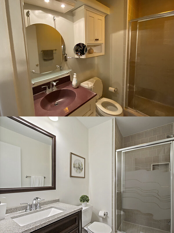
A pre-fab vanity with matching mirror from Home Depot was an inexpensive update (along with paint and removing an extra cabinet) that dramatically changed the way this en suite bathroom showed.
Looking for custom tips as you think about your next chapter? Reach out today for a virtual or in-person, no pressure consultation (bonus: these recommendations are equally as rewarding if you are staying in your home but watching your budget)!
Amber Harris is the owner of At Home DC, an interior decorator and a licensed real estate agent with Keller Williams Capital Properties working with clients in DC, Maryland and Virginia.
Let There Be Light & Style: Tips for Updating Your Windows
They say the eyes are the windows to the soul, and I say that windows are the eyes to your home. While it’s natural to focus on the furniture, wall art and other accessories in a home, adding or updating your window treatments is an easy way to make a big impact — from maximizing natural light to adding a little polish to elevate your space.
Layering White Curtains (with a Subtle Pinstripe) Adds Texture to These Windows, While the Matte Black Hardware Ties In with Stripes and Dark Accents and Anchors the Look (Photo by Beth Caldwell)
Here are a few tips and considerations to get you started on assessing and optimizing your windows:
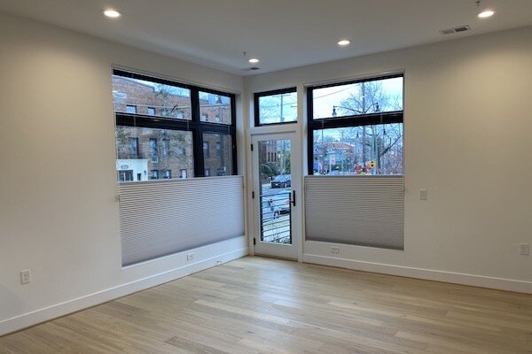
Consider both form and function.One size does not fit all and you want to think about your functional needs (privacy, room darkening, etc.) and the aesthetic of your room. For example, top down, bottom up shades are a great option for a first-floor room, as you can let in natural light while still maintaining a level of privacy. Similarly, if you’re light sensitive, you may want to consider a blackout option (whether shades or curtains) and even layer both for texture and added darkness.

Balance trendiness and timelessness.
If you are going with a custom window treatment, perhaps a fabric roman shade, consider the print and palette and how forgiving they will be if you want to change your design in a few years. There is nothing wrong with investing in a bold choice but, if budget is a concern, consider a simpler print in a neutral palette or, even better, pair a basic shade with curtains that bring in a pop of color and/or pattern that is easier to change with evolving tastes.
Measure, measure, measure.
The key to a polished look is tailoring — from the placement of your hardware to the length and width of your curtain panels. Depending on your space, standard sizes may or may not work; however, sometimes a quick hem or the addition of a tie back can make all the difference. If you want to emphasize ceiling height and add drama, consider mounting your hardware closer to the ceiling and, if you want a more casual look, consider purchasing longer curtains and letting them pool on the floor slightly (but please don’t don’t let them limbo just above whatever you do).
Light Pooling in These Sheer Curtains Works with the Casual Vibe of This Dining Room, While the Navy Trim Highlights the Vertical Details in the Wallpaper and Wainscoting (Photo by Beth Caldwell)
You don’t have to break the bank.
It is true that custom window treatments — whether shades or curtains — can be expensive (especially if your home is full of windows). However, adding a decorative curtain rod and curtains can be an easy weekend project and there are plenty of sources for less expensive finishes that still have style. If you are going custom, look out for sales (think buy two get one free) or consult with a decorator (like me) to see if they have access to pricing that may save you a few bucks.
Inexpensive Sheers Layered Over Blinds, Filter the Daylight and Add Softness to This Nursery (Photo by Beth Caldwell)
Whether are looking to soften a space, make a bold statement or just sleep past a 5:57am sunrise, a window makeover may be your solution. Reach out if you have questions or want to schedule a virtual consultation to find the best (and most stylish) option for you and your budget!
Amber Harris is the owner of At Home DC, an interior decorator and a licensed real estate agent with Keller Williams Capital Properties working with clients in DC, Maryland and Virginia.
Project Spotlight: Setting the Scene for a Life of Adventure
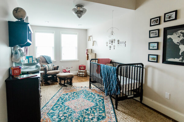
While I have heard some speculate that we may see a baby boom in the next nine months thanks to household quarantines (if so, a joyful outcome after these challenging times), I wanted to take some time to look back at a nursery I had the privilege of helping neighbors and friends Alpa & Dave complete as they awaited the arrival of their precious daughter.
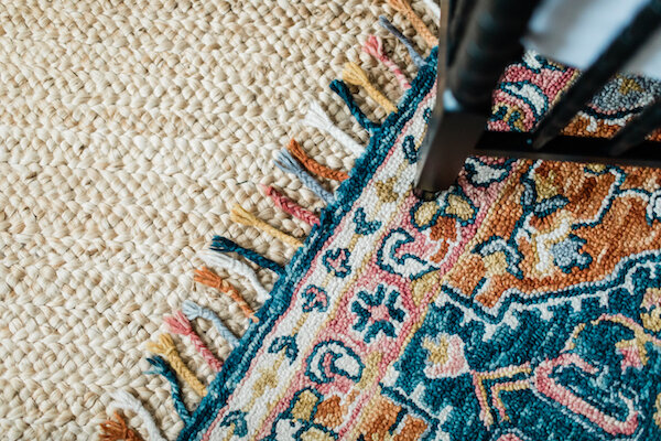
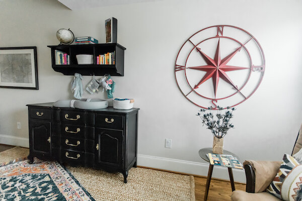
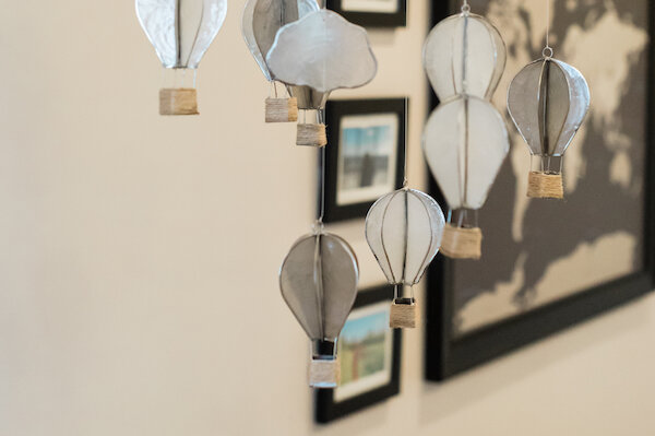
As a multicultural family and travel aficionados, our conversations quickly turned to a travel-inspired theme but not in the sense of airplanes, cars and boats or a kid-like interpretation of it. Instead the final design captured all the excitement of exploring the world and cultures in a more bohemian and fluid form. By mixing textures and textiles and using a neutral background and pieces paired with pops of color, the resulting space is warm and welcoming but hardly cookie cutter…and it has room to evolve as Alpa & Dave’s daughter grows up and they travel together as a family.
Check out the slideshow below for a peak into this space (and some ideas you can pull from the project…if you need them now or in nine months)!
To learn more about some of the pieces you see featured, check out “Get the Look” below…and thanks, as always to the talented Beth Caldwell for capturing this special space!
Get the Look
DaVinci Jenny Lind 3-in-1 Convertible Crib in Ebony (Amazon)
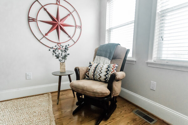
Huron Glider and Ottoman Set in Espresso & Beige (Dutailier)
Alex Fringe Area Rug (Grandin Road)
Canvas Earth Toned World Travel Map (Push Pin Travel Maps)
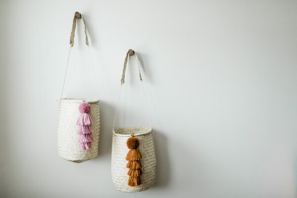
Hanging Baskets and Tassels (Xinh & Co.)
Capiz Hot Air Balloon Mobile (Pottery Barn Kids)
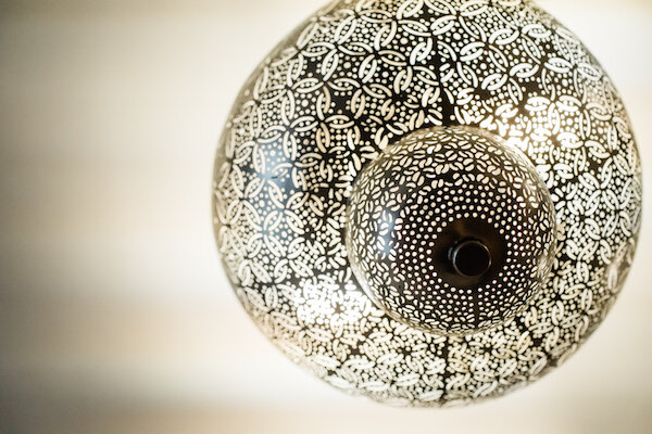
Punched Metal Flushmount (Pottery Barn Teen)
Round Metal Compass Wall Decor in Red (Wayfair)
Paint Color: Natural Linen (Sherwin-Williams)
No Longer Available
Vintage Dresser/Changing Table (Miss Pixie’s)
Shelf Unit (Wayfair)
Greene Hand-Woven Natural Area Rug (Wayfair)
Baby Blankets (Sari Bari)
Diamanta Throw in Indigo (The Citizenry)
Zigzag Velvet Lumbar Pillow (World Market)
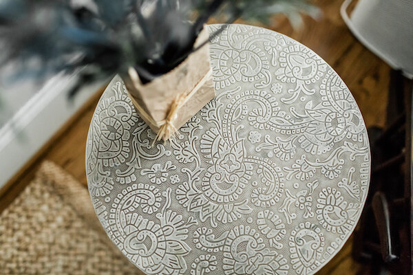
Embossed Azaria Round Accent Table (World Market)
Amber Harris is the owner of At Home DC, an interior decorator and a licensed real estate agent with Keller Williams Capital Properties working with clients in DC, Maryland and Virginia.
Project Spotlight: New Home, Fresh & Fun Look
One of the best compliments is when past clients connect me with future clients and last year I was lucky to have the opportunity to partner with Audrey & David to help make their new home in American University Park (built in 1937, mind you) the perfect “at home” for their young family of five (plus one furry friend).
Whimsical Windom
While my clients already had a few projects in mind for their main level living areas (such as refinishing the hardwood floors, painting and adding recessed lighting), we made a few additions — including installing a modern wainscoting to the dining room topped with a fun wallpaper and making the front door pop on the inside in a beautiful deep blue. However, we spent most of our time focusing on fixtures and finishes that would be updated, family friendly and stylish and complement this DC colonial.
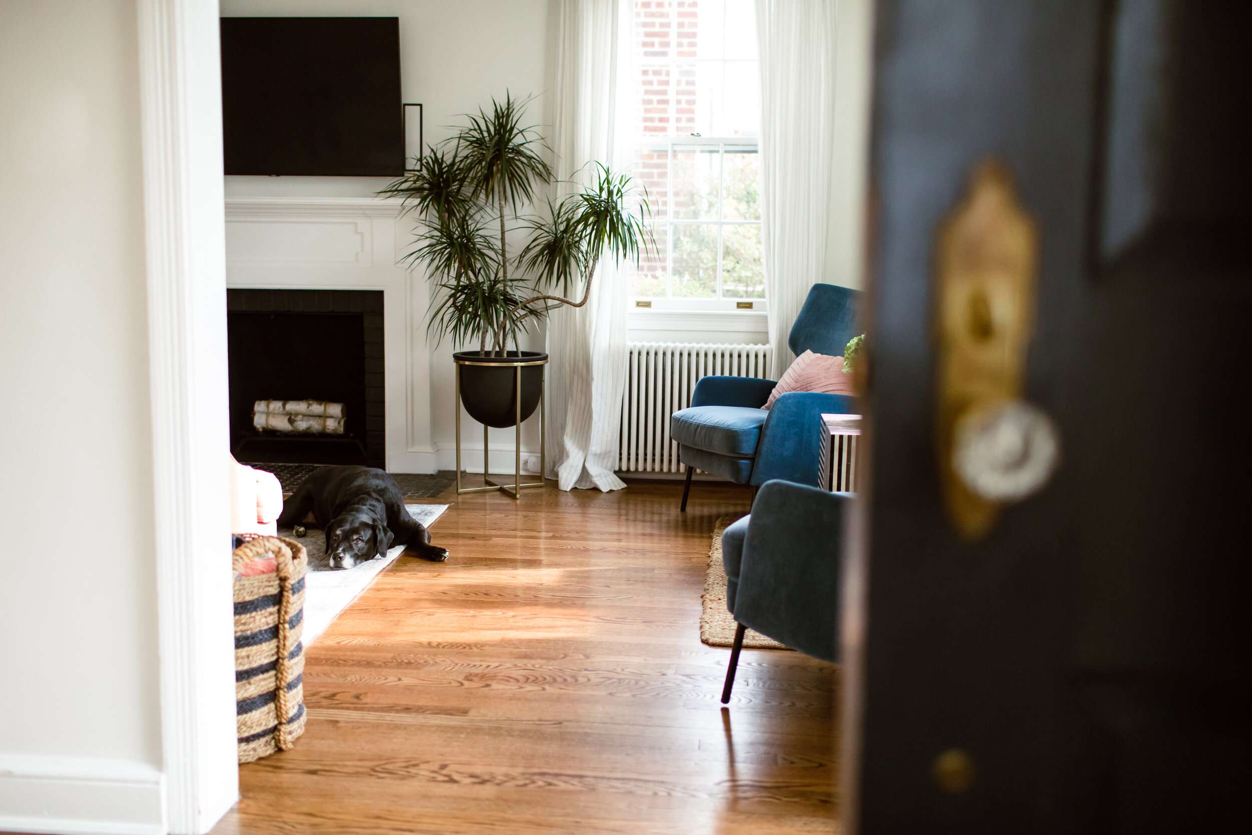
Working with pieces that would be moving to their new home, including a well-loved sofa and beautiful dining room table, the ultimate goal was an eclectic but timeless space where modern touches could play with rustic and bohemian accents. For our palette we focused on blending tones of blue and blush while adding structure with black and white accents (which you’ll see in curtain hardware, that amazing inlay accent table and even subtle pinstriping in the curtains) and warmth with gold tones.
We also played with shapes, and you’ll see a theme of hexagons throughout, balanced with round accents (from side tables and mirrors to finials) and organic edges in pieces like the coffee table. And, while not an open concept space, we wanted spaces to talk to each other but each have have own feel. Above you’ll see before and after shots of the living and dining rooms, and you can scroll down for a slide show with more details. And, while we shopped for decorative accents to complete the spaces, I love how we were able to include pieces of art from the family’s collection to complete the look.
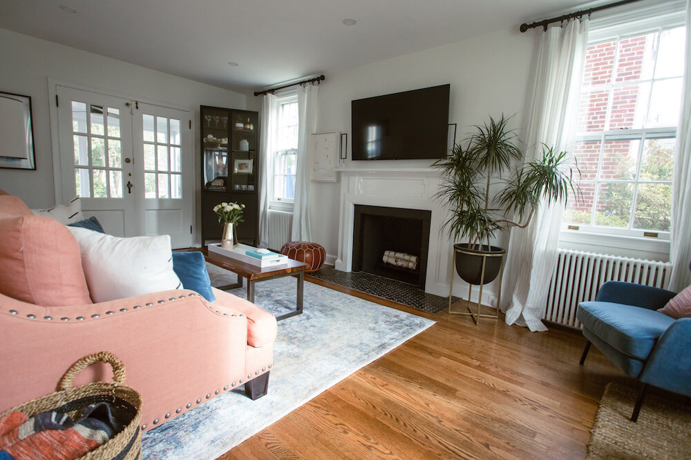
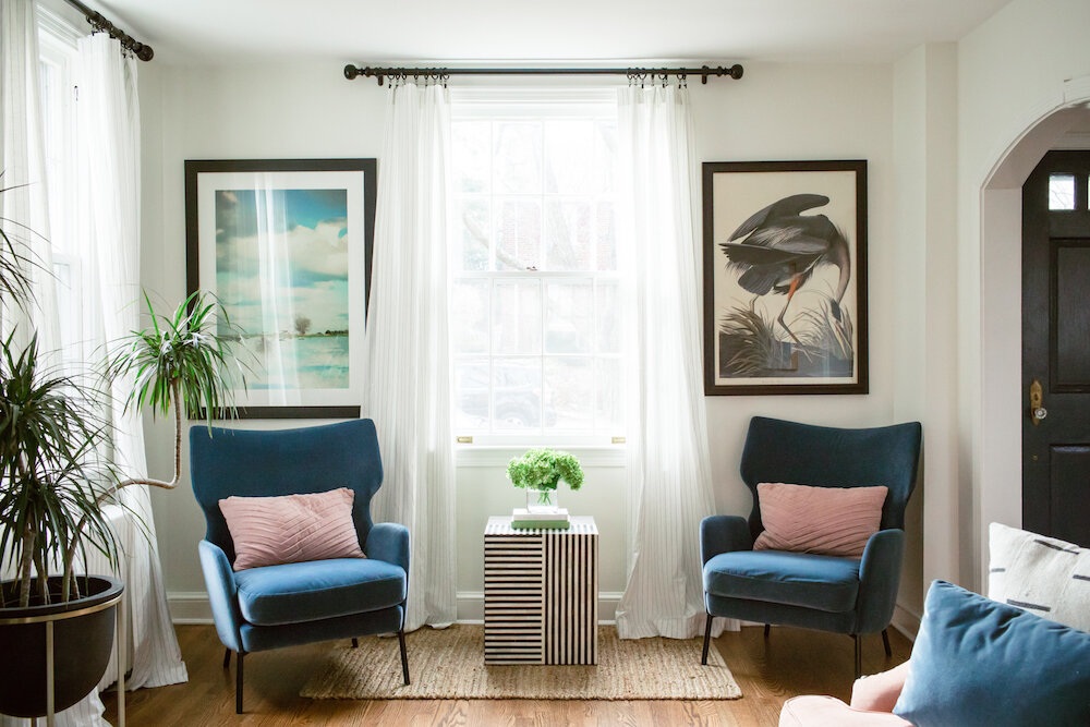
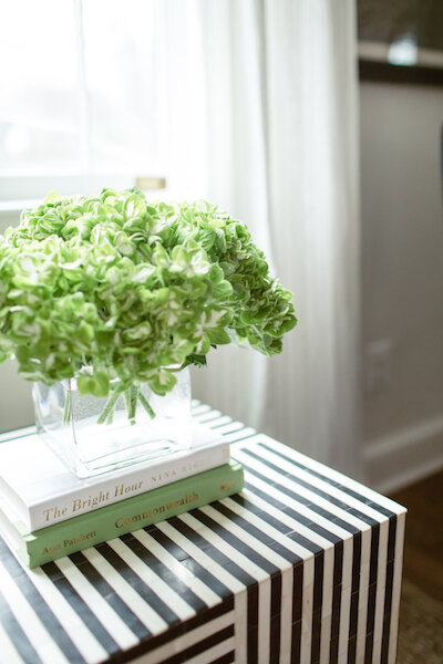
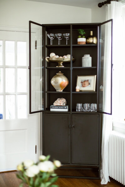
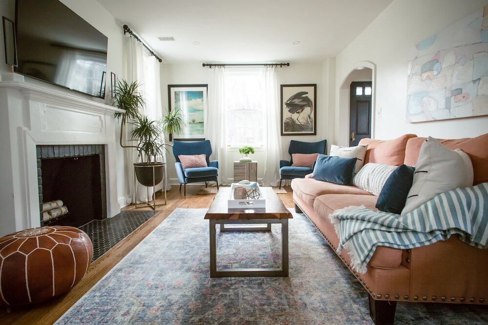
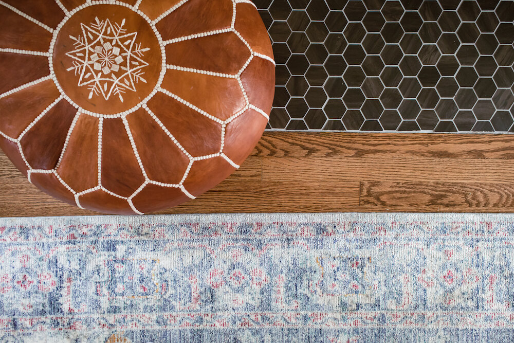

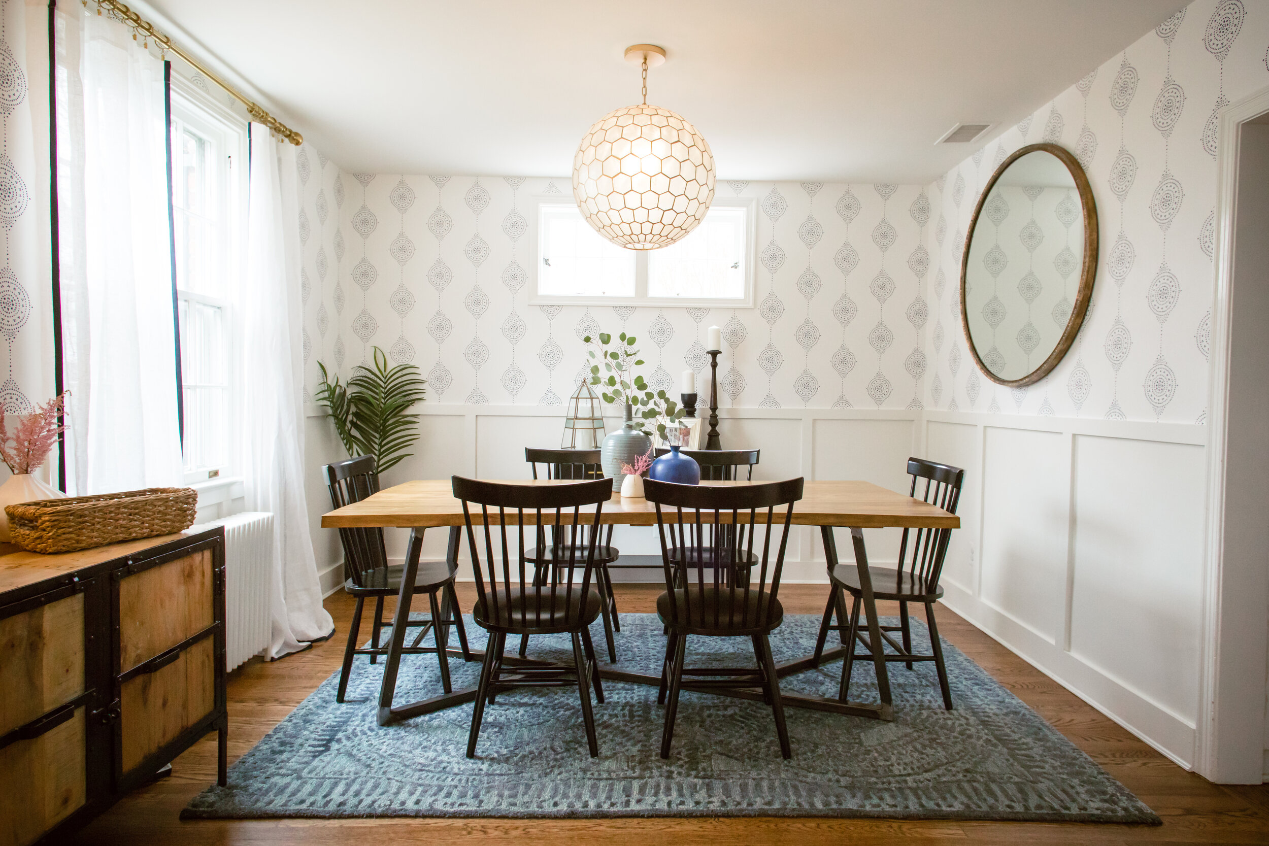
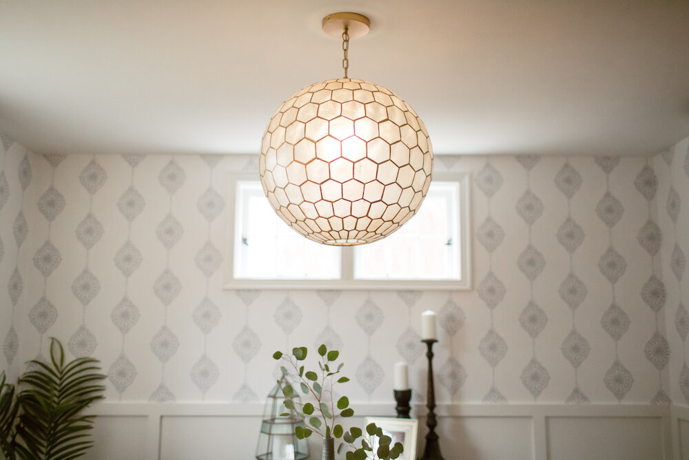
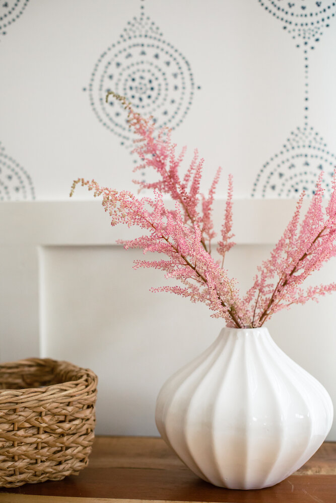
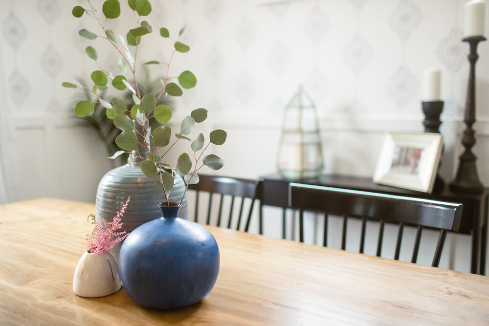
To wrap things up, let me give a shout out to Beth Caldwell for the beautiful photography…and you can find out more about the pieces and finishes below!
Get the Look
Living Room
Alex Navy Blue Accent Chairs (Crate & Barrel)
Heather Chenille Jute Rug (Pottery Barn)
Drapery Rods, Finials & Rings (Ballard Designs)
Joanna Gaines Isabel Rug (Anthropologie)
Casement Black Tall Cabinet (Crate & Barrel)
Laquer Wood Tray (West Elm)
Eden Cross Base Standing Planter (West Elm)
Moroccan Leather Pouf (West Elm)
Marble Round Nesting Side Tables (West Elm)
West Elm + Rejuvenation Cylinder Floor Lamp (West Elm)
Assorted Accessories: HomeGoods & Target
Sofa & Art: Client’s Own
Dining Room
Capiz Honeycomb Chandelier (Serena & Lily)
Luna Stripe Wallpaper (Serena & Lily)
Maze Rug (West Elm)
Markel Mirror (Ballard Designs)
Metalwork Console (West Elm)
Drapery Rods, Finials & Rings (Ballard Designs)
Linen Sheer Trim Curtain in White/Navy (Pottery Barn)
Spin Floor Vase (CB2)
Linen Textured Ceramic Lamp (Target)
Assorted Accessories: HomeGoods & Target
Dining Room Table, Chairs & Cabinet: Client’s Own
Entryway
Cedar & Moss 3-Arm Semi-Flush Chandelier (Rejuvenation)
Amber Harris is the owner of At Home DC, an interior decorator and a licensed real estate agent with Keller Williams Capital Properties working with clients in DC, Maryland and Virginia.
Project Spotlight: Elevating a Basement Bathroom
Ready for Guests…and the Homeowners (Photo Credit: Beth Caldwell)
According to a range of surveys and accompanying articles (I’ll leave you to Google these), we spend around an hour a day in the bathroom. That statistic would seem reason enough to make sure the bathrooms we own are as lovely as the other spaces in our homes. And, while choosing vanities and toilet paper holders may not be as sexy as a new sectional or chandelier, taking a little extra time to make smart selections can greatly enhance the feel and function of these spaces we enjoy (privately).
Recently, I had the chance to partner with Dave and Molly as they planned a renovation of their basement, including the second full bathroom in their charming Takoma Park home. With limited space (like other clients), they had already been brainstorming ideas to modify the small footprint when we teamed up to take things to the next level (working with general contractor Jose Serrano and architect Maria Wright) — including modifying the approximately 3’ square glass-enclosed shower stall to a larger open shower and pushing back a wall a few inches to add critical space and function.
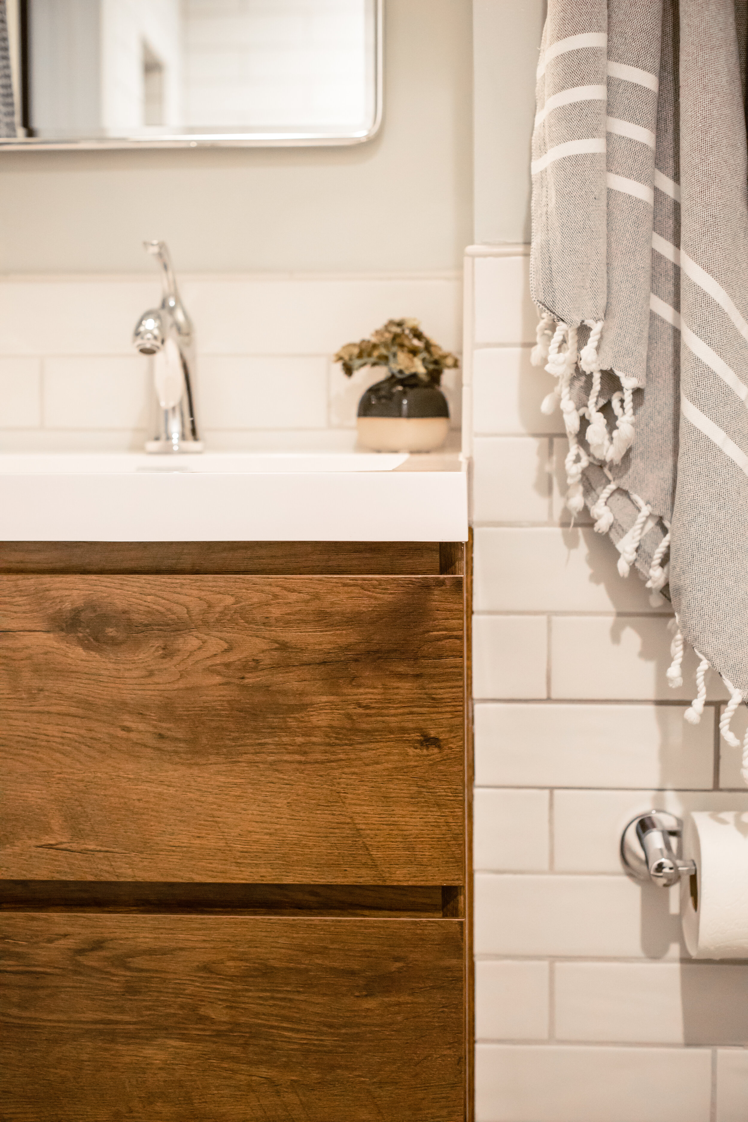
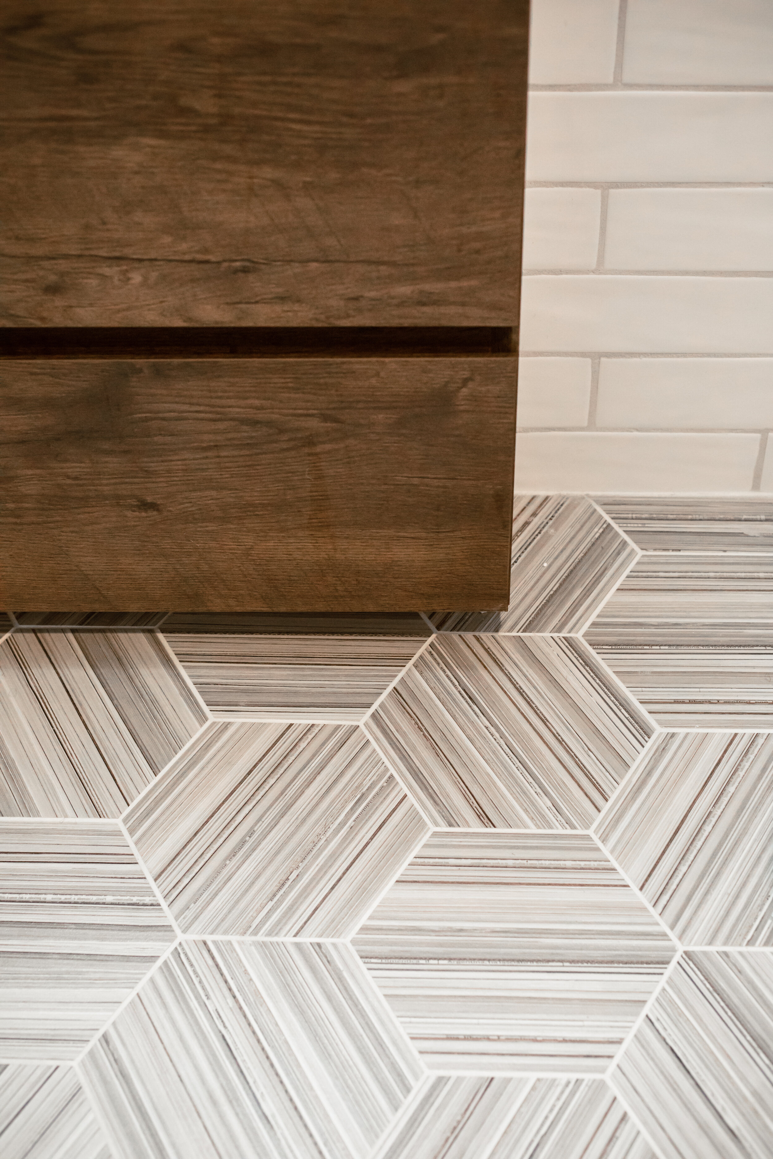
Tile selection was central to the finished product and, as I’ve said before, it’s worth it to splurge on something unique in small bathrooms (as the incremental cost won’t be much but the impact will be substantial). We started with a special tile I had seen on a previous trip to Architectural Ceramics, the Hexagon Deco Chronicle in Paper Bianco. The tile print is of pages of paper layered on top of each other, and you can actually make out Italian text on some of those pages (che meraviglia!). To contrast the cooler tones in the tile and pick up on the variation and contrast within it, we went with warmer wood accents in the vanity and custom shelving (which was stained to match the vanity).
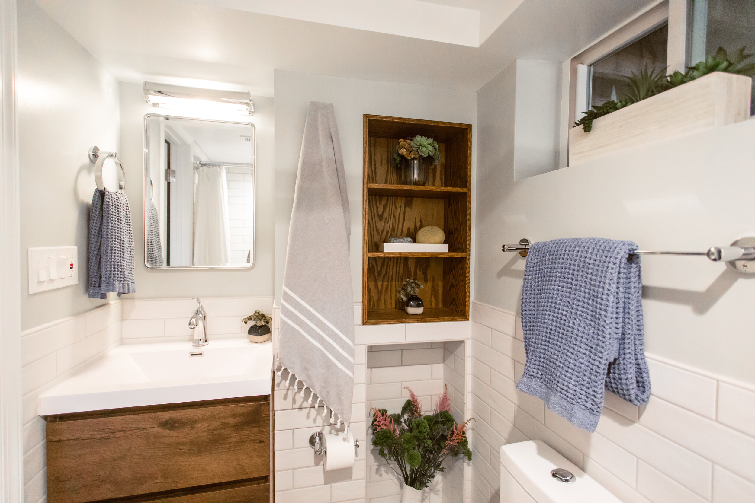

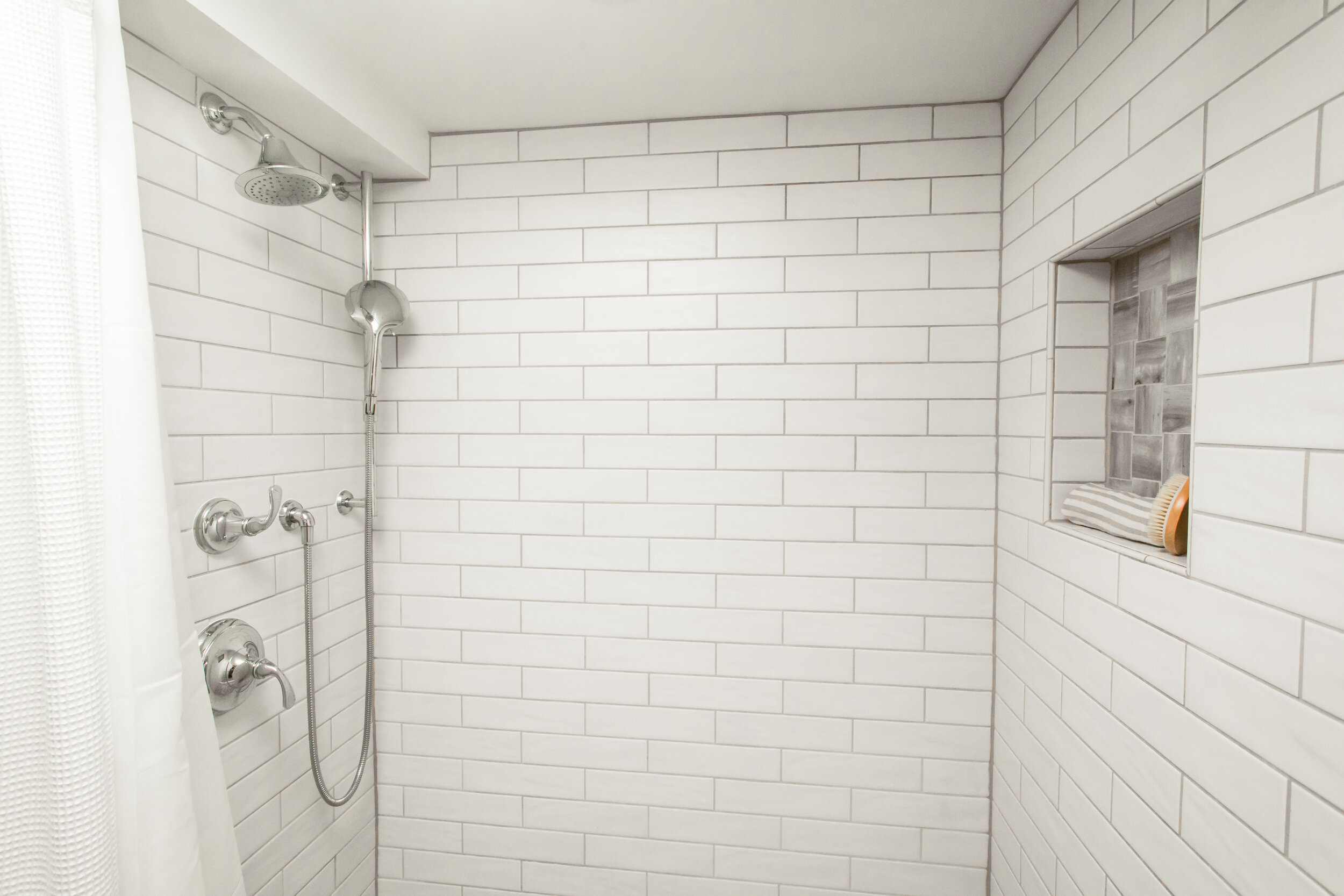
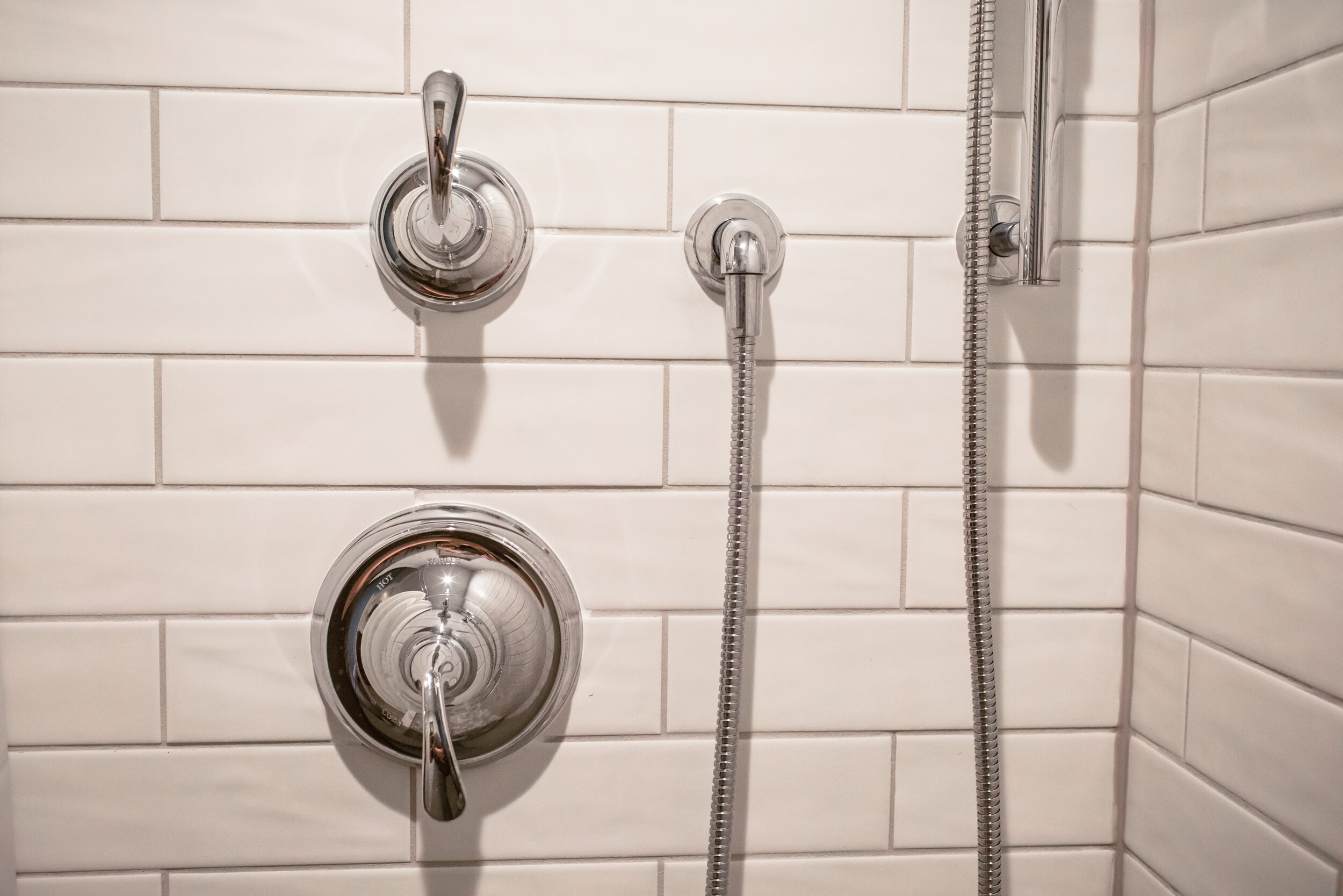
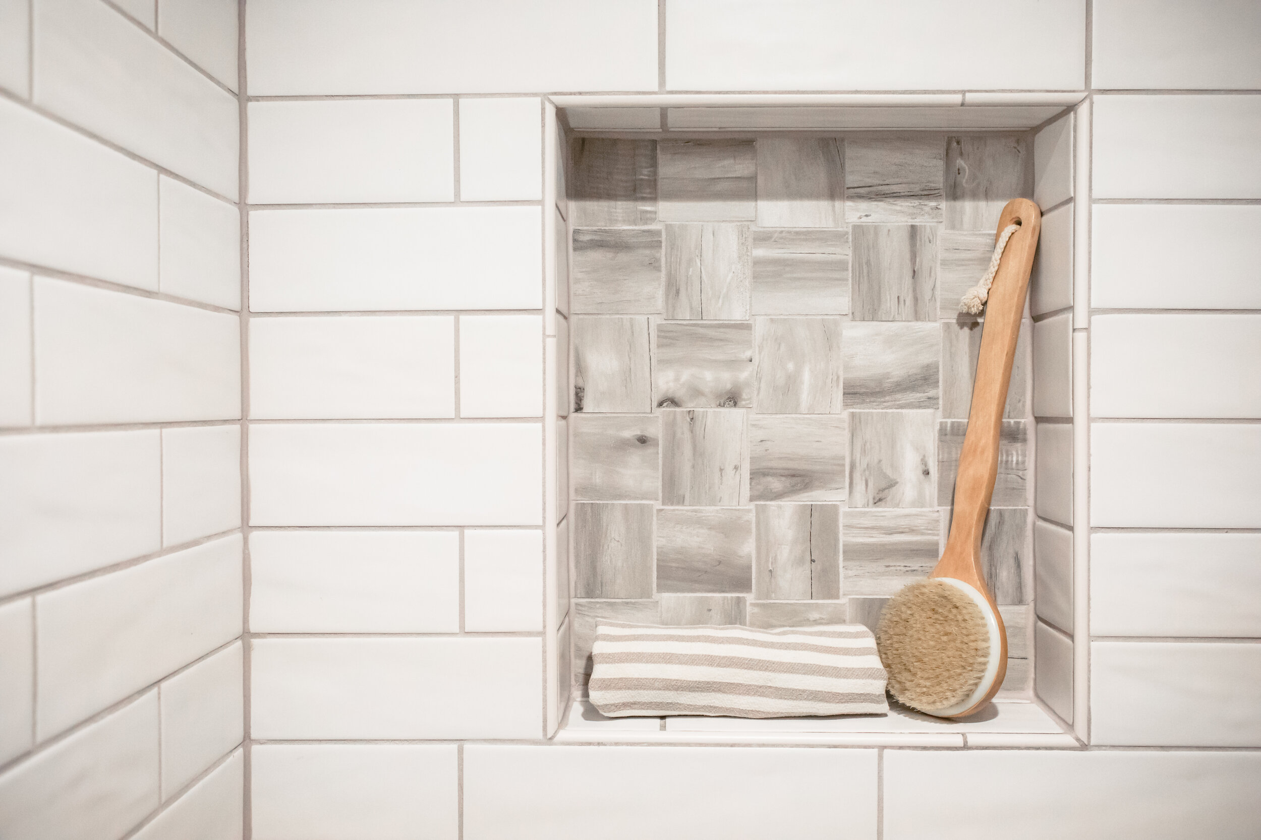
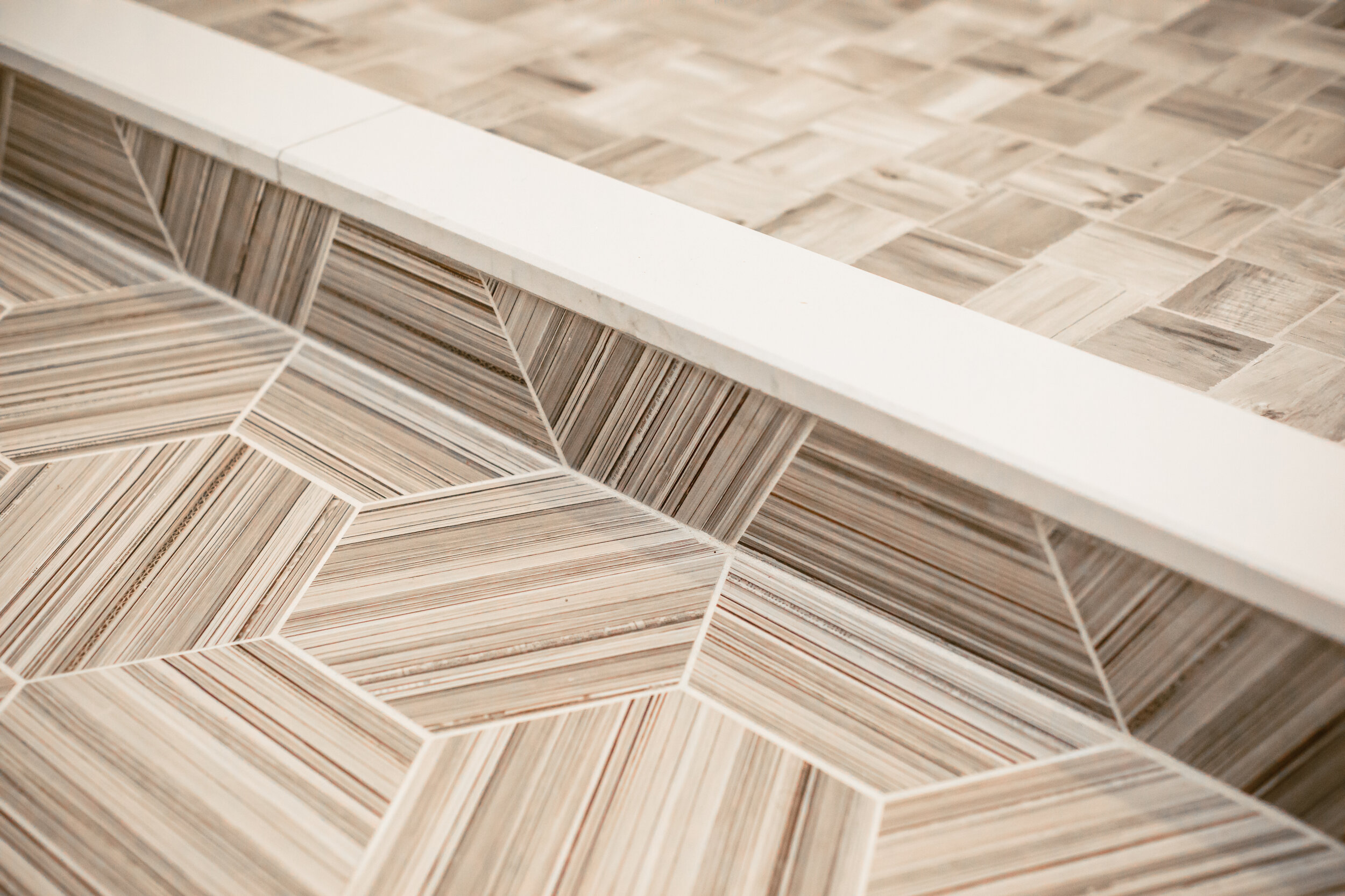
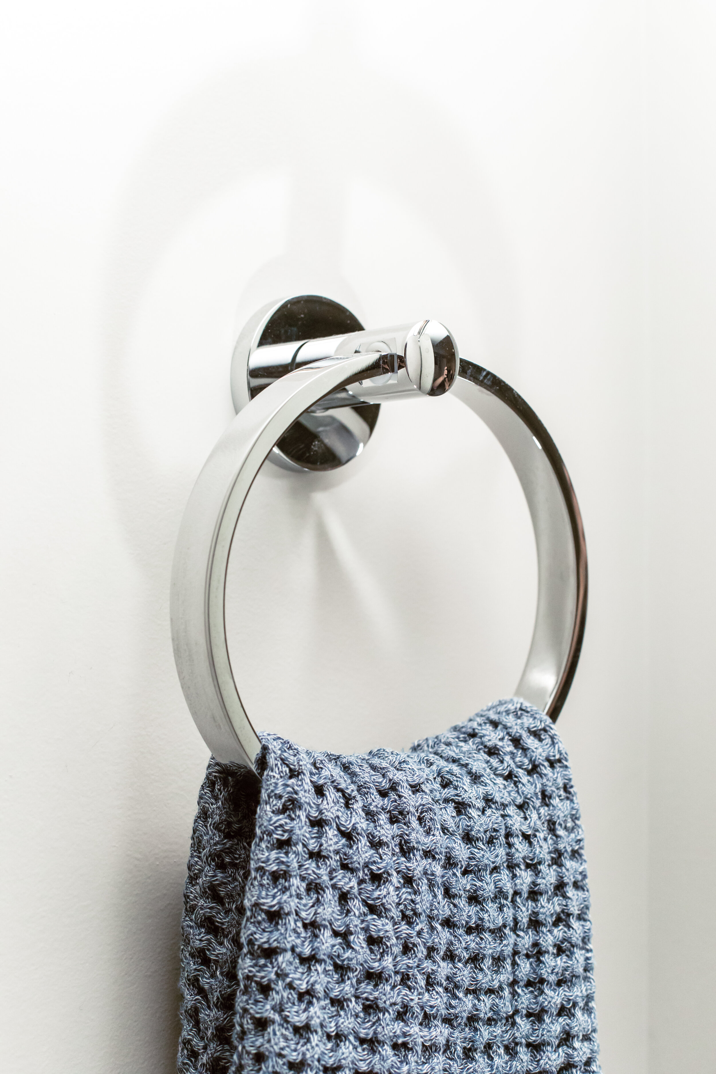
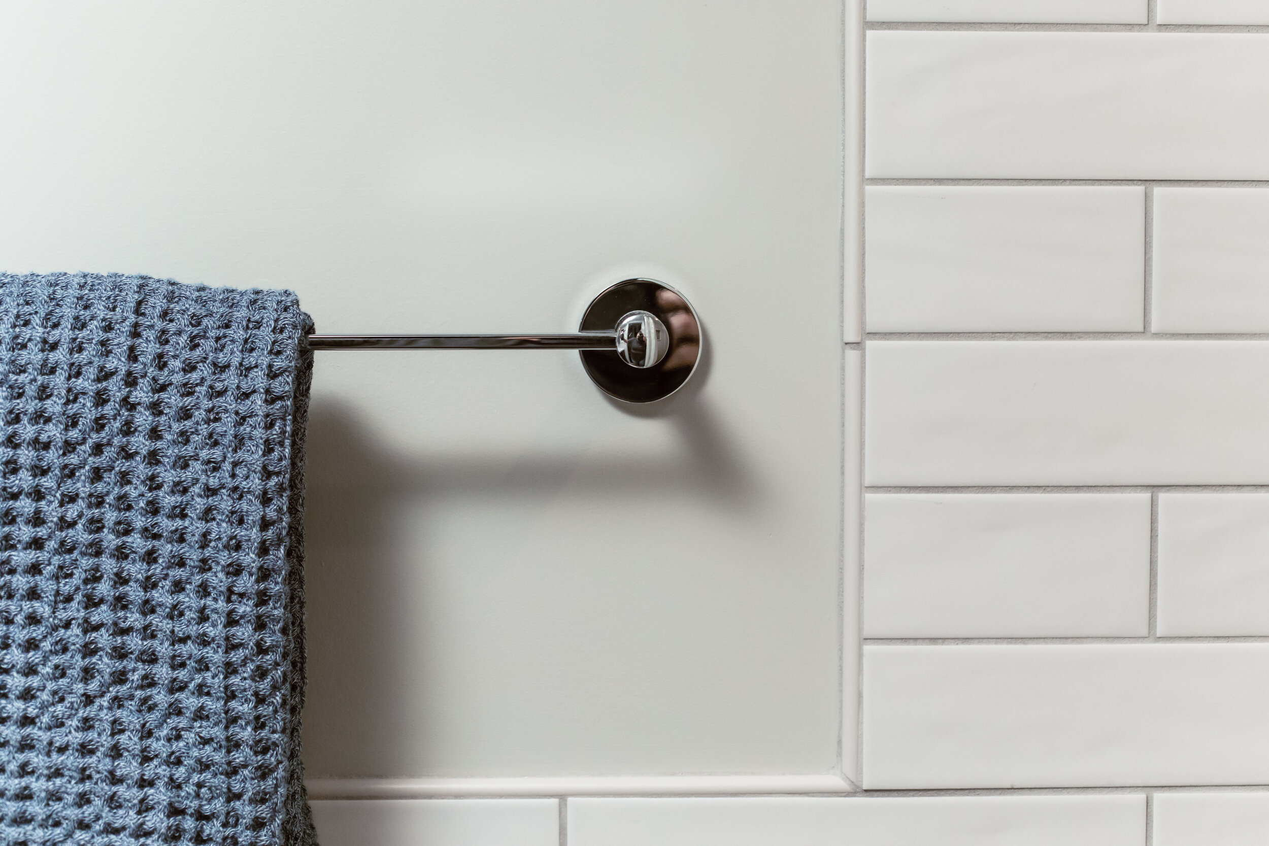
To complement the floor tile, I chose a Kiln & Penny subway tile with a matte white finish paired with the Estonia mosaic tile, which has more organic striations that go well withe the hex floor tile. Utilizing two different tones of gray grout, we minimized the contrast between tiles on both floor surfaces, while adding it to the shower and bathroom walls. To round out the palette, I wanted to keep things neutral to maintain the focus on the floor tile and wood accents by using Conservative Gray from Sherwin Williams for the walls.
While matte black finishes would have made a nice complement, my clients loved adding a modern touch with polished chrome accents in the medicine cabinet/mirror, vanity sconce, fixtures and hardware. We mixed pieces from Restoration Hardware, Pottery Barn, Schoolhouse and Kohler by aligning the finishes and designs featuring curved elements (contrasting the geometric tile). In the end, we created a space that is welcoming to guests but that, word has it, has become the favored bathroom for my clients (the best compliment).
So, what nuggets can you take away from this project if you are looking to embark on your own bathroom reno? Here are a few:
Build on a finish or feature you absolutely love and that makes the space feel special. In this case, we started with the floor tile and went from there.
Plan and pay attention to details. With such an intricate tile, we had to ensure it was laid meticulously — from the direction of the tiles to how they met the shower edge (check out the photo above with the split hex tiles). We also ensured the vanity drawers would clear the door trim easily by modifying how the tile was laid by the vanity.
Don’t be afraid to mix and match. From three different tile shapes and types to lighting, hardware and accessories from different vendors, the best finished spaces don’t look like you pulled them out of a page of a catalog.
Finally, thank you to Beth Caldwell for capturing this stunning “after”…and stay tuned for more project spotlights soon!
Finishes Guide
Hexagon Deco Chronicle Tile in Paper Bianco (Architectural Ceramics)
3x12 Kiln & Penny Gesso Natural Field Tile (Architectural Ceramics)
Vintage Recessed Medicine Cabinet in Polished Chrome (Pottery Barn)
Royale Adjustable Sconce in Polished Chrome (Restoration Hardware)
Maxwell Bathroom Accessories in Polished Chrome (Schoolhouse)
Amber Harris is the owner of At Home DC, an interior decorator and a licensed real estate agent with Keller Williams Capital Properties working with clients in DC, Maryland and Virginia.
Green & Gorgeous: Color Inspiration for Your Home
Every year, several design-focused entities name their color of the year, and this year has been dominated by rich blues — from Pantone’s Classic Blue to Sherwin-Williams’ Naval. And, as much as I love blue (especially as an alternative neutral), I am green with envy to start 2020!
When I say green, you may immediately think of a pure ROYGBIV green or perhaps a traditional hunter green or a more natural olive, and it’s exactly that range that has me excited about incorporating this color in subtle and more meaningful design elements. It can be beautiful paired with some of the aforementioned blues or be the star of the show when contrasted with clean neutrals. Moreover, during the winter months when green is lacking outside, why not bring more of it inside?
Below are a few items to draw inspiration from — whether you are simply adding a live (or faux) plant to your home or looking to create a statement with piece of furniture:
Amber Harris is the owner of At Home DC, an interior decorator and a licensed real estate agent with Keller Williams Capital Properties working with clients in DC, Maryland and Virginia.
Five Fall Finds Under $100
It’s the autumnal equinox (aka first day of fall)…even if it doesn’t feel like it in DC (currently 93 degrees). However, that doesn’t mean you can’t bring a touch of the season to your home!
Here are five stylish accessories you can add to your home this fall to have you as cozy as a pumpkin spice latte (if that’s your jam):
Amber Harris is the owner of At Home DC, an interior decorator and a licensed real estate agent with Keller Williams Capital Properties working with clients in DC, Maryland and Virginia.
Mix and Don't Match: Adding Style with Prints
From our youth, we learn how to match — like when you play one of those classic card games flipping pictures of farm animals. Matching can be helpful with games and socks, but it isn’t always your friend when creating a space with personality and style. By carefully introducing complementary colors, textures and patterns you can avoid making a space feel like it’s a page ripped out of a catalog from one store (hint: also source your pieces from more than one store…always!).
One of the easiest ways to create an original design is by playing with patterns….yes, more than one. Here are a few tips for those who aren’t comfortable mixing but want to push themselves beyond their comfort zone:
1. Pick a print you love. Start with a textile or pattern that you gravitate toward and make that the foundation you build on. It doesn’t have to be on the largest piece in the room and can even be something as small as an accent pillow.
2. Take inspiration from your print for your palette. This doesn’t necessarily mean pulling specific colors from the print or every color. If it’s a bold print/pattern, it may mean finding the right neutral in tone and saturation that will ensure your print pops. Identify primary and secondary colors that can be through lines in your space. If it’s something more subtle (like the rug pictured), think about pulling a contrasting color to feature in another piece to bring out the pattern.
3. Categorize your print and contrast. Is your primary print large or small scale? Is it floral, geometric or linear perhaps? If it’s smaller in scale, you’ll want complement it with another pattern in a larger scale. Similarly, if it’s linear, consider bringing in a floral (modern or traditional) or a pattern with more movement/roundness.
4. Pick three patterns (at least). There are many principals that invoke the rule of three. Your three patterns don’t all have to be bold but they should draw from the same palette…think a rug with a subtle geometric pattern paired with a striped accent chair and a floral accent pillow on a neutral sofa.
5. Have fun! Prints are a great way to update a space with minimal investment. If you’re afraid to commit, choose things you can return and swap easily and put a hold on those custom upholstery orders. Rugs, throw pillows , duvets, table runners and even temporary wallpaper are all easy options.
Amber Harris is the owner of At Home DC, an interior decorator and a licensed real estate agent with Keller Williams Capital Properties working with clients in DC, Maryland and Virginia.
7 (Inexpensive) Ways to Add a Splash of Spring to Your Home
Today is officially the first day of spring (we’ll see what mother nature does), and it’s the perfect time to add some new style to your home…without breaking the bank! Here are seven ways to spruce up your interior as we welcome longer days, warmer weather and all that the season brings!
1. Update your accent pillows. Regardless of season, changing the throw pillows on your sofa or bed, is an easy way to update a space on a dime. If you have lots of neutrals, consider adding contrasting hues; if you have a more finite color palette, swap a geometric pattern for a modern floral or a solid for something with texture. I always recommend investing in down or high-quality synthetic inserts in standard sizes, so you can just wash your covers and swap them easily.
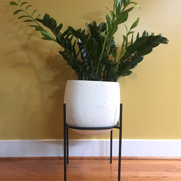
ZZ Plant I Welcomed Into My Home Last Year (Shooting Off New Growth)
2. Treat yourself to fresh flowers or a new houseplant. Greenery is the best way to add some life (literally) to your home and, if you don’t think a plant is too much of a commitment, consider adding a decorative planter and a low-maintenance addition, like a ZZ plant (Zamioculcas zamiifolia). As a bonus, plants can improve your indoor air quality! However, if that’s too big a step or your four-legged friends won’t stand for it, stop by a local store and buy a few stems to arrange yourself. I’m a big fan of the hydrangeas from Trader Joe’s (about $6 for three stems) as they easily fill out a low vase and can last up to two weeks (with regular trimming and water changes). I also find the act of arranging flowers to be relaxing and a great way to de-stress….another bonus!
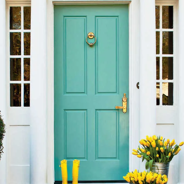
Add Life to Your Front Door with a Pop of Color (Image: Southern Living)
3. Add some color and decor to your door(s). A fresh coat of paint (and a new color) can do wonders for your walls but even updating your doors can create a stylish impact (and take a lot less time). If you have a street-facing front door, consider an accent color that coordinates with your exterior….and add a new doormat, wreath or planter while you’re at it. If you live in a condo, simply painting the interior (if you have restrictions) with a bold color adds tons of style. Need more tips? Southern Living has you covered.
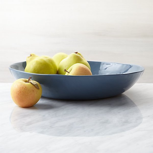
4. Edit your kitchen countertops & dining room table. We’re all familiar with spring cleaning but have you taken inventory of what’s on your kitchen counters or dining table? Now’s the time to edit what’s out on your kitchen surfaces (what do you use daily and what can go in the cabinets or pantry) and perhaps add a functional accent piece, like a colorful bowl you can fill with fresh fruit and veggies from your local farmers market or a bright canister to store frequently used cooking tools. Similarly, refresh your dining room by adding a colorful runner to your table and simple accessories (maybe even those flowers you brought home earlier).
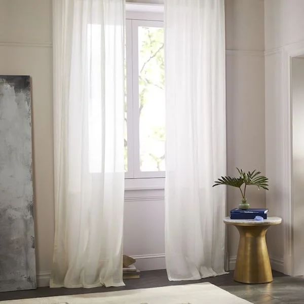
5. Let the sun shine in. Take advantage of more hours of natural light by updating your window treatments. If you have curtains, consider swapping them for a lighter linen option, like the West Elm ones here. If you have blinds or shades, keep them open and add some sheers to frame and soften your window. Now’s the time to give your windows a good clean inside and out…you’ll be amazed at the difference!
6. Bring the outside in with photography. One of my favorite DIY decorating hacks is to use photography and gallery frames to create inexpensive, meaningful and impactful wall art. Take your camera and grab some shots of the cherry blossoms and other flowers in bloom or find a talented friend and ask if you can print some of their shots you’ve hearted on Instagram. If you already have frames, just swap out the photos. If you don’t, head to Michaels for great deals on gallery-style frames (think narrow edges, modern lines and exaggerated white mats).
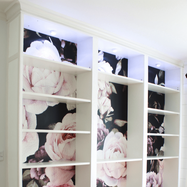
7. Re-style your shelves. If you have built-in bookshelves or a freestanding set, add some flower power with a removable wallpaper in the back (like this modern floral project from Top Shelf DIY). If you aren’t ready for wallpaper, simply start by removing all items from your shelves (and other flat surfaces) and carefully select pieces to add back in. Mix books with objects, framed items and other meaningful pieces. Less is always more.
Happy Spring!
Amber Harris is the owner of At Home DC, an interior decorator and a licensed real estate agent with Keller Williams Capital Properties working with clients in DC, Maryland and Virginia.
10 Holiday Gifts Under $100 for the Home-Lover You Love
It’s hard to believe the holiday season is already upon us (even if some stores would have you think the Christmas season started in August). The winter months are the perfect time of year to re-imagine your interior spaces…and a great source of ideas for loved ones you are looking to shop for!
Here are ten of my favorite decorating finds (all under $100) that make great gifts this time of year (or really any time)!
And, if you still can’t decide how best to delight that home-lover in your life, consider giving them expert help with a gift certificate for decorating services from At Home DC…available in the DC area and for remote consultations!
Amber Harris is the owner of At Home DC, an interior decorator and a licensed real estate agent with Keller Williams Capital Properties working with clients in DC, Maryland and Virginia.
Project Spotlight: Focusing on Function & Family in Southeast DC
While interior design is thought to primarily be concerned with aesthetics, some of the biggest transformations when working with a designer or decorator are measured by the function of the space for the person(s) that call it home.
That is exactly the case with the family I had the pleasure of working with in southeast DC recently. While they loved their DC rowhome, with two rambunctious kids, the space (and more importantly the furniture) they had did not match their style or need for flexibility. At the heart of this challenge was a beautiful, traditional six-seat dining room table that rarely was used partially for fear of it falling prey to adorable but potentially destructive young hands. This piece was creating a physical and emotional block that was preventing the space from meeting their needs.
Other challenges that came up through our consultation included:
- Frantic feel when you entered the house and a need for organization;
- Limited space for kids to play (especially important with all the rainy days we've had lately);
- Multiple dining spaces but none of which met all their needs; and
- Untapped space in the kitchen that housed a mostly unused desk turned drop area.
To tackle these problems, we identified a few keys tasks and pieces that would transform the design and function of the home:
- Consolidate dining spaces from three to two, including adding a cost-effective dining nook and new, kid-friendly drop-leaf dining room table (allowing the dining room to become a larger playroom, when needed);
- Bring more modern lines and finishes to the space, playing into existing wrought iron elements and adding more casual/weathered wood elements;
- Modernize the color palette, while working with the existing wall color (Benjamin Moore's Spanish Olive);
- Incorporate flexible pieces that can work in multiple spaces and be moved easily, as well storage options (primarily for toys); and
- Add sophistication by juxtaposing patterns and textures.
And here's where we are now (photos by Beth Caldwell):
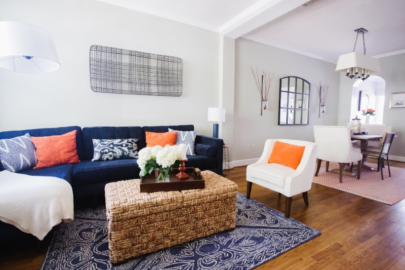
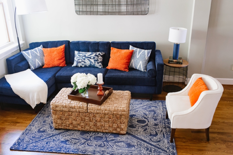
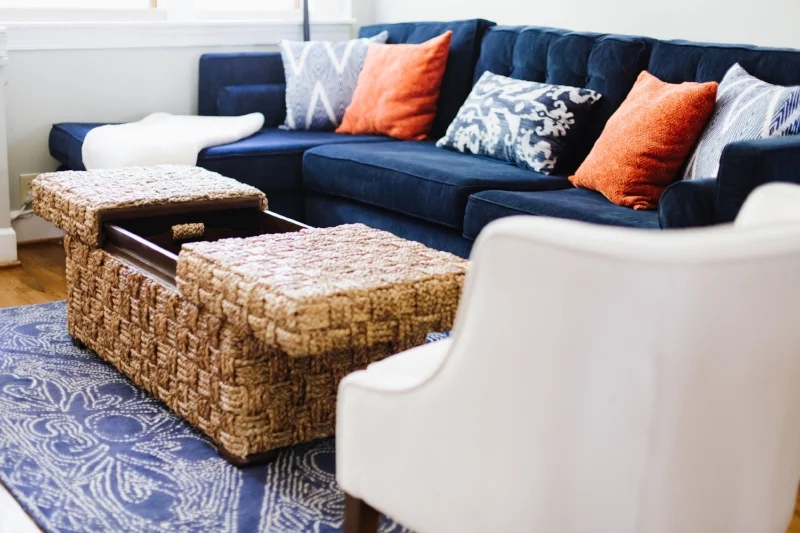
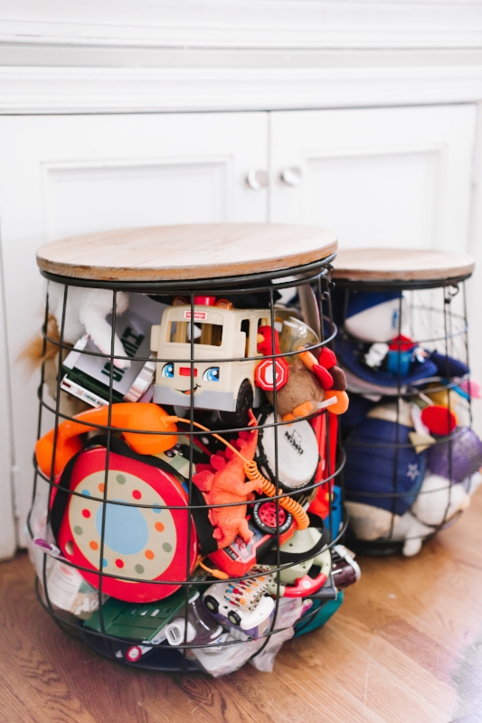
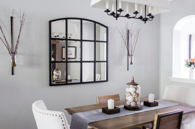
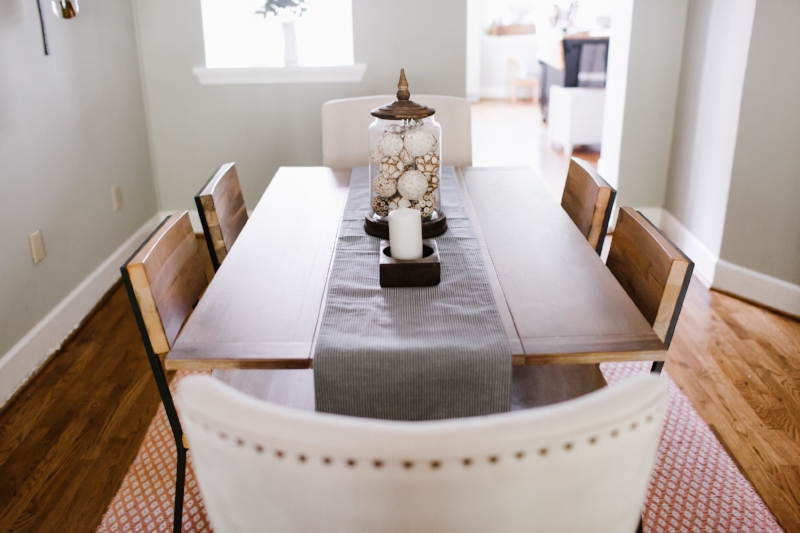
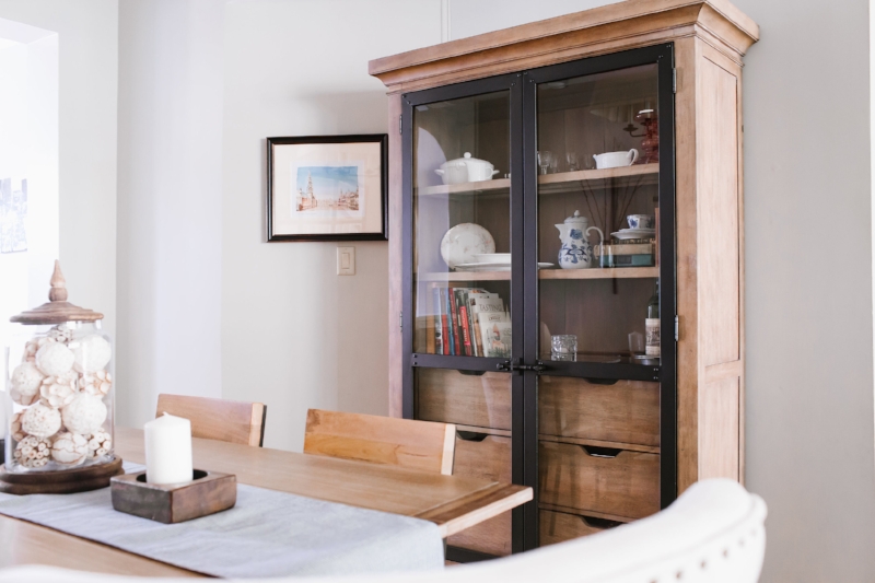
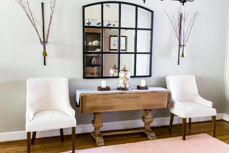
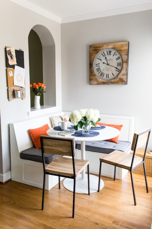
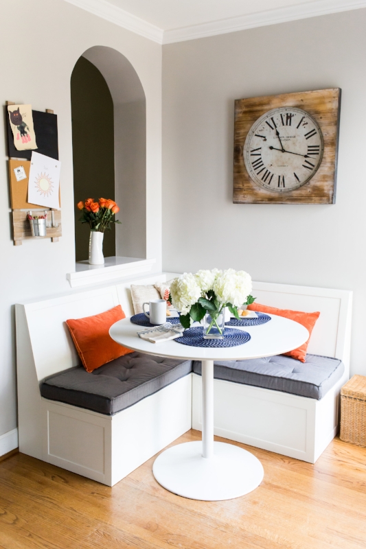
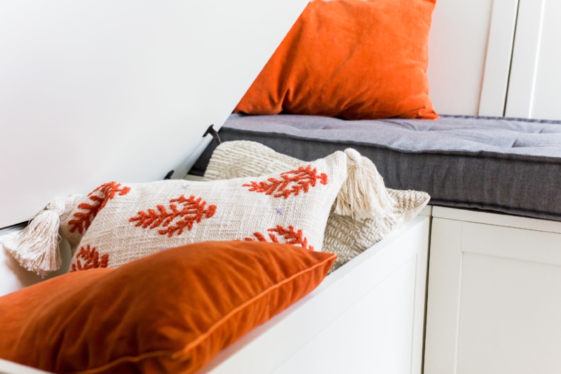
While there is still room for some more touches (new/updated upholstered cornices above the windows, removing baseboards in dining nook for a more custom look with the benches, adding a console in the dining room for extra serving space, etc.), the transformation has helped my clients enjoy their home even more...which is always priority number one from the outset.
Goods Guide
Living Room
- Braxton Sectiona in Bentley Indigo with Mocha Legs (Joybird)
- 5’ x 7’ Mirabelle Rug in Indigo (Serena & Lily)
- Andros Sliding Trunk (Grandin Road)
- Molly Accent Chair in Stella Ivory (Grandin Road)
- Tobacco Basket Metal Wall Art (Crate & Barrel)
- Three-Piece Metal and Wood Basket Set (Wayfair)
- Modern Cylinder Ceramic Table Lamp in Navy Blue (Shades of Light)
- Loden Arc Floor Lamp (World Market)
- Oliver 100% Cotton Throw Pillow in Navy (Wayfair)
- Lindon Spice Throw Pillow (Pier 1)
- Lindon Spice Lumbar Pillow (Pier 1)
- Printed Indigo Throw Pillow (World Market) - No Longer Available
Dining Room
- Bradding Collection Drop Leaf Natural Stonewash Dining Table (Pier 1)
- 6' x 9' Safavieh Handmade Boston Flatweave Orange Cotton Rug (Overstock)
- Aimee Accent Chair in Stella Ivory (Grandin Road)
- Raw Mango Rustic Dining Chair (West Elm)
- Fort Oglethorpe Lighted China Cabinet (Birch Lane) - No Longer Available
- Pre-Existing Wall Mirror, Sconces & Chandelier
Dining Nook
- Breton Banquette - Two 30" and One Corner (Ballard Designs)
- Odyssey White Dining Table (CB2)
- Raw Mango Rustic Dining Chair (West Elm)
- Embroidered Rue Pillow (Anthropologie)
- Lindon Spice Lumbar Pillow (Pier 1)
- Custom Banquette Cushions; Pre-Exising Wall Clock
Amber Harris is the owner of At Home DC, an interior decorator and a licensed real estate agent with Keller Williams Capital Properties working with clients in DC, Maryland and Virginia.
'Trading Spaces' Tidbits: Lessons from Our Favorite TV Designers
While I've always been interested and invested in interior design on some level (i.e.,I would redecorate my room as often as my mom/budget would allow in middle school), there's no doubt that the debut of Trading Spaces on TLC in 2000 was a big moment for me and millions across the country (and later around the world).
As a junior at Georgetown University, TLC was always on in our dorms and living rooms (can't forget A Baby Story and A Wedding Story, too), and Trading Spaces had a great role in making interior decorating accessible. Fast forward to today where stores likes Home Goods and Wayfair and platforms like Houzz and Pinterest help individuals pull together their perfect space or, at the least, articulate their vision to a decorator or designer.
Little did I know in 2000, that I would be working for the company responsible for TLC and Trading Spaces two short years later. Over 14 years, I worked my way to VP and also had a chance to meet a range of talent, including a few of the original designers. With the return of the series earlier this month, I thought it would be fun (and informative) to reflect on a few design lessons we can gleam from the cast (and that often come up as I'm consulting with clients).
Vern Yip: Timeless Design Doesn't Have to Be Boring
While there were always designers you loved to hate, I found myself drawn primarily to Vern Yip's work. Last month, I had a chance to meet Vern (again) at the Washington Design Center's Spring Market, where he gave the keynote, and his approach to timeless design remains. Trends will come and go, but classic lines, patterns and finishes aren't the opposite of "on trend." When creating a space, bigger spends are best spent on furniture and accessories that will pass the test of time. Layer lower cost, trendier pieces on top of those (think an accent table or decorative object) if you want to be "of the moment"...then you won't feel guilty when you want to move on.
Laurie Smith: Beautiful Fabrics Can Elevate Any Space
Laurie Smith was well known for spending the largest portion of her limited budgets on fabrics, adding color and pattern through silks and other luxe textiles. Throw pillows are a great way to update a space, whether a living room, bedroom or dining nook and you can find new and vintage fabrics to make custom pillows or search your favorite store for pre-made covers that make a statement through color, texture, pattern or special details like trim, fringe and beading.
Genevieve Gorder: Fun is Part of Function
When choosing someone to partner with on your space, you want to have good communication and good energy, and Genevieve Gorder definitely always (and still has) both. Gorder always brought an energy to the rooms she designed not taking herself or the task at hand too seriously. Your home should bring you joy....so ditch that expensive white sofa that you hover over when guests sit down with wine and find furniture and accessories that are stylish and livable.
Were you a fan of the original Trading Spaces and/or are you watching the reboot? If so, what are the tidbits you've taken away and from whom?
Amber Harris is the owner of At Home DC, an interior decorator and a licensed real estate agent with Keller Williams Capital Properties working with clients in DC, Maryland and Virginia.
Get Ready for Spring & Summer with Upcoming Free Workshop!
In February, I had the pleasure of presenting an interactive session on designing for small spaces in conjunction with the DC Public Library. With more than 20 in attendance and positive feedback, I am excited to share that I'll be returning to the Petworth Library in May...this time with a superstar of landscape design!
Edamarie Mattei and I met more than 10 years ago by chance in a tennis class, and we connected over the sport, our shared alma mater (Georgetown University) and our interests in potentially pursuing careers beyond our current (at the time) lines of work in education and media, respectively. Since then Edamarie has built a thriving landscape design company, Backyard Bounty.
That brings us to today as we both run our own businesses and decided why not tackle the topic of entertaining during warm weather months from both our areas of expertise! We hope you'll join us on May 15th:
Indoor & Outdoor Entertaining: Making Your Spaces Function & Flow
Tuesday, May 15 | 7-8:30pm
Petworth Library (4200 Kansas Avenue NW) | Lower Level Meeting Room
Amber Harris is the owner of At Home DC, an interior decorator and a licensed real estate agent with Keller Williams Capital Properties working with clients in DC, Maryland and Virginia.
Free Local Event on February 8: Small Spaces, Big Style
One of the many things I love about my line of work is getting to meet (and work with) neighbors, and I am looking forward to meeting many more next month at a special workshop I am hosting with my friends at the Petworth Library:
Small Spaces, Big Style
Thursday, February 8 | 7-8:30pm
Petworth Library (4200 Kansas Avenue NW) | Lower Level Meeting Room
RSVP Today!
Inspired by my work with clients that have small spaces (like this bathroom), I'll be sharing tips on how to make the most of all types of tight spaces. I also have asked participants to share their dilemmas before the session for potential inclusion (just email me).
Click the link above or the button below to let me know if I'll see you there!
Amber Harris is the owner of At Home DC, an interior decorator and a licensed real estate agent with Keller Williams Capital Properties working with clients in DC, Maryland and Virginia.
Bathroom Makeover: Small & Green to Spa-Like & Serene
Even if we only spend a fraction of our day there, we place a premium on bathrooms. It's not uncommon for many of DC's row homes to lack a dedicated master bathroom but, often when they do have one, it's hardly a spacious five-piece en-suite.
My clients recently had the chance to move to a larger home in the Brightwood Park neighborhood of Washington, DC, but their new-found master bath was dated and hardly a retreat (see below). While the small space meant there weren't any options for reconfiguring the layout (without undertaking a major renovation), we were able to radically change the feel of the space with new tile, new fixtures and combining some Scandinavian inspiration with natural elements.
Before...
You can see the end result further down, but I wanted to share a few tips and tricks that helped us create this miniature master spa bath:
- Keep your color palette simple. Less is more in terms of color when creating a serene space, especially a bathroom. While white is the go-to for a spa-like feel, adding a contrasting but muted color (in this case a lighter shade of Sherwin-Williams Bonsai Tint, created by mixing in a little more white to tone it down) with a lighter wood tone (via our tile) takes this bathroom from basic to custom.
- Limit the type of tile (color, size and shape) to create a more spacious feel. For this bathroom, we used a 6" x 24" Driftwood tile (in Greywood) from Architectural Ceramics. Meant to simulate wood planks, the tile was laid vertically in the shower to make the tight stall feel larger and horizontally along the floor to make the space feel wider. We did use a smaller scale 2" square tile for the shower floor, but you also could up the spa-feel by opting for a pebble floor (check out Island Stone's awesome options).
- Choose smart storage options. While less than 19" deep, the vanity selected features plenty of storage - concealed behind doors and using the open shelf at the bottom. While it may be tempting to add shelves above the toilet (as before), these would contribute to making the space feel smaller; alternatives, like a multipurpose baskets (as pictured below), allow you to store extra towels and toiletries in a stylish, mobile and contemporary way.
- Blend modern lines with organic materials and shapes. A clean-lined vanity and rectangular tiles could easily read cold but adding in natural textures, such as the twig-based wall art and the rope details on the waste basket and accompanying storage basket (all from HomeGoods), off sets the harder edges without going too country or rustic.
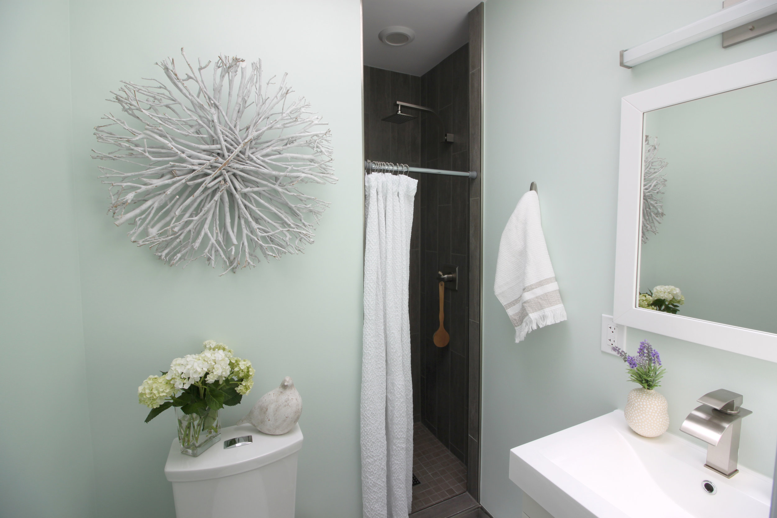

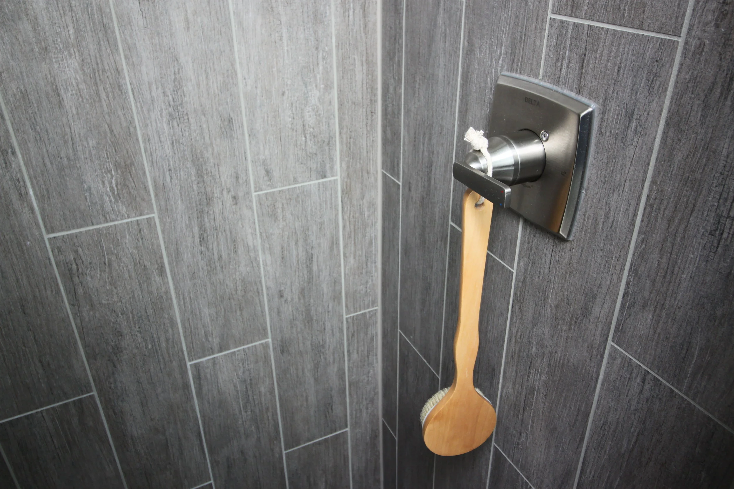
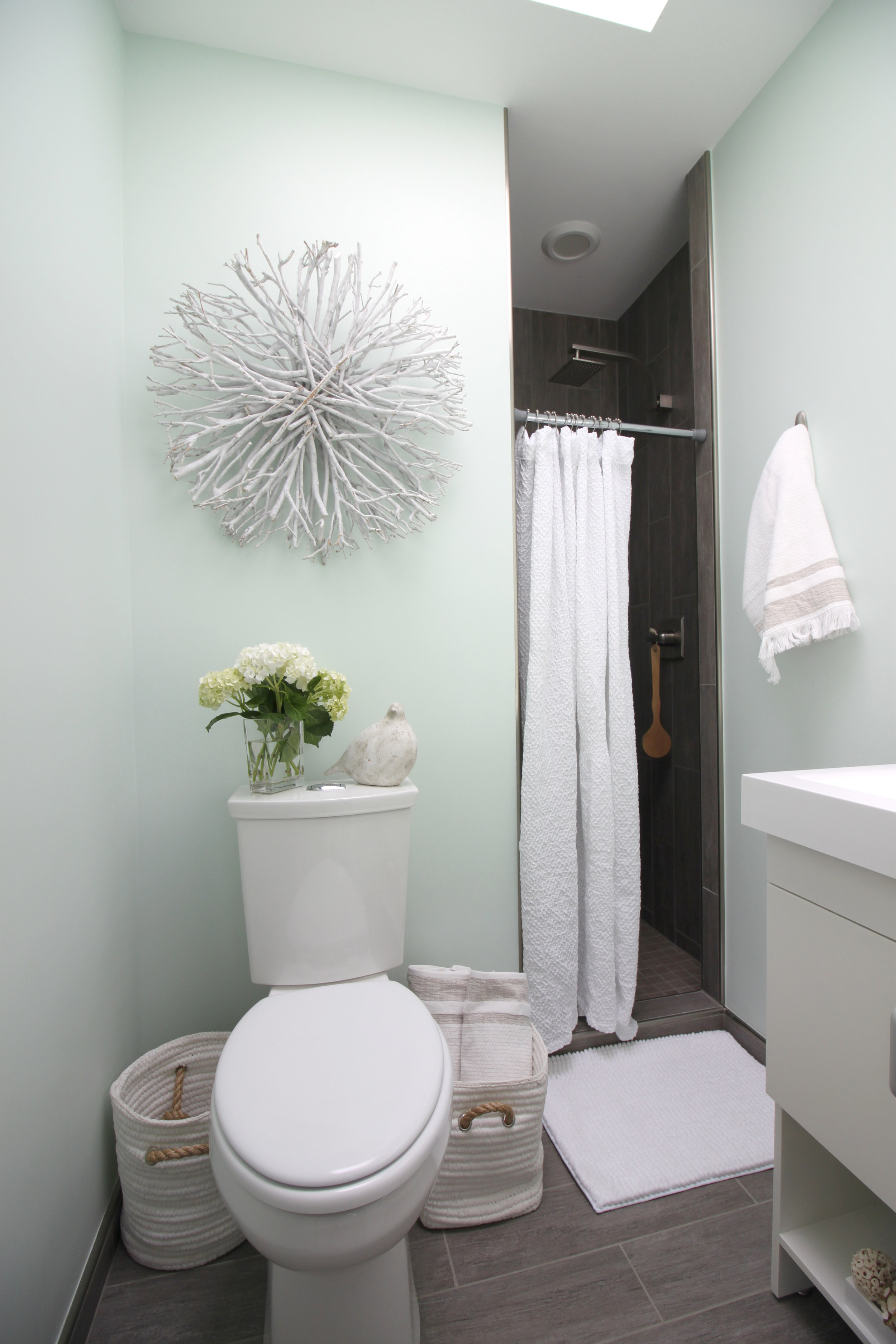
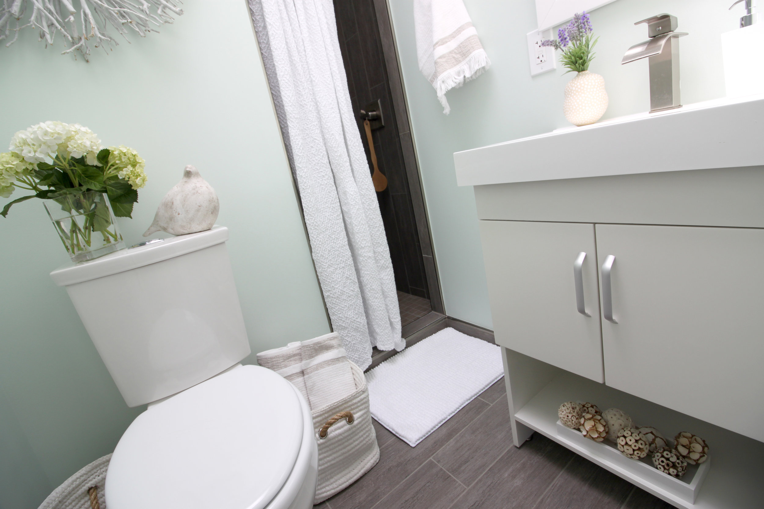
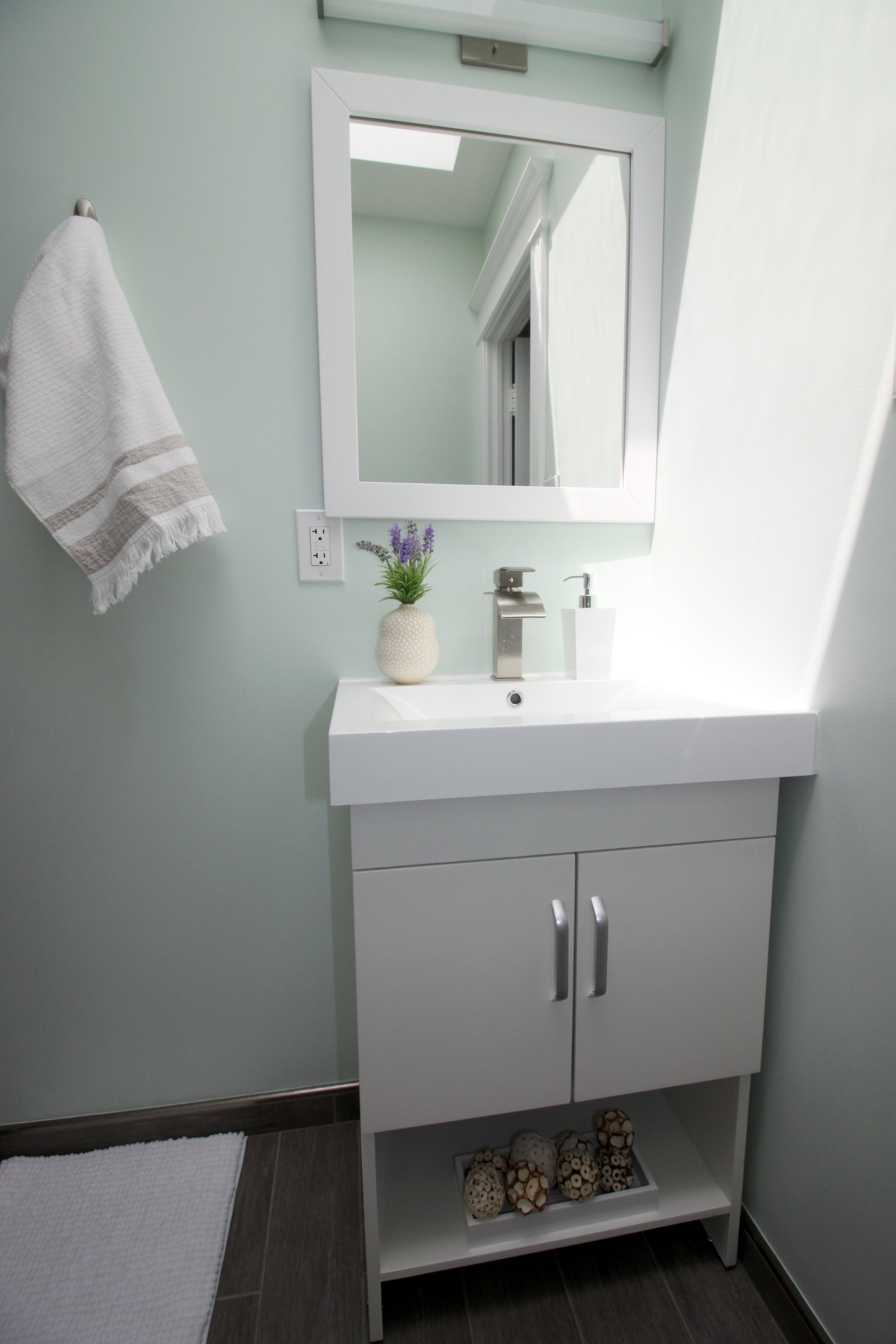
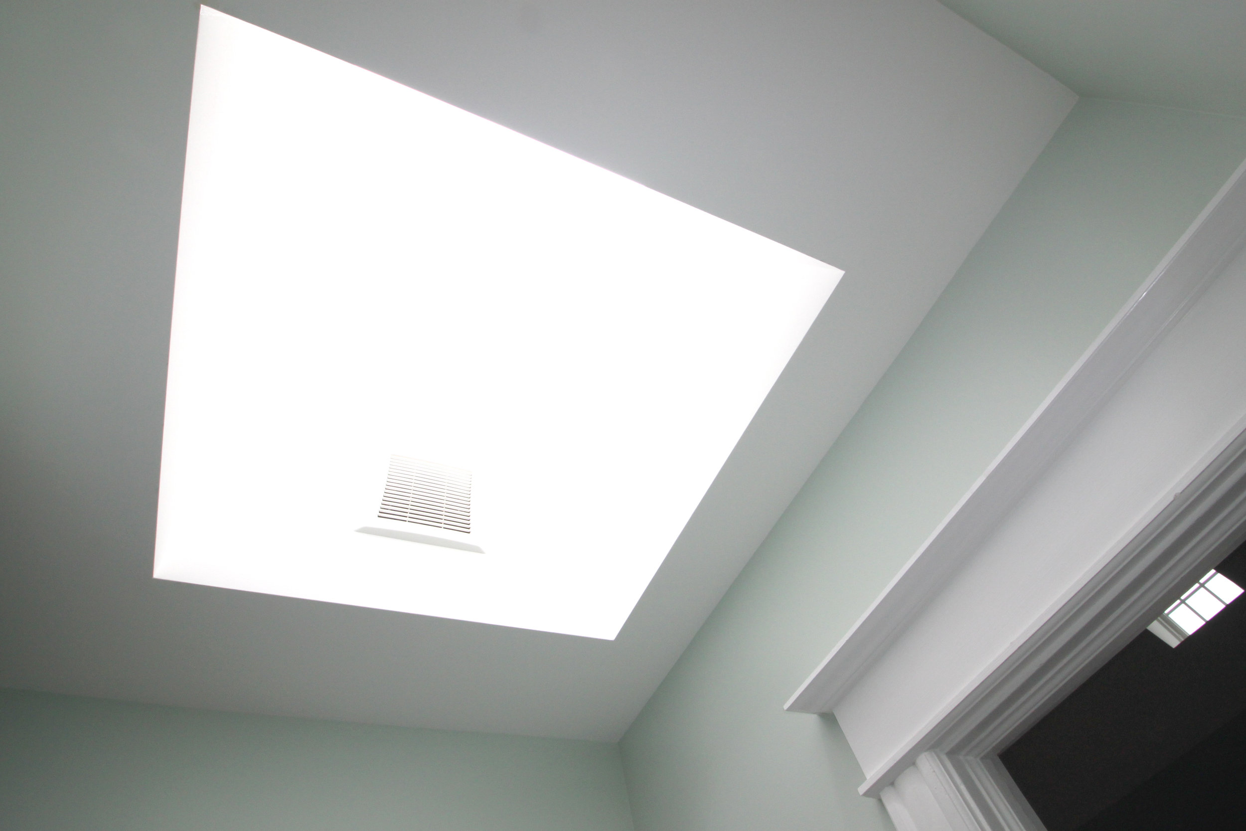
All in all, I just love the way we were able to create a personal spa in such limited space for these deserving clients.
Amber Harris is the owner of At Home DC, an interior decorator and a licensed real estate agent with Keller Williams Capital Properties working with clients in DC, Maryland and Virginia.
Earthly Inspiration for the Home
One of the many things I love about Washington, DC is the sheer number of (mostly free) museums that are minutes away from my home. That being said, it often takes out-of-town visitors to nudge me to take some time to enjoy them and their exhibits.
A few days ago, my nephew and I spent a good part of the day in two Smithsonians, including the National Museum of Natural History. While many flock to the Hope Diamond, we ended up getting sucked into the surrounding Geology and Gems & Minerals exhibits. Design-wise we've seen geodes as bookends and lamps and seen malachite as wall art and even inspiring wallpaper prints, so I thought I'd use my visit to explore some colors that caught my eye and could add a interest to your interiors...enjoy!
Striped La Jolla Basket (Medium: $128; Source: Serena & Lily)
While I neglected to get the name of this mineral (believe it may be chalcedony), this basket reminds me of the dusty pink shards (and, like the gems and minerals we saw, no two of these baskets are the same.
Pink isn't just for a girl's room, so try adding these to a mid-century design based in medium grays or navy blue. Baskets like these are great for adding style and storing a multitude of items - from spare throws or magazines to dog toys!
Ink & Ivy Rocket Armchair (Medium: $239.99; Source: Wayfair)
Continuing with some more muted tones, I love this pale jade-colored Mesolite - blending sharp and soft. This Ink & Ivy chair does just that with its strong structural wood lines and lighter upholstery (also comes in a bench).
This would be a great reading chair in a bedroom (pair with a matte metallic floor lamp) or you could use a pair to create a seating area (perhaps with a c-table) or to accompany a couch in a full living room setup.
Welbis Writing Desk ($321.99; Source: Joss & Main)
A bold blue is not for the faint of heart, but this lapis lazuli-inspired desk is a great accent in a home office or as a work space in a master bedroom. If you need a desk in a master, try mixing things up and pairing it with this matching chest as a side table on the opposing side of the bed.
Amber Harris is the owner of At Home DC, an interior decorator and a licensed real estate agent with Keller Williams Capital Properties working with clients in DC, Maryland and Virginia.

