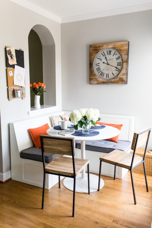
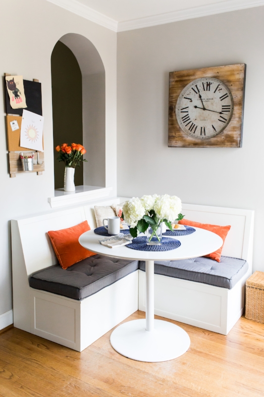
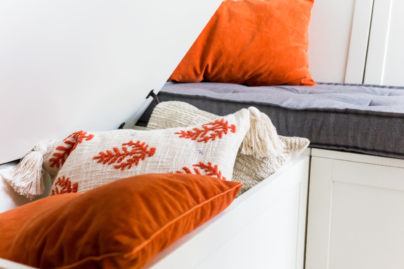
One of the best compliments is when past clients connect me with future clients and last year I was lucky to have the opportunity to partner with Audrey & David to help make their new home in American University Park (built in 1937, mind you) the perfect “at home” for their young family of five (plus one furry friend).
Whimsical Windom
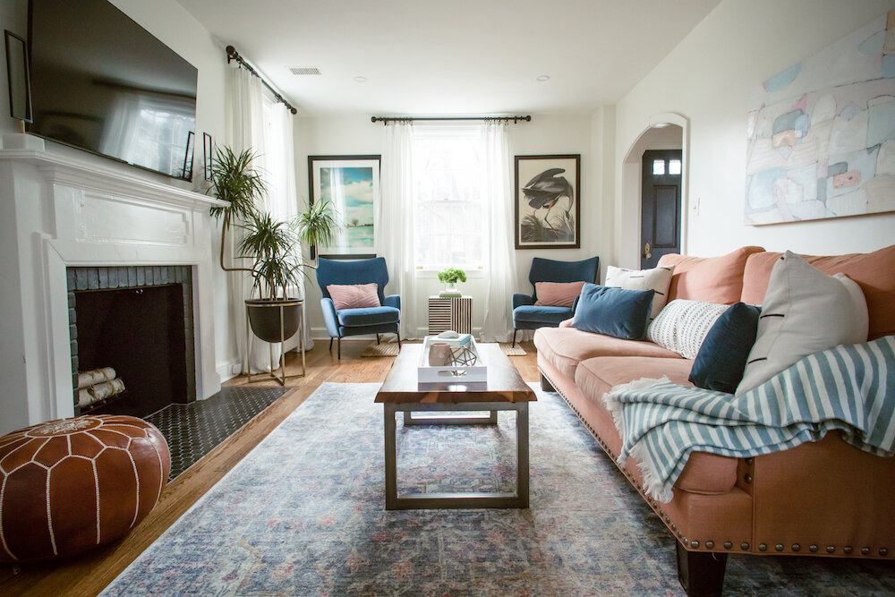
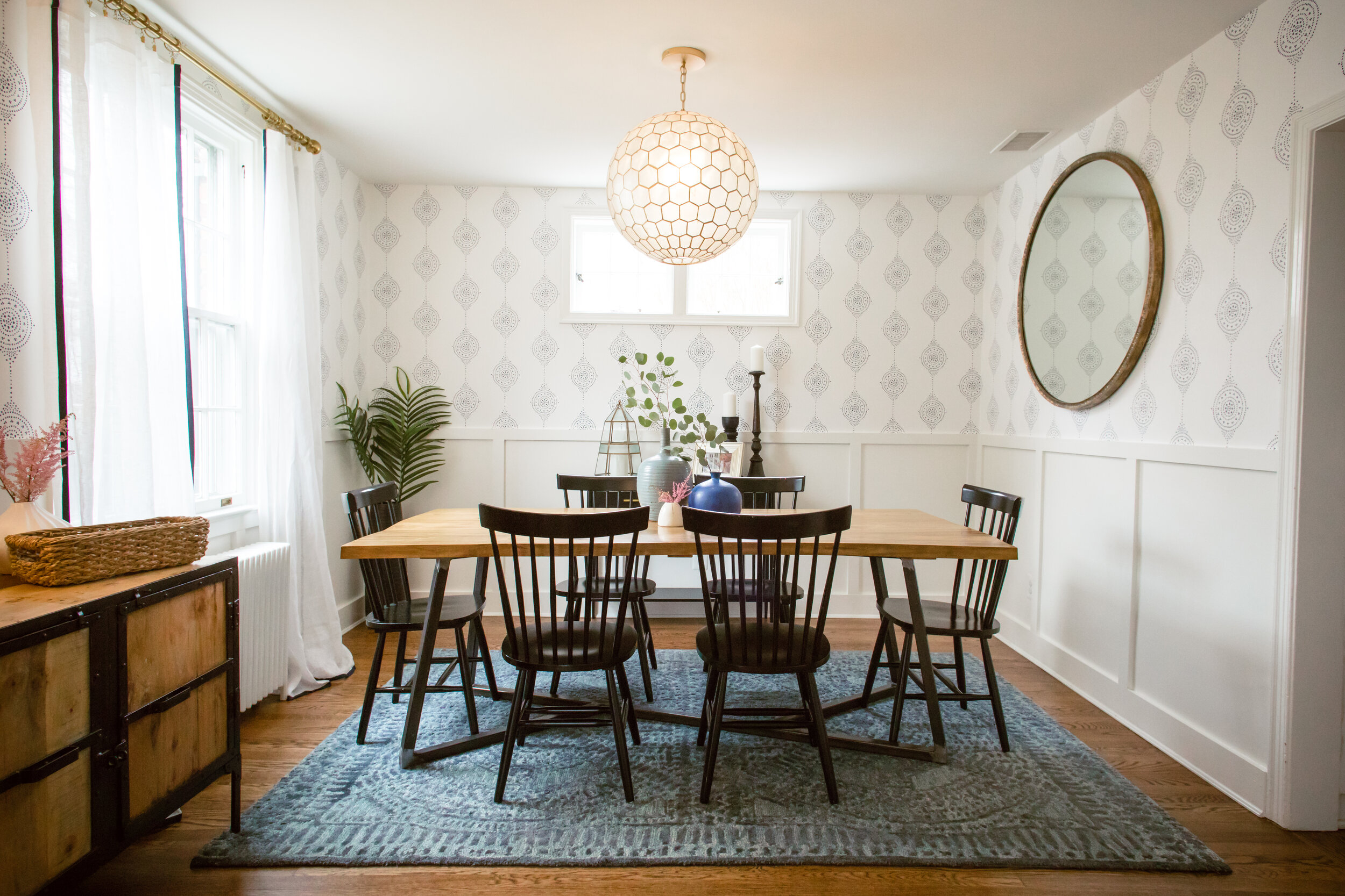
While my clients already had a few projects in mind for their main level living areas (such as refinishing the hardwood floors, painting and adding recessed lighting), we made a few additions — including installing a modern wainscoting to the dining room topped with a fun wallpaper and making the front door pop on the inside in a beautiful deep blue. However, we spent most of our time focusing on fixtures and finishes that would be updated, family friendly and stylish and complement this DC colonial.
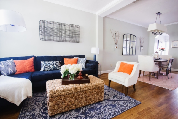
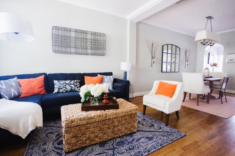
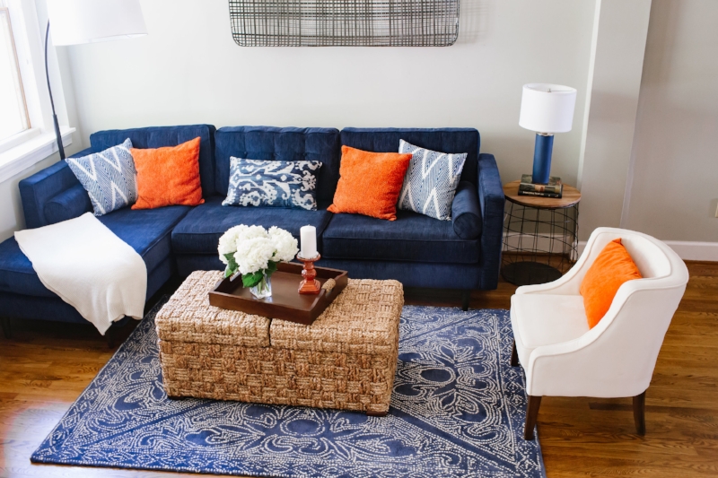
Working with pieces that would be moving to their new home, including a well-loved sofa and beautiful dining room table, the ultimate goal was an eclectic but timeless space where modern touches could play with rustic and bohemian accents. For our palette we focused on blending tones of blue and blush while adding structure with black and white accents (which you’ll see in curtain hardware, that amazing inlay accent table and even subtle pinstriping in the curtains) and warmth with gold tones.
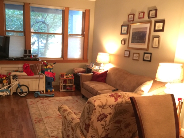
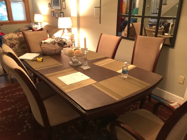
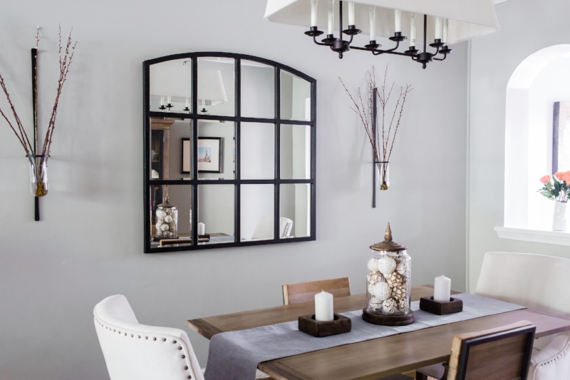
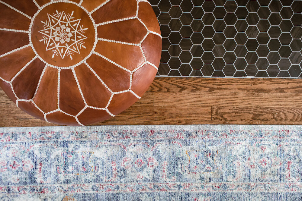
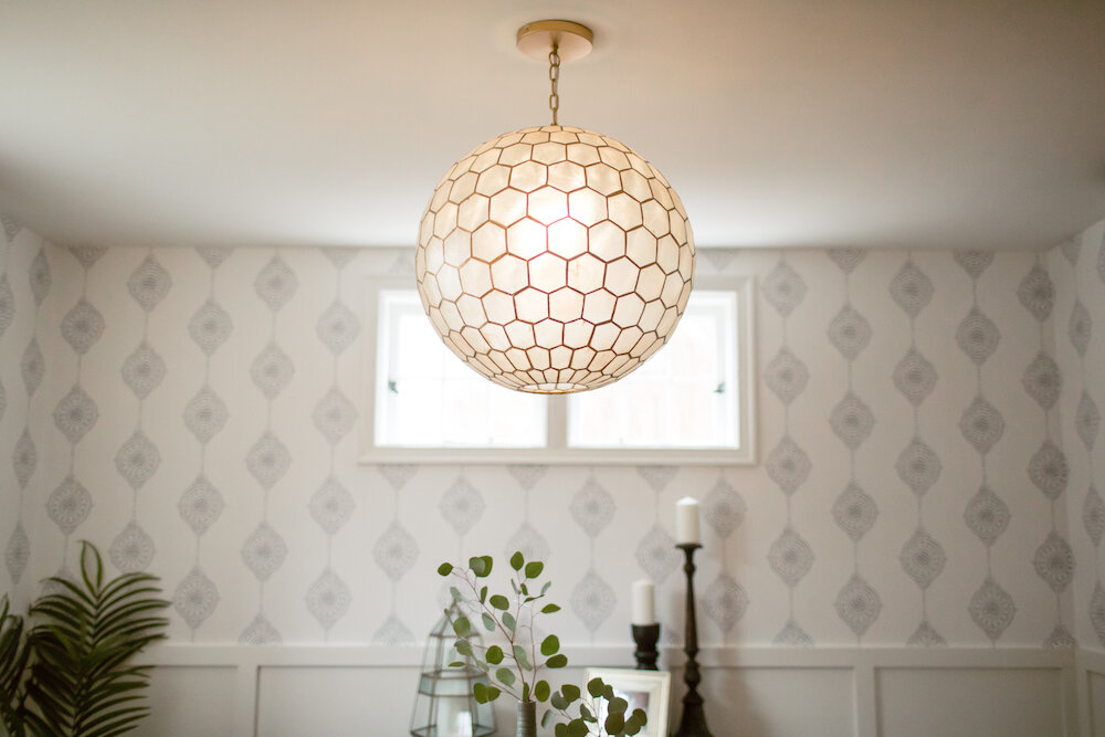
We also played with shapes, and you’ll see a theme of hexagons throughout, balanced with round accents (from side tables and mirrors to finials) and organic edges in pieces like the coffee table. And, while not an open concept space, we wanted spaces to talk to each other but each have have own feel. Above you’ll see before and after shots of the living and dining rooms, and you can scroll down for a slide show with more details. And, while we shopped for decorative accents to complete the spaces, I love how we were able to include pieces of art from the family’s collection to complete the look.
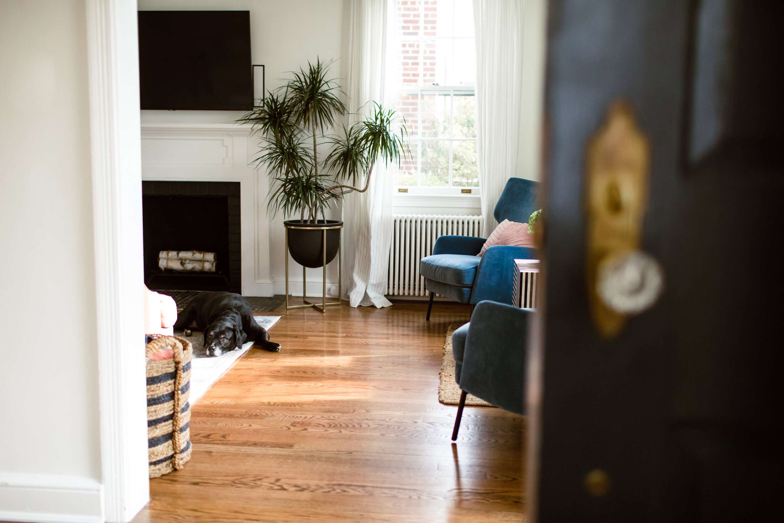
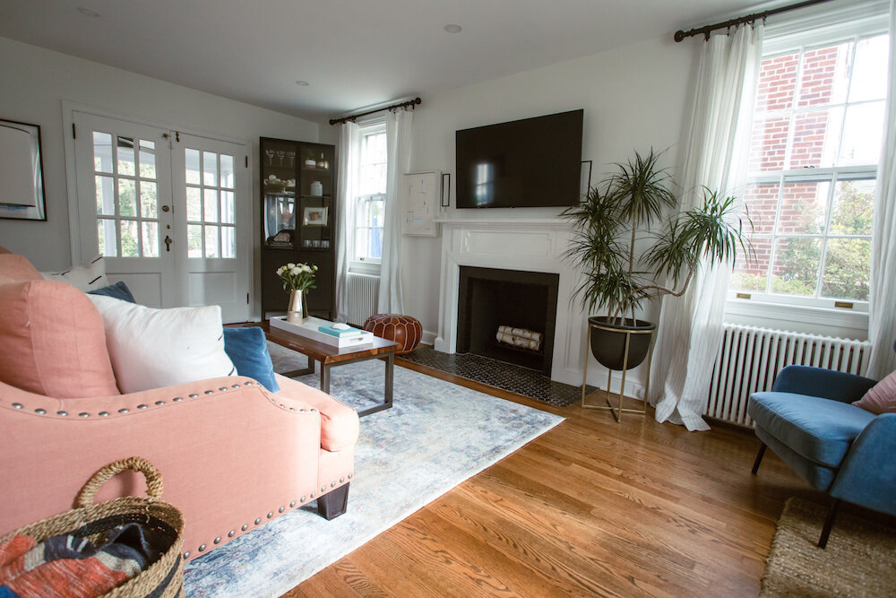
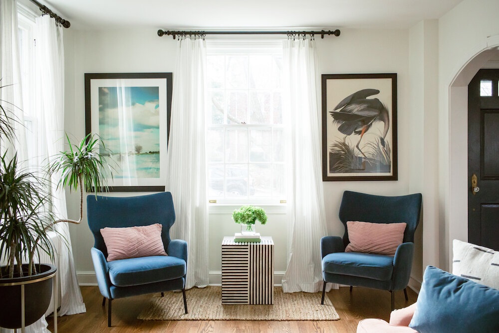
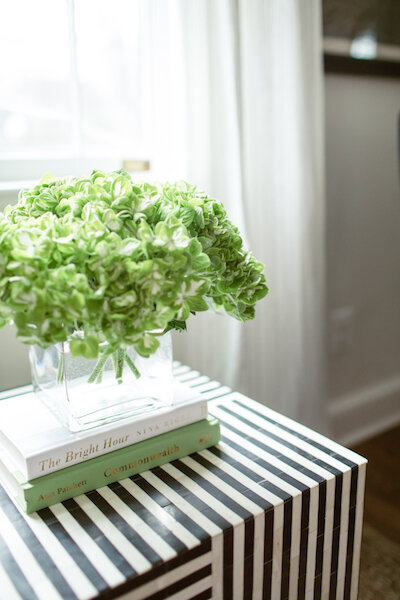
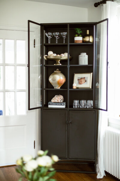

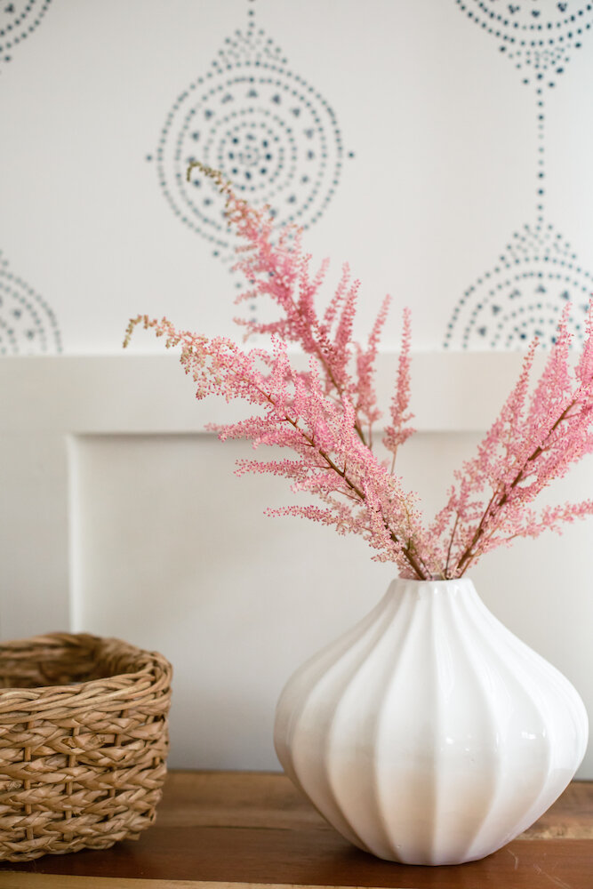
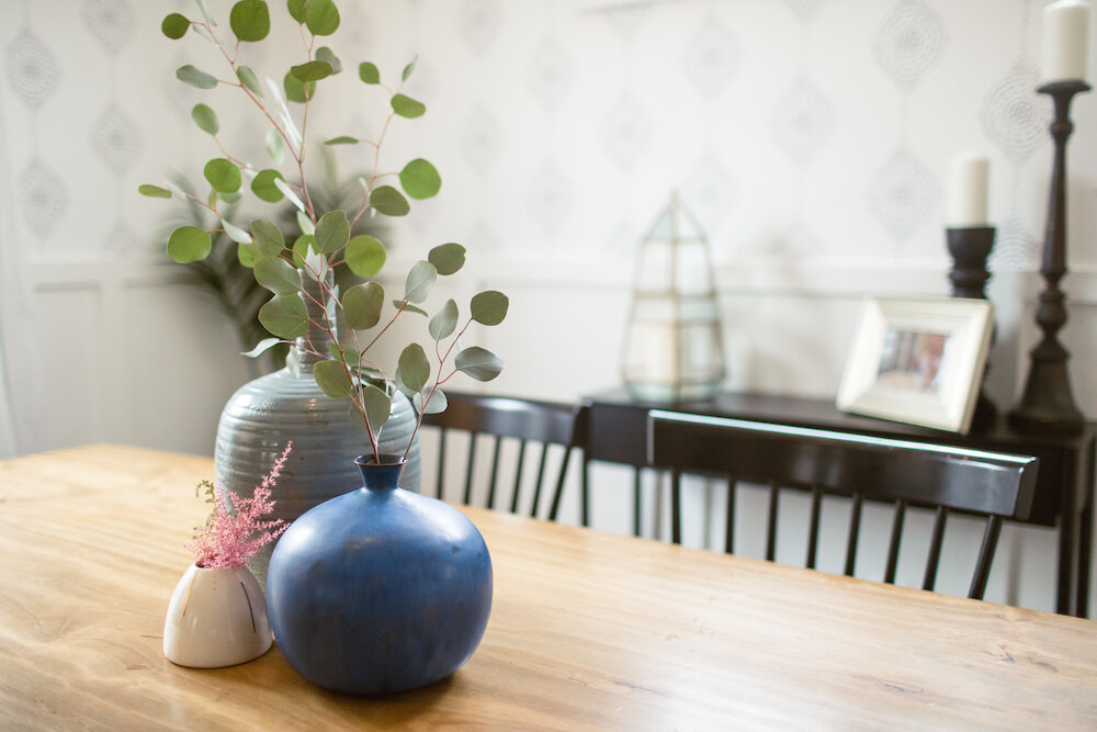
To wrap things up, let me give a shout out to Beth Caldwell for the beautiful photography…and you can find out more about the pieces and finishes below!
Get the Look
Living Room
Alex Navy Blue Accent Chairs (Crate & Barrel)
Heather Chenille Jute Rug (Pottery Barn)
Drapery Rods, Finials & Rings (Ballard Designs)
Joanna Gaines Isabel Rug (Anthropologie)
Casement Black Tall Cabinet (Crate & Barrel)
Laquer Wood Tray (West Elm)
Eden Cross Base Standing Planter (West Elm)
Moroccan Leather Pouf (West Elm)
Marble Round Nesting Side Tables (West Elm)
West Elm + Rejuvenation Cylinder Floor Lamp (West Elm)
Assorted Accessories: HomeGoods & Target
Sofa & Art: Client’s Own
Dining Room
Capiz Honeycomb Chandelier (Serena & Lily)
Luna Stripe Wallpaper (Serena & Lily)
Maze Rug (West Elm)
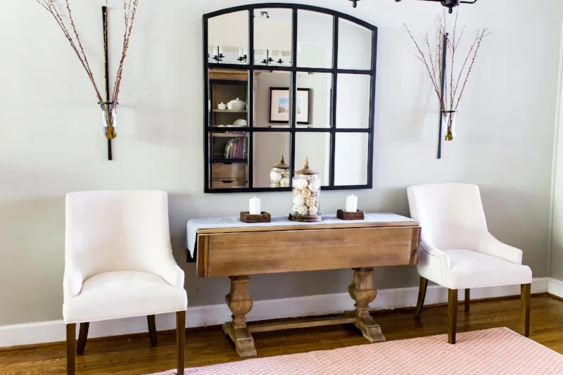
Markel Mirror (Ballard Designs)
Metalwork Console (West Elm)
Drapery Rods, Finials & Rings (Ballard Designs)
Linen Sheer Trim Curtain in White/Navy (Pottery Barn)
Spin Floor Vase (CB2)
Linen Textured Ceramic Lamp (Target)
Assorted Accessories: HomeGoods & Target
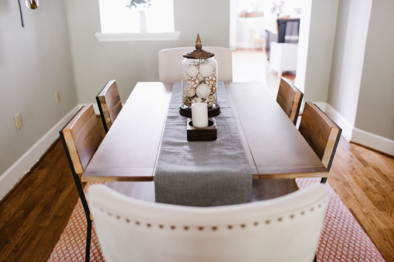
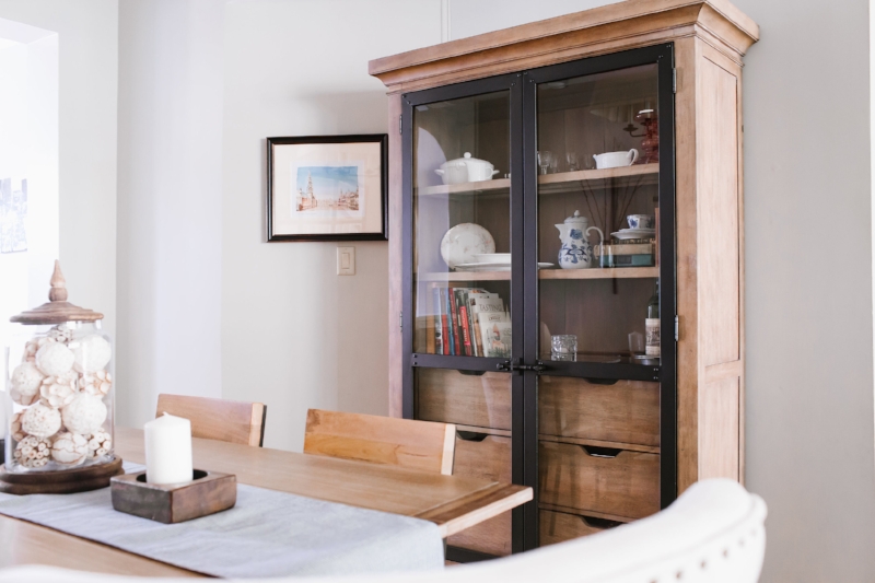
Dining Room Table, Chairs & Cabinet: Client’s Own
Entryway
Cedar & Moss 3-Arm Semi-Flush Chandelier (Rejuvenation)
Amber Harris is the owner of At Home DC, an interior decorator and a licensed real estate agent with Keller Williams Capital Properties working with clients in DC, Maryland and Virginia.


