Ready for Guests…and the Homeowners (Photo Credit: Beth Caldwell)
According to a range of surveys and accompanying articles (I’ll leave you to Google these), we spend around an hour a day in the bathroom. That statistic would seem reason enough to make sure the bathrooms we own are as lovely as the other spaces in our homes. And, while choosing vanities and toilet paper holders may not be as sexy as a new sectional or chandelier, taking a little extra time to make smart selections can greatly enhance the feel and function of these spaces we enjoy (privately).
Recently, I had the chance to partner with Dave and Molly as they planned a renovation of their basement, including the second full bathroom in their charming Takoma Park home. With limited space (like other clients), they had already been brainstorming ideas to modify the small footprint when we teamed up to take things to the next level (working with general contractor Jose Serrano and architect Maria Wright) — including modifying the approximately 3’ square glass-enclosed shower stall to a larger open shower and pushing back a wall a few inches to add critical space and function.
Tile selection was central to the finished product and, as I’ve said before, it’s worth it to splurge on something unique in small bathrooms (as the incremental cost won’t be much but the impact will be substantial). We started with a special tile I had seen on a previous trip to Architectural Ceramics, the Hexagon Deco Chronicle in Paper Bianco. The tile print is of pages of paper layered on top of each other, and you can actually make out Italian text on some of those pages (che meraviglia!). To contrast the cooler tones in the tile and pick up on the variation and contrast within it, we went with warmer wood accents in the vanity and custom shelving (which was stained to match the vanity).
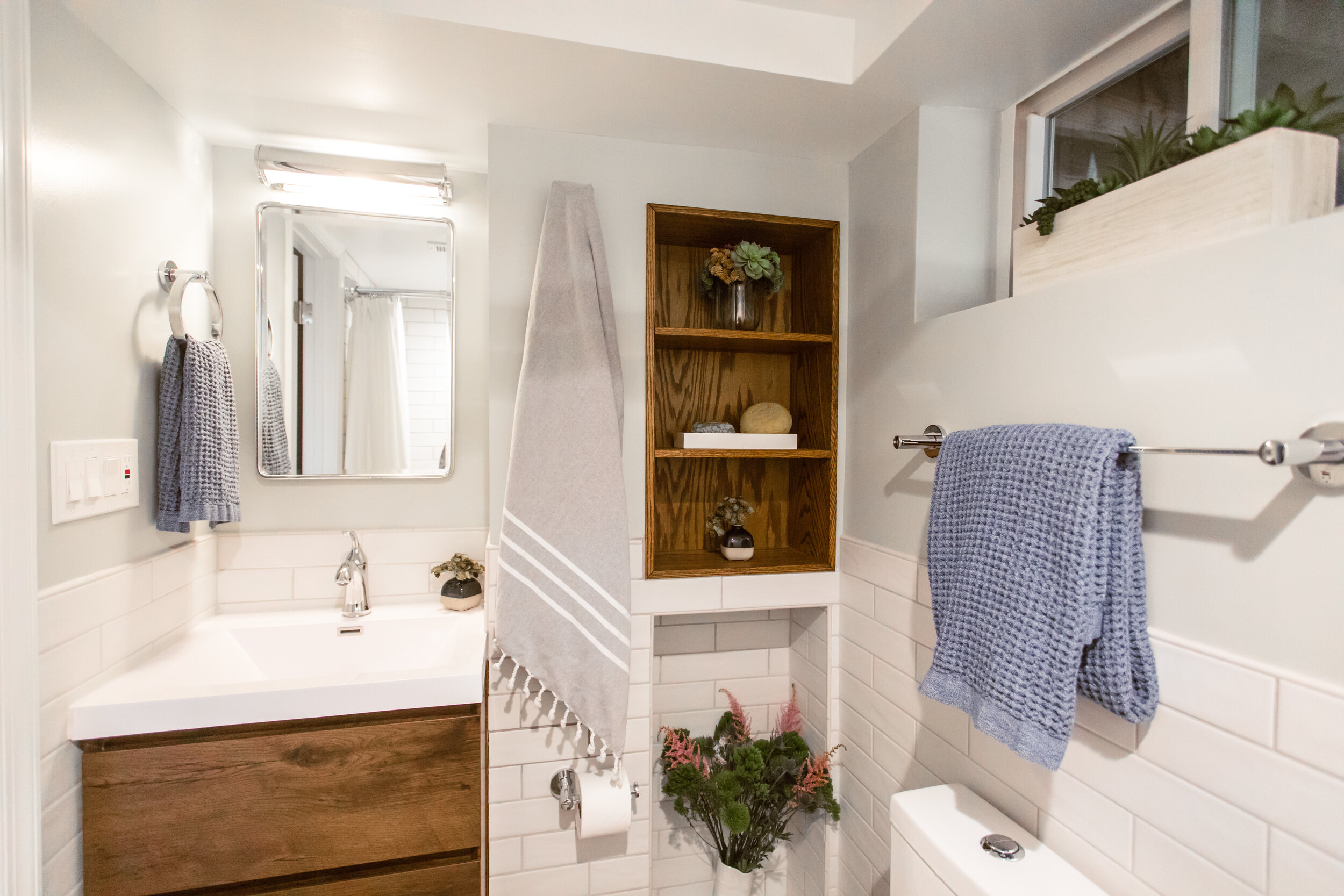

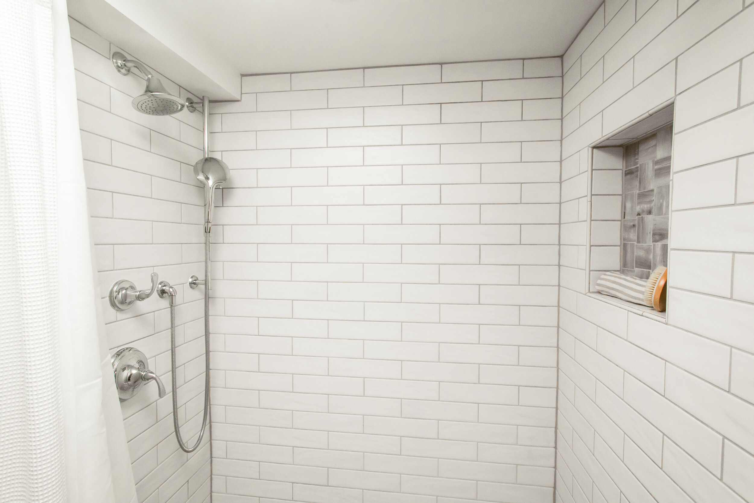
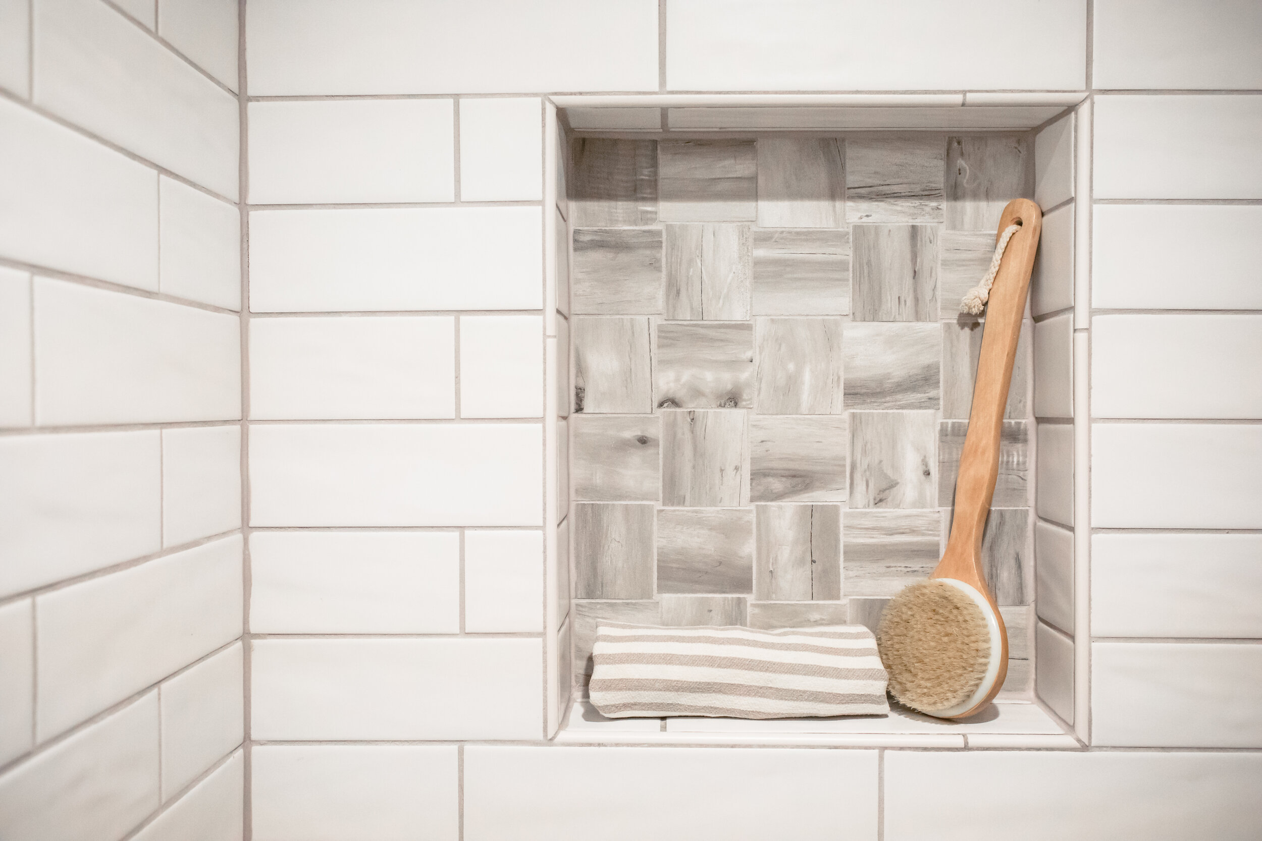
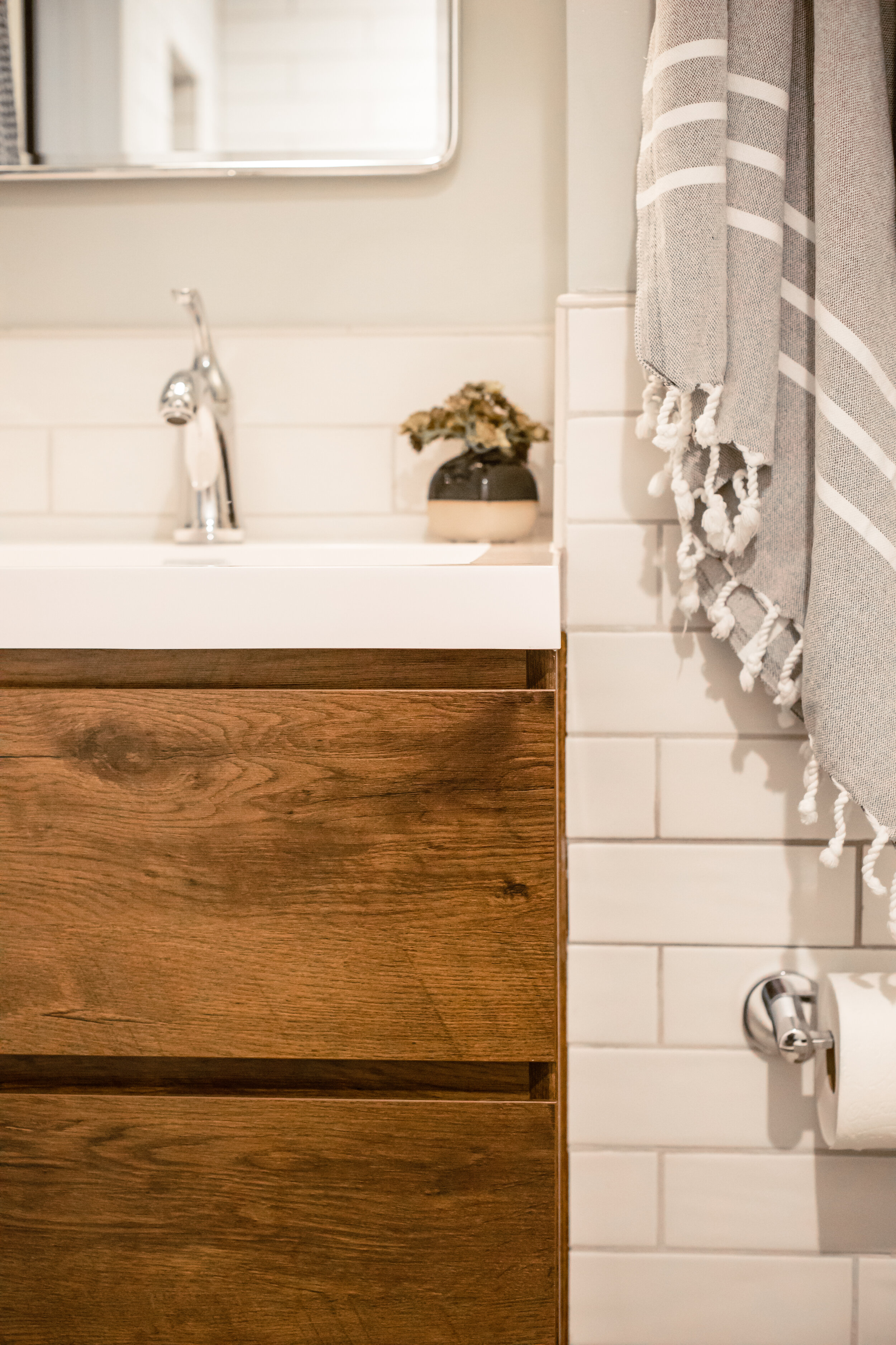
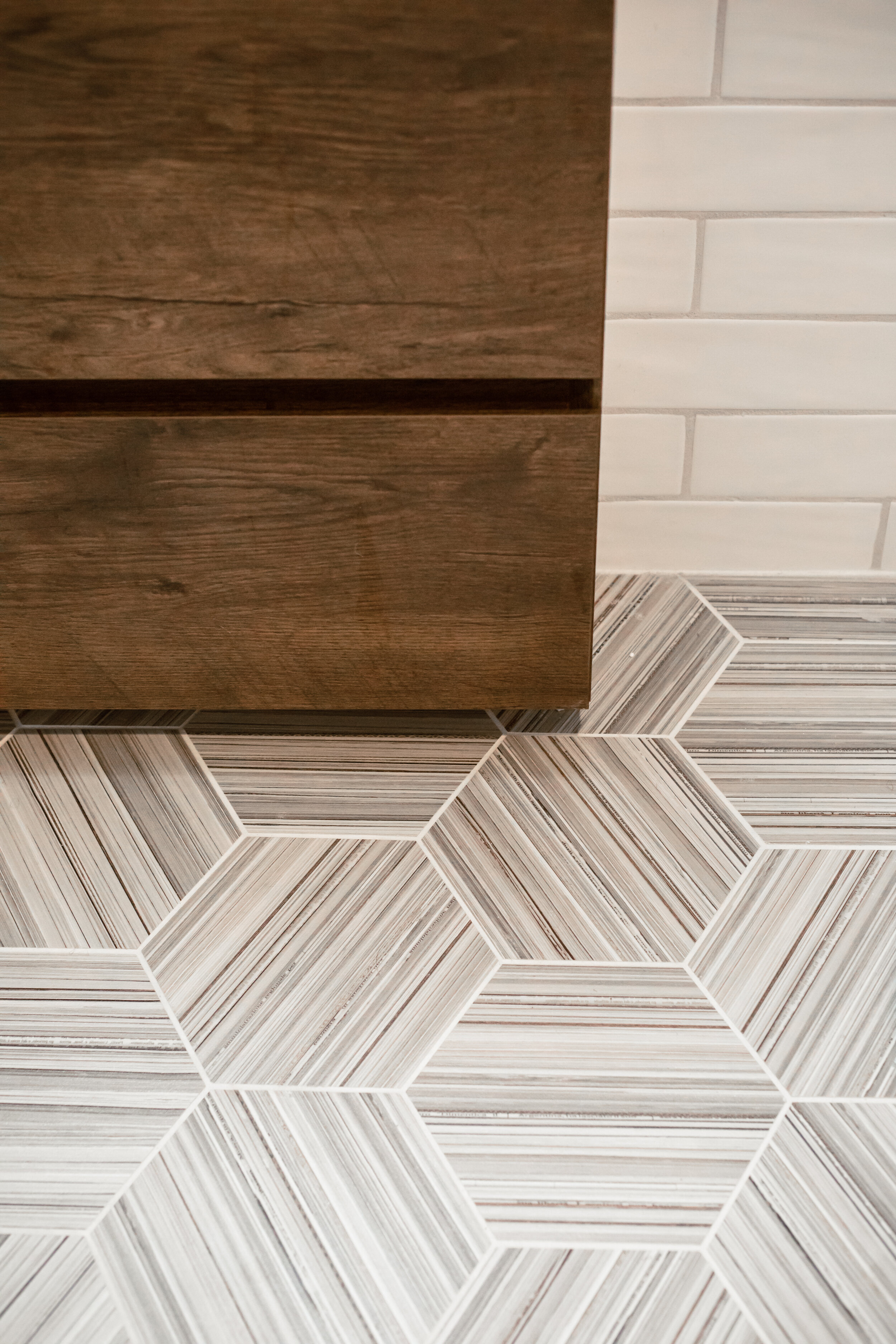
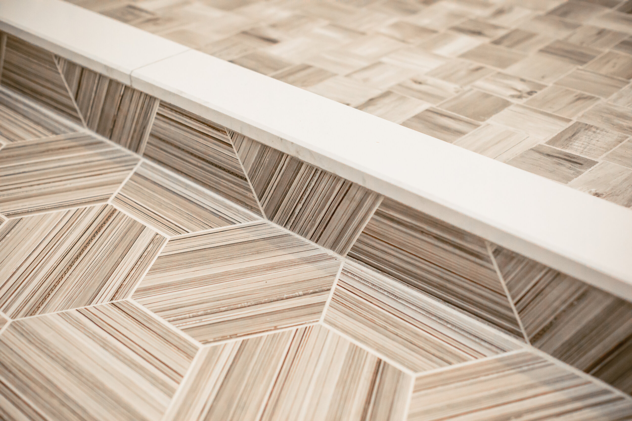
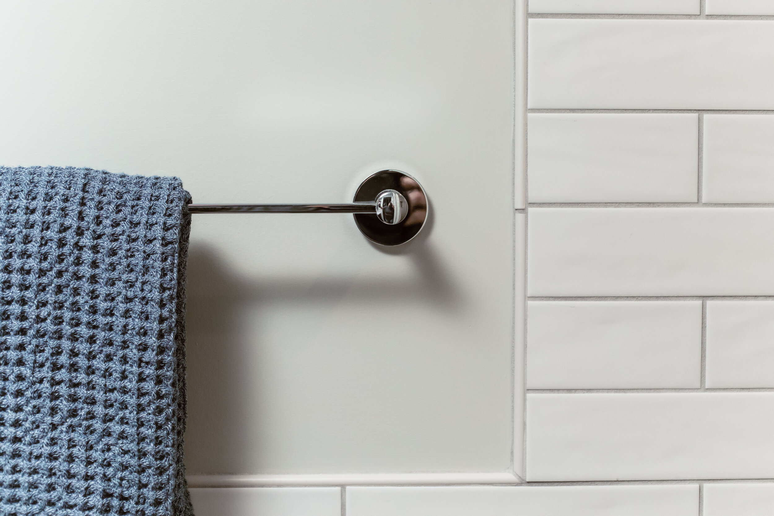
To complement the floor tile, I chose a Kiln & Penny subway tile with a matte white finish paired with the Estonia mosaic tile, which has more organic striations that go well withe the hex floor tile. Utilizing two different tones of gray grout, we minimized the contrast between tiles on both floor surfaces, while adding it to the shower and bathroom walls. To round out the palette, I wanted to keep things neutral to maintain the focus on the floor tile and wood accents by using Conservative Gray from Sherwin Williams for the walls.
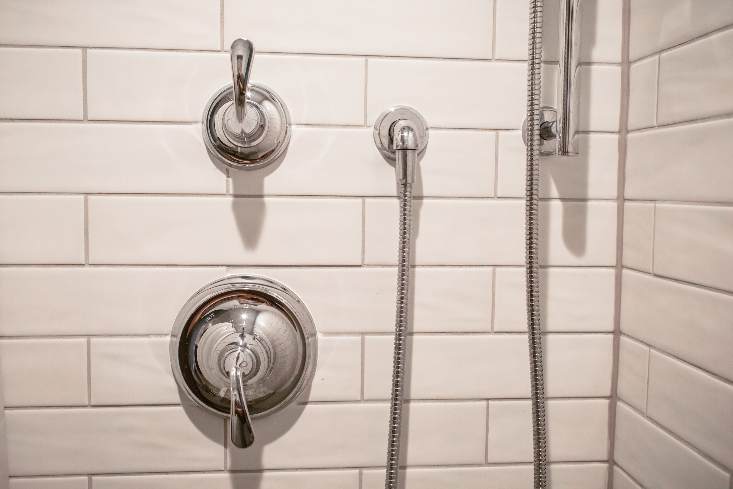
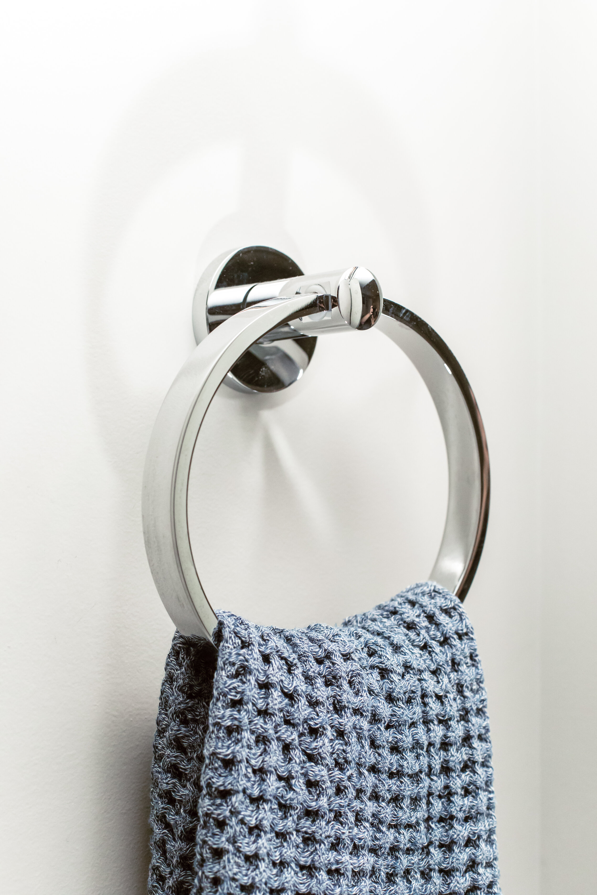
While matte black finishes would have made a nice complement, my clients loved adding a modern touch with polished chrome accents in the medicine cabinet/mirror, vanity sconce, fixtures and hardware. We mixed pieces from Restoration Hardware, Pottery Barn, Schoolhouse and Kohler by aligning the finishes and designs featuring curved elements (contrasting the geometric tile). In the end, we created a space that is welcoming to guests but that, word has it, has become the favored bathroom for my clients (the best compliment).
So, what nuggets can you take away from this project if you are looking to embark on your own bathroom reno? Here are a few:
Build on a finish or feature you absolutely love and that makes the space feel special. In this case, we started with the floor tile and went from there.
Plan and pay attention to details. With such an intricate tile, we had to ensure it was laid meticulously — from the direction of the tiles to how they met the shower edge (check out the photo above with the split hex tiles). We also ensured the vanity drawers would clear the door trim easily by modifying how the tile was laid by the vanity.
Don’t be afraid to mix and match. From three different tile shapes and types to lighting, hardware and accessories from different vendors, the best finished spaces don’t look like you pulled them out of a page of a catalog.
Finally, thank you to Beth Caldwell for capturing this stunning “after”…and stay tuned for more project spotlights soon!
Finishes Guide
Hexagon Deco Chronicle Tile in Paper Bianco (Architectural Ceramics)
3x12 Kiln & Penny Gesso Natural Field Tile (Architectural Ceramics)
Vintage Recessed Medicine Cabinet in Polished Chrome (Pottery Barn)
Royale Adjustable Sconce in Polished Chrome (Restoration Hardware)
Maxwell Bathroom Accessories in Polished Chrome (Schoolhouse)
Amber Harris is the owner of At Home DC, an interior decorator and a licensed real estate agent with Keller Williams Capital Properties working with clients in DC, Maryland and Virginia.

