Makeover

Project Spotlight: Family Kitchen Goes from Black & White to Warm & Welcoming

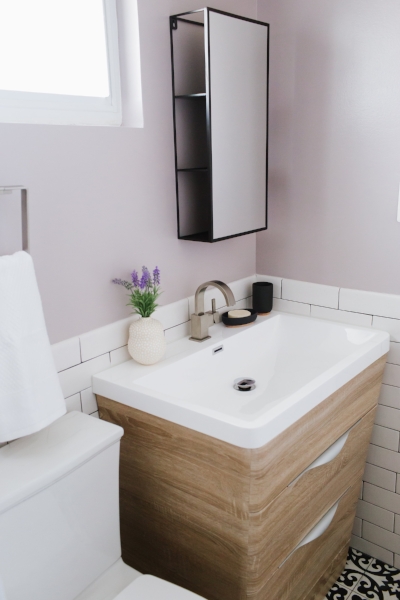
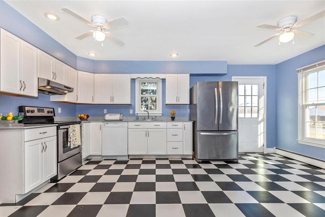
When Jessica and Joel first toured their new Montgomery County home, they knew it was the one for many reasons (I was there as their agent, so I saw it on their masked faces)…however, the kitchen wasn’t one of them. While large and with great natural light, the layout and look wasn’t them. Jess is a (fellow) baker and with an active boy at home, the space needed a blend of form (bye-bye brick and checkerboard floor) and function (hello storage and counter space).
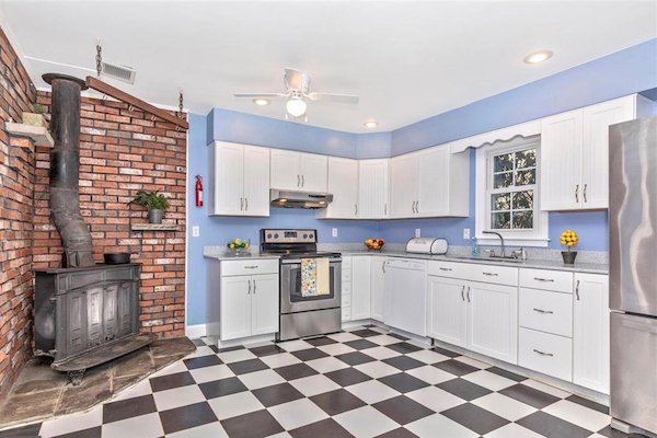
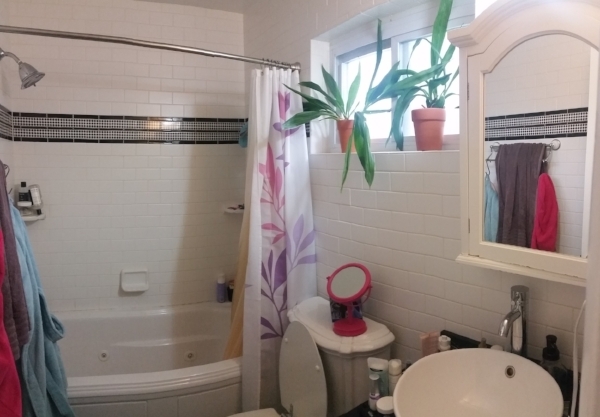
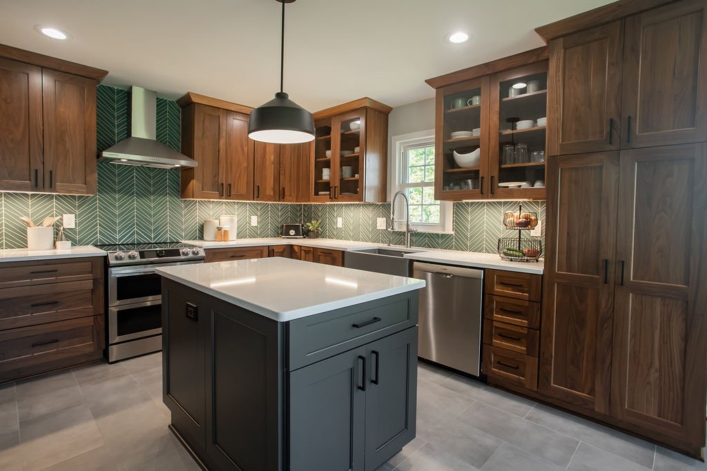
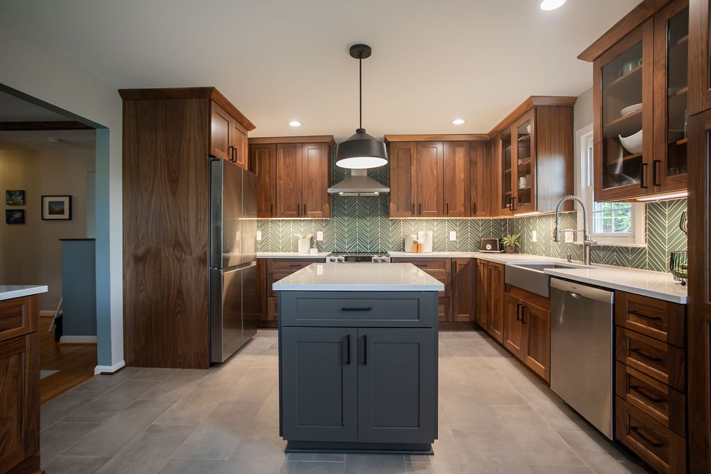
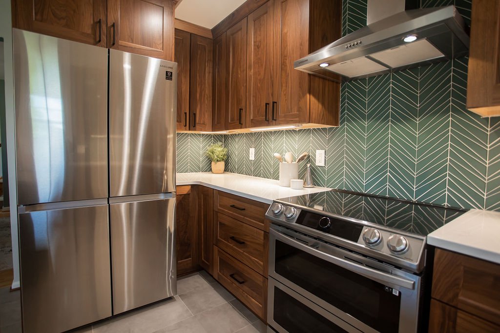
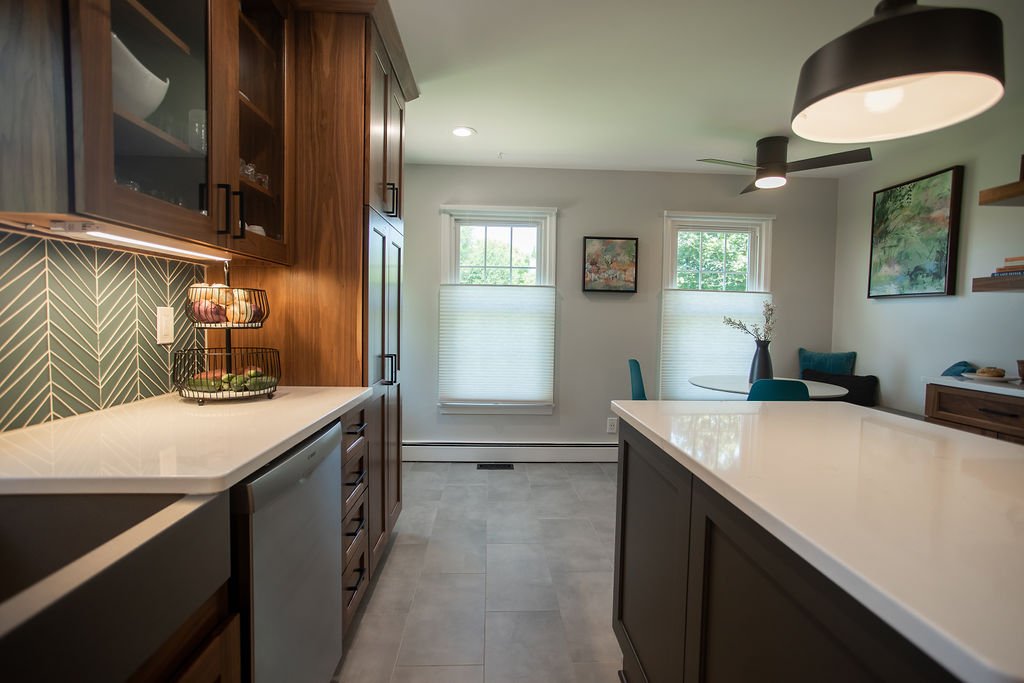
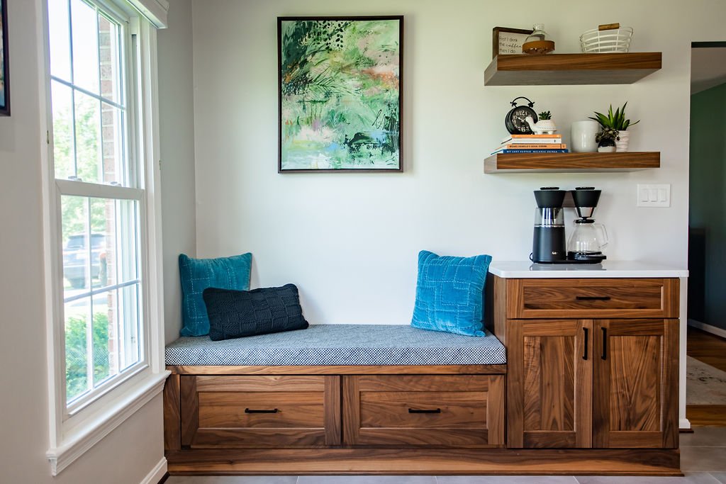
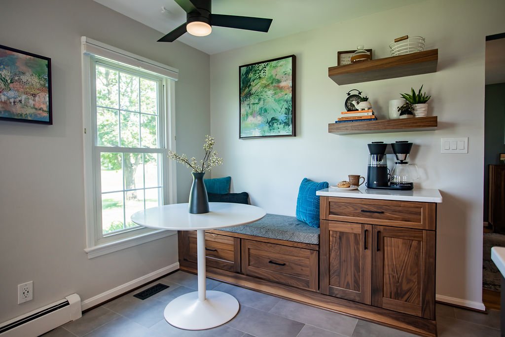
After settling into their home a bit more, J&J reached out to partner on this exciting transformation. From picking out cabinets to pouring over tile (my chosen pastime), the end result is not only beautiful but now serves as a favorite room for all. Keeping the same footprint (save shifting the opening to the dining room), we were able to confirm the brick could be removed (a messy but worthwhile update that extended into the living room) along with the soffit and — opening up layout options. By relocating the refrigerator, we achieved a beautiful stretch of cabinetry that welcomes you as you walk in and added a welcome pantry. We also created enough space for an island (including a microwave drawer tucked away) and an eat-in area with seating, storage and an essential coffee station!
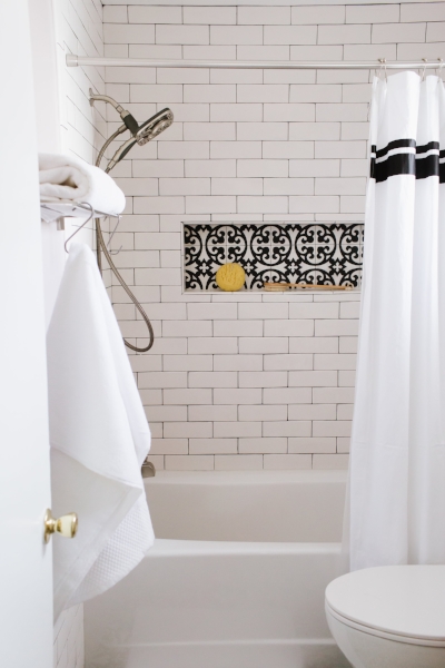
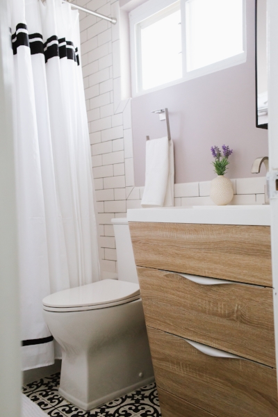
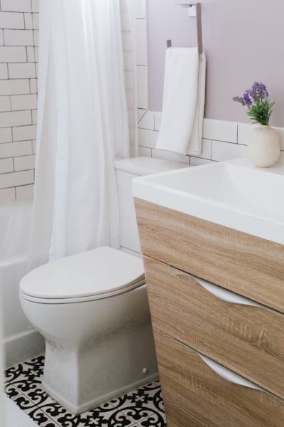
How It’s Going…

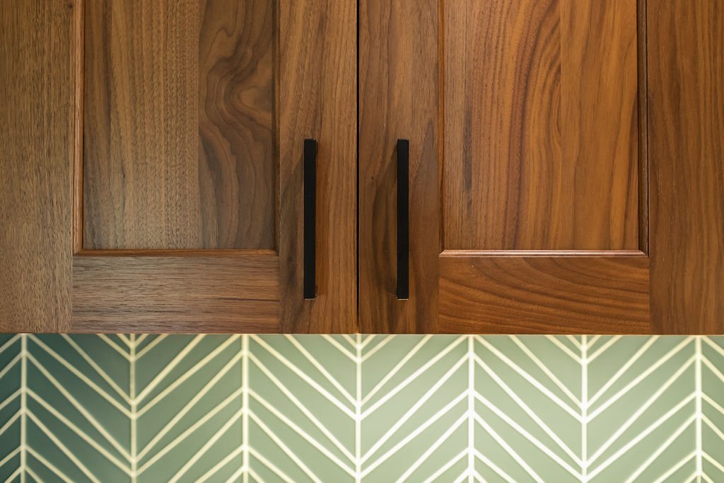
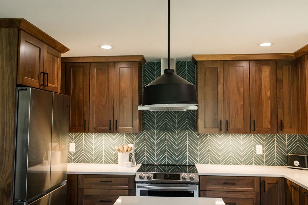
For the aesthetic, we focused on the cabinetry finish first, with the clients wanting a wood finish. Brighton Cabinetry had a beautiful walnut in a natural finish that we all loved in the Cascade style and paired with a contrasting island in Urban Bronze. For the backsplash, we knew there was an opportunity for a “wow” moment, so we went to my favorite local tile source, Architessa, and picked out Island Stone’s Palms tile in the Matte Lagoon finish. To round out the surfaces, we chose a clean matte gray field tile and a quartz countertop with subtle veining throughout the soft white background.

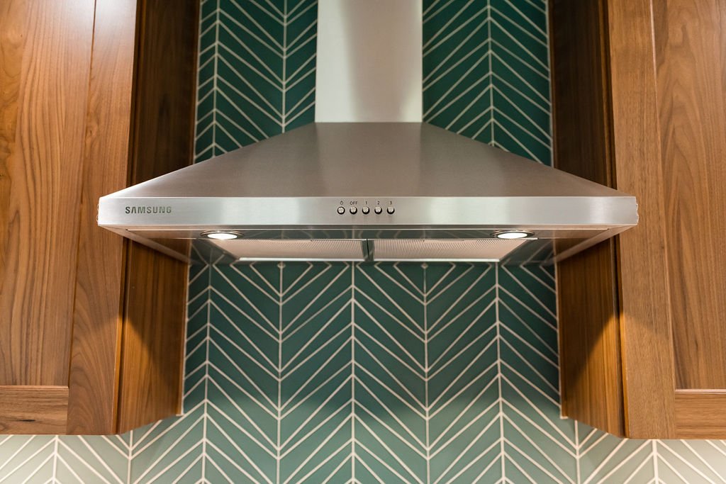
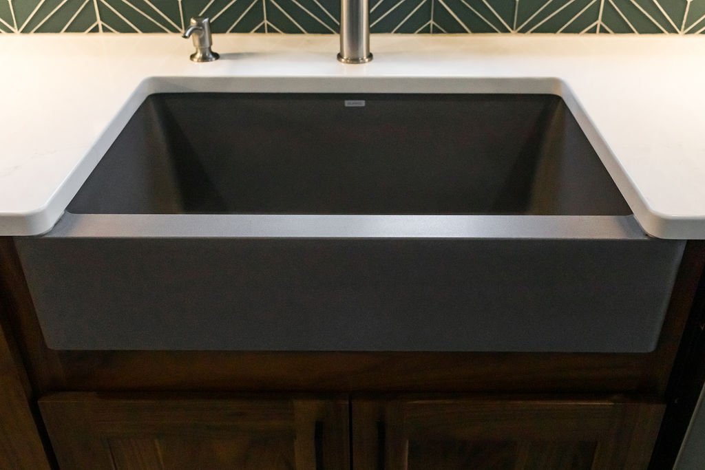
To pick up on the angles in the backsplash, we chose an island pendant and ceiling fan that mimicked the lines, in addition to a similarly styled range hood. Rounding out the design, we added a farmhouse-style Blanco sink in a complementary gray and matte black accents through the lighting and cabinet pulls. A suite of Samsung appliances in stainless steel and a faucet my clients had upgraded in the previous kitchen worked well with the overall look. The dining nook is a second home for their son and features a custom bench cushion in a fun Sunbrella print, CB2 tulip table and easy care chairs from Article, with crisp cellular shades from Smith & Noble and colorful artwork selected by the client. Check out more of the project (after photos by the talented Beth Caldwell) in the slideshow below!

Thinking about a renovation and need a helping hand (and eyes)? Don’t hesitate to reach out and let’s chat!

Get the Look

Amber Harris is the owner of At Home DC, an interior decorator and a licensed real estate agent with Keller Williams Capital Properties working with clients in DC, Maryland and Virginia.

Project Spotlight: Small But Unboring Bathrooms

While we've previously covered a small bathroom makeover on this blog, today's post expands on it by digging into ways to inject personality into private spaces that are best known for function over form.

Earlier this year, I worked with my clients in Rockville to help them add new life to two of the bathrooms in their lovely home. While it would be easy to go with a standard 3x6 subway tile surround and standard pre-fab vanity, these homeowners were open to ideas and finishes that would add style to these smaller spaces. (You can see one of the before and afters below.)

While each homeowner and space is unique, I want to challenge you (whether you are working with a designer/decorator or not) to take these tips to heart before you start your own bathroom project:

1. Find At Least One Feature/Finish to Splurge On: As with any room, you want to have a focal point or feature that draws the eye initially and that is complemented by the rest of the design. In small bathrooms, one easy way to do this is through floor and accent tile. In both of these bathrooms, we chose conversation-worthy tiles — a black and white cement tile for the hall bathroom (LiLi's Marrakesh 1 from Architectural Ceramics in Chevy Chase) and a blue-toned marble chevron tile from TileDaily for the master bathroom.

LiLi's Marrakesh 1 Tile in Bathroom Niche (Also Used on Floor)

LiLi's Marrakesh 1 Tile in Bathroom Niche (Also Used on Floor)

Chevron Mix Blue Marble Mosaic Tile from TileDaily

Chevron Mix Blue Marble Mosaic Tile from TileDaily

2. Make Small Changes That Feel Custom: You may not have the budget for custom cabinetry but consider swapping the hardware or adding a custom countertop to a pre-built unit. In the master bathroom, we swapped out the silver hardware for a square-shaped brushed gold finishes to match the other hardware and paired it with a quartz top (Emerstone Quartz Carrara White from Architectural Stones in Rockville) that matched the in-shower bench added during the renovation. Other ways to add a custom feel without spending too much include using tiles in different shapes (we used 3x9 in the hall bathroom and 3x12 in the master bathroom) or with a contrasting grout (as we did in the hall bath to complement the cement tile floor).

Strasser Woodenworks Vanity (from Wayfair) with Updated Hardware

Strasser Woodenworks Vanity (from Wayfair) with Updated Hardware

Custom Quartz Countertop Added to Pre-Fab Vanity

Custom Quartz Countertop Added to Pre-Fab Vanity

3. Include Contrasting Elements to Add Interest: As in other spaces in the home, don't hesitate to play with tone and texture to add personality. In the hall bathroom, we paired a more modern natural wood vanity with the starker black and white tile work. My client chose to go with brushed silver hardware but another option is to add matte black/iron finishes to tie together the modern vanity and the vintage-feeling tile. Contrast can also come in the form of color, like the Behr Vintage Mauve paint in the aforementioned bathroom or the blue towels in the master bath (bringing out the blue tones in the chevron tile and contrasting with the Behr Sandstorm paint).

LiLi Cement Tile from Architectural Ceramics Contrasts with Fresca Milano Vanity (from Wayfair)

LiLi Cement Tile from Architectural Ceramics Contrasts with Fresca Milano Vanity (from Wayfair)

Behr Vintage Mauve Contrasts with 3x9 Goose Down Matte Tile from Sonoma Tilemakers via Architectural Ceramics

Behr Vintage Mauve Contrasts with 3x9 Goose Down Matte Tile from Sonoma Tilemakers via Architectural Ceramics

Bathroom Makeover: Small & Green to Spa-Like & Serene

Even if we only spend a fraction of our day there, we place a premium on bathrooms. It's not uncommon for many of DC's row homes to lack a dedicated master bathroom but, often when they do have one, it's hardly a spacious five-piece en-suite. 

My clients recently had the chance to move to a larger home in the Brightwood Park neighborhood of Washington, DC, but their new-found master bath was dated and hardly a retreat (see below). While the small space meant there weren't any options for reconfiguring the layout (without undertaking a major renovation), we were able to radically change the feel of the space with new tile, new fixtures and combining some Scandinavian inspiration with natural elements.

Before...

Before...

You can see the end result further down, but I wanted to share a few tips and tricks that helped us create this miniature master spa bath:

  1. Keep your color palette simple. Less is more in terms of color when creating a serene space, especially a bathroom. While white is the go-to for a spa-like feel, adding a contrasting but muted color (in this case a lighter shade of Sherwin-Williams Bonsai Tint, created by mixing in a little more white to tone it down) with a lighter wood tone (via our tile) takes this bathroom from basic to custom.
     
  2. Limit the type of tile (color, size and shape) to create a more spacious feel. For this bathroom, we used a 6" x 24" Driftwood tile (in Greywood) from Architectural Ceramics. Meant to simulate wood planks, the tile was laid vertically in the shower to make the tight stall feel larger and horizontally along the floor to make the space feel wider. We did use a smaller scale 2" square tile for the shower floor, but you also could up the spa-feel by opting for a pebble floor (check out Island Stone's awesome options).
     
  3. Choose smart storage options. While less than 19" deep, the vanity selected features plenty of storage - concealed behind doors and using the open shelf at the bottom. While it may be tempting to add shelves above the toilet (as before), these would contribute to making the space feel smaller; alternatives, like a multipurpose baskets (as pictured below), allow you to store extra towels and toiletries in a stylish, mobile and contemporary way.
     
  4. Blend modern lines with organic materials and shapes. A clean-lined vanity and rectangular tiles could easily read cold but adding in natural textures, such as the twig-based wall art and the rope details on the waste basket and accompanying storage basket (all from HomeGoods), off sets the harder edges without going too country or rustic.

All in all, I just love the way we were able to create a personal spa in such limited space for these deserving clients. 

Amber Harris is the owner of At Home DC, an interior decorator and a licensed real estate agent with Keller Williams Capital Properties working with clients in DC, Maryland and Virginia.